A Long Weekend Zombie Apocalypse!
April 27, 2015 by crew
I recently “unearthed” a box of Mantic Zombies from the impulse-buy stacks cluttering up my desk, and thought, “Why not?” I usually scramble to get miniatures and terrain ready for our monthly AD&D campaign, and what I end up painting is, most often, not what I want to be painting. I didn’t need the zombies for our next game, but these figures suddenly called out to me from beyond the grave. So, I pushed aside a player’s gaudy, cobbled-together fighter/mage, and cracked open the crypt… er… box.
On the day I ordered them I vacillated between buying one or two kits and then realized there were thirty in a pack (they currently sell in boxes of forty for £24.99). For most post-apocalyptic zombie applications that may seem woefully inadequate, but it was more than I had ever stocked a dungeon with, so I only ordered one kit. Warning: your needs or willpower may vary.
Day One
This wasn’t my first Mantic purchase but I have to admit I was a bit disappointed when I took an inventory of what was inside: ten identical sprues and a dearth of spare parts. Two of the three extra arms were clutching a hand or a head respectively meaning they had to be incorporated into the models. There were only three types of legs plus three variations of the torso, one of which had both arms extended, reminiscent of Vampira stalking a victim…or of the French army in 1940.
My first thought was “WTF? How am I going to make thirty original/different figures with such a paltry selection?” As it turned out, that wasn’t a problem (Author’s note: I should mention here that I had just finished putting together sixty-plus GW wood elves, and given the volume of extra bitz I had just shoehorned into my cabinet, my expectations were likely too high).
The models were easy to individualize, despite the lack of bitz options.
The first thing I did was dry-fit and play around with all the components to see how many variations I could come up with. What saved the day was the torso/legs “socket,” which allowed for varied angles on the body, and the numerous characterful heads -- my favourite being the one that looks like Steve McQueen…on one side anyway.
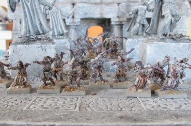
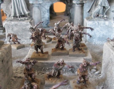
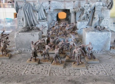
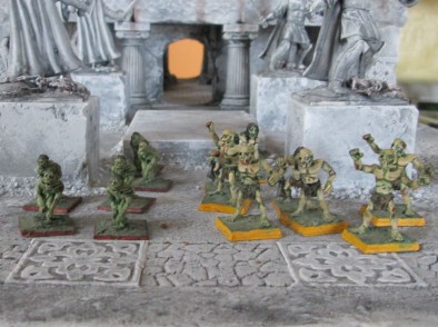
Any zombie horde, left unsupervised, will eventually form a Conga line. Steve McQueen is second from the left.
Murphy’s Law of Flash: you will only find it when you’re drybrushing. There wasn’t a lot, but it showed up in the worst possible places in the latter stages of painting -- on the inside of the arms and legs. Vigilance required. After naively thinking I had got rid of it all, I set about gluing them together. As I mentioned, coming up with individualized poses wasn’t an issue; a lot of thought seems to have gone into the kit design.
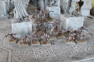
As for the hands carrying heads, I decided to go with the head being a projectile, rather than something the zombie was trying to perch on its vacant neck. I even managed a few good “baseball” poses. My only complaint would be that the torso/legs socket wasn’t completely round, so there were some restrictions. I should have puttied the arm/shoulder joints; I didn’t. Even without paint they looked fabulous. Day One done.
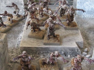
Baseball pose (center on dais). Catcher to pitcher: “Let’s get our signals straight: one finger for a curve, two for a fastball, and three for an eyeball.”
Day Two
Now, to the business of painting. I’m only human, unlike @elromanozo and the other fabulous artists who post tutorials on here, so what follows will not be a how-to guide, but rather an answer to the question, “Why on earth did you paint them like that?”
Let me see if I can pre-empt a few comments. If you think they look like they’ve been stomping out a batch of Chianti Classico in a shed in Tuscany, you’d be right; or, if you feel they look like someone who’s inadvertently dropped their smartphone in the toilet on the New York/LA Redeye, you’d also be correct. There was a method to my madness however as I’ll explain below. For the squeamish among you it may be time to move on.
That tragic moment when you realize the men’s room is ten steps too far.
When a corpse has been lying around for a day or so blood pools in the lower part of the body (any that hasn’t leaked out, that is), creating an effect that looks like bruising. Where does the blood go when a victim is animated immediately after death? For the answer to this hypothetical question I went to the closest subject-matter expert I could find: my brother. He is a former army medic, paramedic, and now a helicopter paramedic. Given what I already knew I asked him if blood might pool in the extremities of a recently deceased zombie. I got a long-winded answer that involved terms like “dependent lividity,” and other medical jargon that went far beyond my pay grade. The short answer was “Yes".
He also eagerly suggested I model bloody vomit due to some upper GI tract bleeding (in retrospect, he got into the spirit of the thing more than he needed to). I didn’t, but I did brush in other appropriate stains. Since the bowel and bladder are no longer concerned with their owner’s dignity following death, I embellished their loincloths to reflect that.
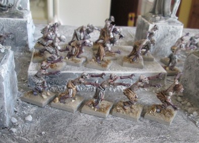
The “skid marks” showed up better on the grey loincloths… but not so good on the photo. Damn you, point-and-click camera.
For all of you “die-hards” still following along I should probably finish up with a few lines on painting. I started with a light flesh tone, and blended it with purple/grey on the arms and legs. I gave the whole model a wash of GW’s Agrax Earthshade. The next step was to drybrushthe original flesh tone over the top, and then go into the low areas with a fine brush and a black or blue wash. There’s also a sepia wash on the edges of the purple, to give those transitional areas that lovely days-old-bruise look. The dried blood was a mixture of black and red (I use Deco Art acrylics), and there’s some red wash applied to the creases as well. Finally, I gave the body a white highlight. Day Two done.
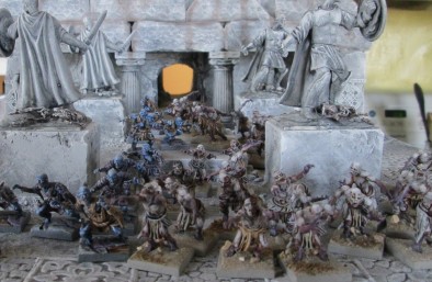
Mantic zombies and ghouls…
Day Three
The colours on the loincloths and bases are neutral, to better show off my putrid palette, and I went with dark colours on what little hair they had, to contrast it with the pale skin. The colour on the bases is a mix of the grey and tan used in the loincloths (my leftover paint, actually), with the flock being a mix of gravel from my driveway, silica sand from a nearby quarry, and ground up florist’s moss. I steered clear of putting anything “living” on the base. The bases themselves were standard two-part Mantic: a square base with a round inset that fits the circular base attached to the legs. I used Milliput to integrate them.
…and the ‘80s zombies and ghouls they’re replacing. What was I thinking? I can, however, say with all honesty that I had no part in choosing the edge colour on the bases. Safe to say these Ral Partha antiques will be “laid to rest.”
These models were a three-day project and a pleasant diversion from my otherwise time-constrained hobbying. I ended up with some truly disturbing models, and a small handful of extra bitz which I can use to make other bad characters worse. The only real casualties in all this were, not one, but two, GW drybrush brushes. If anyone can recommend a more robust alternative (in North America, or something I can get through mail order), I’m all ears.
Oh, and thanks for a great long weekend Ronnie!
If you would like to write an article for Beasts of War then please get in contact with us for more information at [email protected]!
"As for the hands carrying heads, I decided to go with the head being a projectile, rather than something the zombie was trying to perch on its vacant neck"
Supported by (Turn Off)
Supported by (Turn Off)
"The only real casualties in all this were, not one, but two, GW drybrush brushes..."
Supported by (Turn Off)
























![Very Cool! Make Your Own Star Wars: Legion Imperial Agent & Officer | Review [7 Days Early Access]](https://images.beastsofwar.com/2025/12/Star-Wars-Imperial-Agent-_-Officer-coverimage-V3-225-127.jpg)














AD&D? 1st or 2nd edition?
1st Edition 🙂 . When 2nd came out it was a totally different system, and since I could DM 1st edition in my sleep, and had memorized most of the tables, it didn’t make sense to learn an entirely new system. There were quirky things in 1st edition, but the AD&D police don’t live anywhere near me, as far as I know, so over the years I’ve changed the rules to suit the players, and to make the overall game more fun.
great stuff!
Mantic Zombies: So cheap yet so good!
But they are little bit too “tattered” for my taste. More clothes for make that kit good.
The Mantic Revenant figures have more clothing and even some armour, although they appear more skeletal. They are also a great deal!
Craig Pauls, I like the zombies, if you are looking for cheap throwaway brushes try your equivalent of the pound shops in the UK? Can get around 10/12 for that hear.
Thanks, zorg! I’ve been browsing the brushes at the train hobby stores, and on occasion find some I like. We have Dollarama here, which I’m guessing is like your pound shop. I grab a handful of brushes there sometimes as well.
no problem don’t see the point paying 3/4 £ for one brush when you can get a handful for the same job.
Totally agree @zorg . I didn’t think I was overly hard on the GW ones, but they just didn’t stand up. When I complained to the store manager he said he had used the same one for years… I called bullsh*t, but he just tried to sell me another one lol.
I suppose I’ll be sticking to the cheap ones. Sometimes I snip the bristles a bit as well, to make the brush stiffer. They still disintegrate after a dozen or so miniatures, but the price is right.
“Murphy’s Law of Flash: you will only find it when you’re drybrushing”
So, so true 😀
A close relative of sod’s law isn’t he?
Skid marks… genius!
As for Murphy’s Law of Flash – I’m so glad that someone has managed to name this phenomenon!
A timely article for me as I have not painted the undead before and I picked up the Revenants for Saga at the weekend.
I’m jealous: those Revenants look fabulous @huscarle 🙂 . They are definitely on my Christmas list. I think we would all like to see your progress on them… and I hope you have a better camera than I do. I just couldn’t get close enough with my point-and-click.
They are pretty damn fab in the (dead) flesh as well. I’ll post a pic when i get started on some.
These look great. I have accumulated several units of Mantic Undead….just in case I need an undead army at some point. I think you just inspired me to crack them open.
Thank you. Most fun I’ve had painting in quite some time @fgponce 🙂 . There aren’t many colours to them, and not many lines to stay inside of, so you can get to the good stuff (washes and highlights) on them pretty quickly.
Really nice read and the terrain they are presented on looks amazing too 🙂
Thanks @tuskar . The terrain is actually two 18″ by 18″ panels of a six-panel temple ruin. The courtyard, when it’s all assembled, is surrounded on three sides by a colonnade and a balcony (now that I look at, I didn’t finish weathering the courtyard, nor did I put in any of the weedy stuff). The statues are from a series of Greek action figures at Dollarama.
Those statues gives the scenery it’s heroic look – really cool!
As a side note, the statues were not glued to the pedestals, as I painted them up as golems (red gem for an eye, WF skeleton laid out on the base). There was a ring of golem control in the complex, which I was hoping the party would use to animate the statues. My aim was to add them to the group’s growing army. They never found the ring… maybe next time 🙂 .
Lovely stuff
Very nice painting and poses! Since i have only completed 3 zombies out of my 20, i’ll be “borrowing” some of your poses!
Thank you @vesticus and @duster 🙂
Hey hey! Craig finally writes an article! Great job, man. Well written, and your background terrain looks great! Awesome job. 😀
Thanks, Jim 🙂 . I had one of those rare free afternoons where my editor wasn’t pissed at me, or was behind me with his blue pencil, so I was finally able to write something for fun… and I had just finished these models at Easter. I’ve been working on my three-waterfall castle as well, so should be able to post a few more articles on that in the near future.
BTW, great work and legwork on the D-Day stuff! Looks like fun. Alas, no time to pitch in on the Juno Beach landings… maybe next time 😉 .
No worries, @cpauls1 . Fellow BoW member @amphibiousmonster and I have Juno Beach well in hand with some custom-designed Panzer Leader. We promise to do Juno justice. Although regrettably we will have no zombies. 😀
Now that you mention it, there were no zombies (Canadian slang at the time for conscripts) in-theater till ’45, and very few were actually killed in action 🙂 .
As my dad would said “Put a round through every church steeple. There was always some bastard there bringing fire down on us.” Words to live by, now that I think of it 🙂 .
Oh, and it’s nice to see another article author include captions for his photos. 😀 Well done.
Always… that’s where all the fun is, don’t you think? 🙂
Really nice, particularly combined with the excellent scenery.
It always amazes me just how much difference the terrain makes to the look of a game
Thanks @solar . Fairly easy and inexpensive pieces, actually. The pillars are from a wedding cake, and the tiles on the ground are cut from a textured chair runner. Hardware stores often sell off the end of a roll really cheap, or just give it to you if there’s less than 10′ left on it, as it’s not useable. The rest is just polystyrene, foam board, and craft acrylics.
There is nothing more frightening than a zombie conga line! 🙂
A good read and some lovely pictures of the newly painted undead 🙂 looks like the terrain would be perfect for some fantasy zombie horde gaming .. good work!
Thanks @hatamoto 🙂 .
Those Mantic Zombies are really good. Best of their range and probably the only ones I can honestly say beats GWs sculpts. I can highly recommend them. I have about a hundred of them myself. I’ve liked them so much I’ve started selling them 🙂
Now for my question: I’m from Sweden and I’ve been trying to figure out what a “chair runner” is. Is it some kind of protection on the part of a chair you sit on? Is it some kind of protection for the floor so the chair doesn’t damage it? Really love that terrain!
Thanks @tenntrollet. You may be more familiar with wooden chair runners that are put on a wall just above waist height so the back of the chair doesn’t damage the wall. The decorative textured version is derived from that concept. Often the wall is painted different colours below and above the runner. The stuff is like wall paper, but usually only 6″ or less in width, but 50′ in length. I just cut the patterns out and use them either on a diorama floor, as in this case, or along castle walls to embellish them.