Paranoid Miniatures Reveals Render For Their Second Mythos Mini
August 21, 2015 by deltagamegirl22
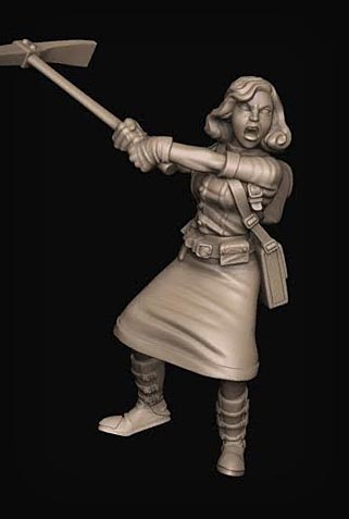
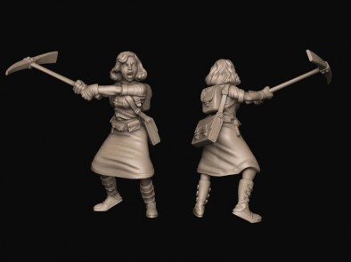
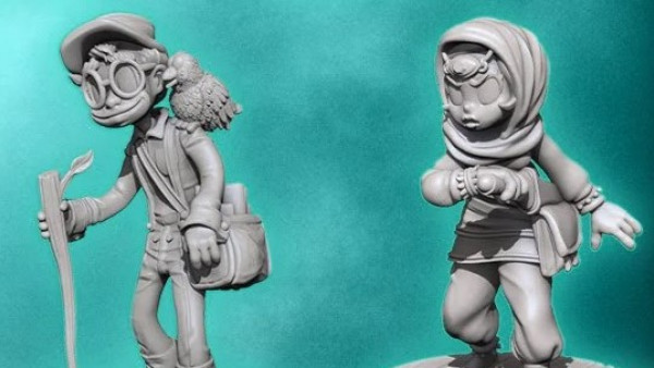
The folks at Paranoid Miniatures have kicked things into high gear and they are starting to crank out renders for their miniatures! We saw their very first miniature, The Sea Queen, at Salute. Now they are super excited to share the render for their second miniature for Mythos - Abigail, of the Priory Faction.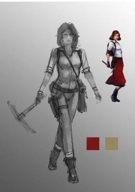
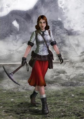
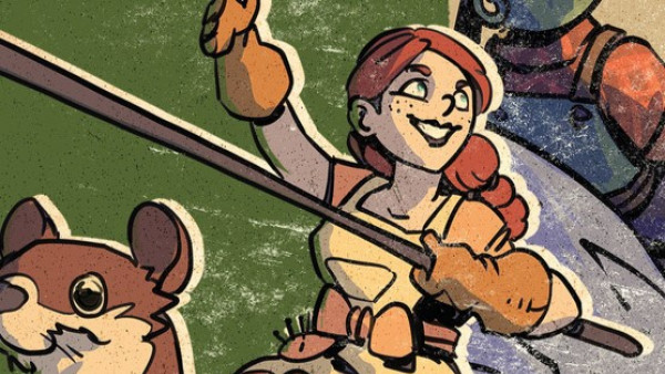
Don't let the cool look of this 1920's beauty fool you. She's wielding a pickaxe, and by the look of things, she just may be mad enough to use it!
Is it just me, or is there something magical in watching the art for a miniature walk off paper and into a three dimensional concept?
Do you see this pickaxe packing, 1920's gal making it's way into your miniature collection?
"Is it just me, or is there something magical in watching the art for a miniature walk off paper and into a three dimensional concept?"





















That seems really promising.
Agreed. Going to have to keep an eye on these…
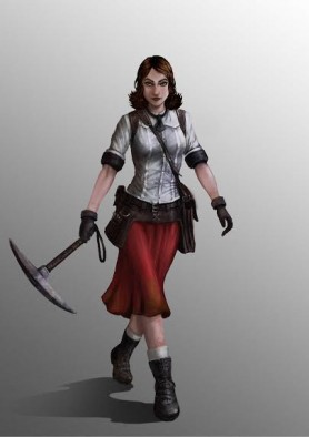
I much prefer the pose in the concept art to the render.
Likewise…
Same here.
One to watch – like this more than the ‘Sea Queen’
I do like the original concept’s pose… but If she’s going to be in the midst of battle against the vile forces of the elder gods, the render’s pose is a lot more reasonable…. maybe they can do an alt pose of her with the swagger as part of the ks or webstore exclusive?
That pick axe is going to be prone to getting bent or broken in the render pose. I’d prefer the slightly safer concept art pose. Still both look great.
Plus is easier to paint, but i like the fact there more “action” in that pose rather than a idle one.
staring at her swinging that pick axe, i’m struck (no pun intended) by just how devastating that would be on her victim… We had a massive ice storm that coated everything in 5+ inches of ice, and it remained that way almost all winter. When it would thaw, it would run on the surface and polish itself to an almost mirror smooth surface.
In my efforts to not get killed every time i went out to my car, I tried pick axing a trench form the water to run through. In the spring, when i saw my poor driveway… yikes.
Picks are more devastating than they think they are 😉
The render looks really odd. It’s as if she’s swinging it for the first time. If the pick was swung overhead it be much more natural looking and not so unbalanced as it currently is. As it is now she looks like she will lose her footing after the swing.
She doesn’t even look like she’s swinging it to me. More holding like a batter awaiting a pitch. Not a fan of the pose at all.
The concept are it really pretty nice. But the render… Is it even of the same character…?
Ok. I have no idea what happened to that post so let’s try again…
The concept art is really pretty nice. But the render… Is it even of the same character…?
The artwork shows a sexy adventuress.
The render shows a frumpy school teacher.
Thank you for taking the time to put your thoughts into the comments guys. We will take the positive and negative feedback and apply them to our future 3D renders more of which will be ready before Christmas. Happy gaming guys and girls.
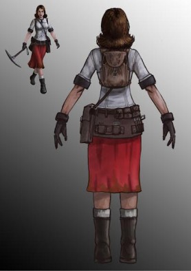
I think the concept art is great (I would actually think about buy, but the render is disappointing (you can do a better female face than that with 3D software now a days). My recommendation (since you are asking for it) stick as close to the concept art as you can and by that I mean the pose (the walking pose is more iconic and memorable which is what you really want for hero mini, the swinging pose in the render makes it look like she is playing base ball with that that pickaxe), dress (bags, boots, socks etc. if… Read more »