Games Workshop Painting Tutorial: How To Paint Nagash Part 1!
September 1, 2014 by brennon
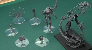
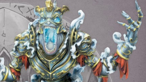
The End Times are approaching and this means that Duncan Rhodes must bend to the will of Nagash and get painting him in an epic four part tutorial. In Part 1 we get a look at assembling this herald of woe!
Did you find these tips helpful when assembling your version of Nagash?
Comment below!
Supported by (Turn Off)
Supported by (Turn Off)
Supported by (Turn Off)

































GW’s painting tutorials are wonderful. I always like knowing and seeing how they get certain effects and paint this and that. I hope they keep them up for all future releases.
This kit isn’t as detailed as I had previously thought… it feels too big, and also a bit rushed/rough… GW is using and abusing the same textures and sculpted patterns with this 3D process.
As for the tutorial, it’s nice of GW to have done this from scratch… not just an assembly manual, but a guide of how and what to assemble to facilitate painting.
You’re not suggesting that the 3D sculpting process is leading to previous assets being reused in a manner that makes it seem too processed? Because I too would worry if that ultimately leads to the death of creativity.
As for the build and whole paint job it’s rather nice. Given they give you some good tips.
Not the death of creativity exactly, but reusing patterns and elements, not just for symmetry and consistency but because it’s easy (or rather, facile), thus getting several “sculpts” or reposes for a fraction of the cost and time. It’s fine for architectural elements or vehicle ornaments, but this is a bit much… of course, the skull and bones motifs are expected, but the cape and the ghosts… and the books… and everything has big surfaces… This looks like it’s just a regular miniature, only scaled up and up and up… Look at the midsection : so smooth… and the large… Read more »
Yeah I get what you are saying. The screaming faces look cut and paste. Same with the tattered holes – cut paste and resized.
Nagash by the way got this size because he got mutated by warpstone when he took control of Cripple Peak.
Oh, sure. Nothing to do with the now affordable 3D sculpting and plastic casting, or the fact that Kaiju are now in fashion.
Seriously, I’m absolutely certain it’s perfectly justified in the background fluff, but that doesn’t justify this being a large toy-like object. The cape’s edge even looks thick, like it’s a smaller miniature scaled up.
I’ve seen this a few times (on PP colossals, on some WWX vehicles…), this issue with details when “scaling up”.
Yeah I get what you mean about “just scale it up”. As if it being bigger makes up for the lack of details that there surely would be.
On the topic of colossals, not a single one makes me excited. Maybe the Khador one, maybe. Now the Gargantuans, they seem to be sculpted for the scale they are. The Skorne mammoth is awesome.
Given some of the artwork GW have released of Nagash I have to say I agree with Romain. This feels like a giant kit for the sake of a giant kit. I would have much preferred a human sized depiction of him and if they needed a big kit, make a mounted version of Nagash on some kind of monster. Games Workshop’s current thinking seems to be big = scary when you can create so much more fear by implication – some of the scariest horror movies work by showing you less rather than showing the horror. For me this… Read more »