This topic contains 20 replies, has 18 voices, and was last updated by nekomata 6 years, 5 months ago.
You must be logged in to reply to this topic.
Home › Forums › Technical Support › Hey you guys! Feedback on Bow 2.0 in general
This topic contains 20 replies, has 18 voices, and was last updated by nekomata 6 years, 5 months ago.
Have now spent a good amount of time with the new site. Still enjoying it and getting used to it.
I think there are only 2 things I actually miss from the old site (assuming I’m not just being blind to features that are actually there!)
1. A full chronology of the latest BoW-produced content. I’m worried that if I don’t get to visit for a day or two I might miss some things and I wouldn’t know to search for it if I didn’t know it was there. If the Latest bar scrolled or something that would work or if clicking Latest took you to a full chronology. BoWis my daily soap opera – I wouldn’t want to miss an episode!
2. The initial Forum page where you could see at a glance the recent thread names under each category. Now you have to click through to each to see what’s new.
Overall there is more at-a-glance stuff on the home page which is definitely an enhancement. It’s just those two most-used categories (for me) which are now a little more work.
Glad to have ya’ll back and the webiste is way faster loading, the few hickups will be sorted in notime, I’m sure 🙂 However no Weekender today :O ;(
And a quick question I actually won something last weekend and claimed the prize, but have not heard anything back, and just wanted to make sure that did not get lost during the move of the website.
And a technical feedback I updated my profile and when switching between the tabs I got error messages the site was not found immediately after it actually finished loading, just going back solved that issue though.
On the same area then swictihing the who can view the new selection is not reflected or displayed until after clicking the save button down below, which can be confusing.
I’m on a Mac in Safari with all current updates.
But still great job guys looking forward to see what’s about to come our way 🙂
Perhaps there is a way to do this, but I have not found it. Is there a link or place I go click to get a list of all the available tutorials? I have seen individual ones but there does not seem to a single go to spot on BoW 2.0 where all the tutorials can be found in on place. For example, I often refer to the tutorials before I start a painting project to remember or learn how to do something I may have seen. In BoW 1.0 is seemed easier to locate all the tutorials. I was hoping for a YouTube-like section where all the tutorials are listed and I could either scroll or search for the videos.
Maybe I am missing something but I can’t find such a feature.
Not yet but we atleast now have the platform to build that
Reorg of content will start in a week or two
The search on here is very powerful now though so definitely give that a go
Thank you, I did find what I needed via the search. Hope you guys can have a future way to find the content all in one spot. Thanks for responding to the community so quickly.
Assuming the site is using the idea of keeping data and layout separate (using style sheets to control the layout), is it possible to allow users to choose different layouts for their homepage?
The main issue I’m having with 2.0 at the moment is that the homepage is so much harder to scan through. With the previous site, I used to be able to just visit the homepage every few days and scroll down until I saw an article that was there on my previous visit. Now I’m looking at the site and seeing what I presume are the last 3 main articles (What were the main articles previous to that? Shouldn’t there at very least be a more button?), the last 5 breaking news articles (Again, no obvious way to see further back than that. It was only by accident that I found the old style list still exists at the side of individual articles.)
The site’s definitely looking nicer, but at the moment it’s seeming that usability has been sacrificed instead. Even if it doesn’t look as nice, and is a non-default option I have to enable in my settings, it would be good to have a “usability mode”. Hell, even just having a “latest articles” page which had the layout of the old homepage would be great.
You must be logged in to reply to this topic.
Supported by (Turn Off)

2
Fight Alongside DakkaDakka’s New Stormpride Sisters On Kickstarter

6
Loads More Burrows & Badgers Previews For New Starter Set!


0
Warlord Offer Sneak Peek Inside Bolt Action Armies Of Germany

10
They Have A Snow Troll! New Middle-earth SBG Miniature Reveals


3
Slithering Creatures & Tech Savants Join Necromunda Range


1
Dive Into Bolt Actions’ 28mm Winter US Army & Airborne Collection

3
FREAKZ! Mutant Murder Machines Available From Osprey Games

4
Cover Your Bases In Dead Animal Bits From Wargames Atlantic


1
New Ottomans & The French In Egypt From Perry Miniatures


3
A New Crew Comes To Freebooter’s Fate & A Pirate Squirrel!


2
Build Your Crusader-era Islamic Army With Victrix Miniatures


1
Buckle Some Swashes With Two New Black Scorpion Miniatures

2
Recruit New 15mm Desert Infantry From Slave 2 Gaming


2
Battle Through New Micro Art’s Pre-Coloured Japanese Terrain

2
Steamforged’s Epic Encounters Hit The Ruins Of Symbaroum!


2
Grab Digital Armoured Clash Rules From Warcradle Studios

5
The Fidwogs Marching Out Soon For ZombieSmith’s This Quar’s War

4
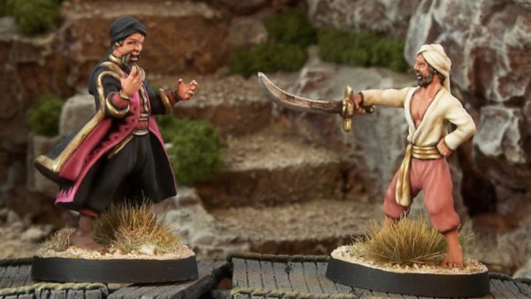
Crooked Dice Gives New Home To Sinbad Range For 7TV Fantasy


1
Spectre Miniatures Reveal Limited Remembrance Diorama

3
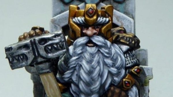
Add Macrocosm’s Mighty 28mm Dwarven King To Your Throng

6
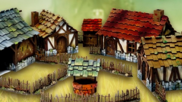
Explore Kromlech’s Ace New Fantasy Realms Terrain Range


6
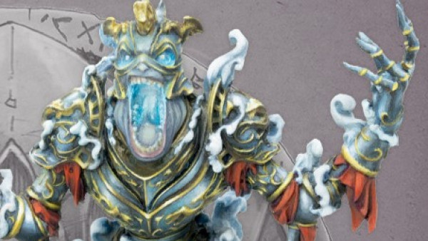
Pre-Orders Live For Studio Tomahawk’s SAGA: Age Of Chivalry

6
Moonstone’s Second Wave Of The Shades Up For Pre-Order


2
Back Great Escape’s Plastic Mounted Gunfighter’s Kickstarter


1
Hunt Down MegaBeasts With Infinity’s December Previews


2
Warlord’s Vanguard: Normandy Board Game Kickstarter Live!

3
Add Grizzled Veteran Miniatures To Your Growing Warcrow Armies

6
Get A Sneak Peek Inside Midgard Heroic Battles’ Rulebook!

0
Check Out Loke BattleMats Ace New Cyberpunk RED Sets!

4
Warp Celebrate Gnomevember With The Mousehold Cavalry!
News, Rumours & General Discussion
News, Rumours & General Discussion
3D Printing for Tabletop Gaming
Technical Support
News, Rumours & General Discussion
Painting in Tabletop Gaming
COG – Trading Bazaar
Painting in Tabletop Gaming
Terrain & Scenery in Tabletop Gaming
News, Rumours & General Discussion
News, Rumours & General Discussion
News, Rumours & General Discussion
3D Printing for Tabletop Gaming
News, Rumours & General Discussion
COG – Trading Bazaar
News, Rumours & General Discussion
News, Rumours & General Discussion
News, Rumours & General Discussion
COG – Trading Bazaar
News, Rumours & General Discussion
Copyright © 2024 Beasts of War Ltd.
All trademarks and images are copyright of their respective owners.


