Home › Forums › Technical Support › Can we have the old layout back please?
This topic contains 18 replies, has 10 voices, and was last updated by ![]() somegeezer 3 years, 12 months ago.
somegeezer 3 years, 12 months ago.
-
AuthorPosts
-
January 22, 2021 at 10:27 pm #1599263
My trusty old laptop, that’s served me well for many years (and continues to do so, thanks to it’s amazing battery life, even after all this time) has a screen resolution of 1366 x 768.
My dual-boot Chui12 tablet, runs both Windows and Android runs a higher resolution, and I have a twin-monitor PC (I think the monitors are 2560 x 1080) but on all three machines, I’ve noticed a really annoying problem with the last few videos…
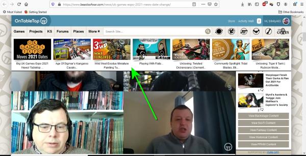
I don’t know when it started happening, but this menu, at the top of the screen, that used to scroll when you went down the page, is now permanently stuck to the top of the page. It makes viewing videos a horrible experience (I have a twin-monitor set up in my workshop and it still happens on this, and almost any display with a widescreen layout – pretty much every screen in my house except my wife’s PC (hell, I even tried it on a Raspberry Pi on my 50″ LCD TV) – suffers from a similar problem. And I don’t want to get into an argument with her over who gets control over her PC on a Sunday morning!).
The only way I can see the entire video onscreen (without going into full-screen mode) is to resize my browser window to “silly-small” (or watch it in portrait mode on my phone).
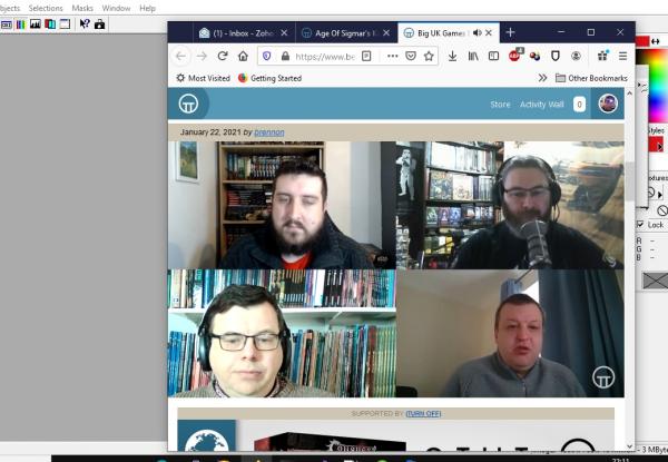
Is it possible to “unpin” these little icons again, or have some kind of button to click to make the video width/height ratio different for wide screen/smaller displays? Thanks!
January 22, 2021 at 10:36 pm #1599275The annoying bar at the top doesn’t quite appear to stay over the top of everything on a scrolling web page.
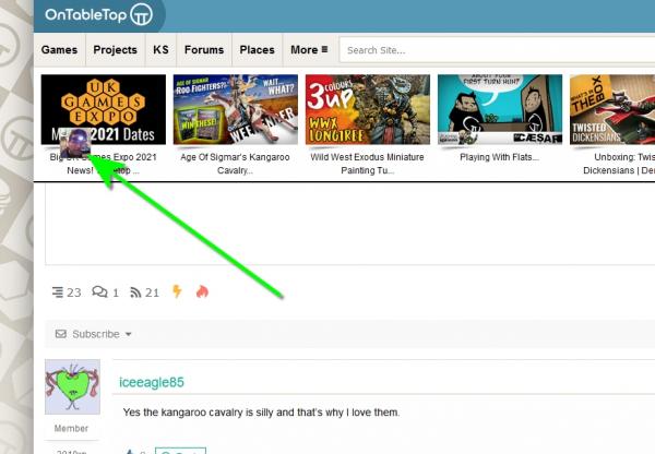
On any page with a comments section, this disembodied head floats about as I scroll up and down too.
 January 23, 2021 at 6:48 am #1599306
I cannot agree with this enough. The ribbons and toolbars on the site take up 40-45% of my laptop screen. This makes it difficult to look at the entirety of pictures or even to read the text which is referring to the pictures at the same time without scrolling up and down repeatedly.
January 23, 2021 at 8:55 am #1599307If you hover on the videos, you should get extra options that allow you to make the video full screen. It looks like four arrows pointing to the corners. That pops it out of the page and makes it much more like just watching tv. The button is there on both YouTube (front stage) and Vimeo (back stage) videos
January 23, 2021 at 9:19 am #1599308@carlospictor – I’m not a fan of full-screen video. Especially not on my twin-monitor set-up. It kind of negates the whole point of having an operating system called Windows for one. On hi-res monitors, it’s ugly (my ‘net connection in my end-of-garden workshop isn’t all that, so I sometimes run videos at 720p to prevent buffering – these look awful full screen). Sometimes I like to click about on other tabs/windows while the guys are in discussion mode, then return when they’re showing stuff to camera.
In short, I don’t want to have to “hack” the way I use my computer in order to watch the videos.
January 23, 2021 at 9:27 am #1599309This happened after the blue Monday stream layout was removed… I have been annoyed by it as well. Locking in screen real-estate is bad design IMHO. Especially if it block such a high percentage on the majority of screens.
If you look at https://store.steampowered.com/hwsurvey you can see that more then 2/3 of all people still use a resolution of 1080p and less. Please unhinge the videobar again. Thank you.
January 23, 2021 at 9:34 am #1599311Even on my tablet when you bring up the screen keyboard and try and type you can see about 2 lines where you can see the text between the thumbnails and the screen keyboard
January 23, 2021 at 11:51 am #1599338+1. I can’t see the whole video and full screen is suboptimal for me
January 23, 2021 at 11:56 am #1599339Understood, just trying to offer an option. On my twin monitor set-up I like having full screen video and still being able to do whatever I want on the second screen. YMMV
January 23, 2021 at 1:19 pm #1599366I think they have went down the discord rout which is a pain at times as you can only see the three sections when you have table’s on cinematic/horizontal mode?
January 23, 2021 at 1:23 pm #1599367The problem with full screen mode is you can’t comment to COGz as you watch the video.
January 23, 2021 at 1:38 pm #1599369I think it’s a glitch in one of lines of programme as the top bar moves up for the new paint video John put up yesterday.
January 23, 2021 at 4:00 pm #1599394+1 to everything being complained about.
I don’t like it from a commenting point of view as well.
I haven’t tried it, but I would imagine replying to a comment on a news/video article would be a pain as well.January 23, 2021 at 7:16 pm #1599457January 23, 2021 at 9:28 pm #1599495 -
AuthorPosts
You must be logged in to reply to this topic.


![TerrainFest 2024! Build Terrain With OnTableTop & Win A £300 Prize [Extended!]](https://images.beastsofwar.com/2024/10/TerrainFEST-2024-Social-Media-Post-Square-225-127.jpg)


