The Creative Process Of Raging Heroes
March 26, 2020 by ludicryan
It can often feel that with the amount of miniatures releasing every year that there is some sort of wizardry that conjures them from the earth. But I have it on good authority that this is not the case!
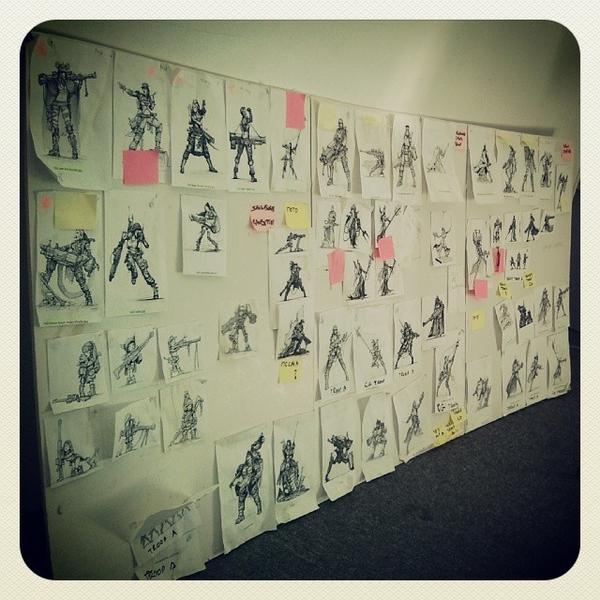
The folks at Raging Heroes have a distinctive style about their miniatures and the work that goes into each one is staggering. In the video above art director Benoit Guerville talks about the creative process that goes into each miniature from idea to concept art to mood board and beyond.
We followed up with Benoit on a couple of questions that arose from learning about their creative process: mainly on how they explore those contrasting themes that add dimension to their miniatures and how to build that creative vision.
Ryan - You talk about adding dimension to each model through contrasting themes. How do you arrive on these themes or concepts? What have been some of the most challenging oppositions to represent in a model?
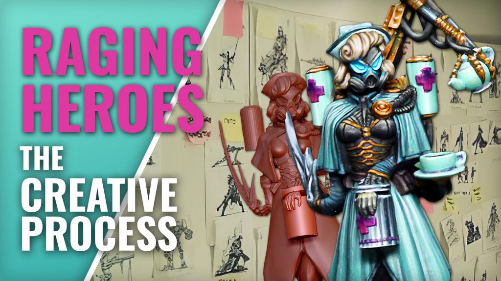
Benoit - Usually, one of those themes is here already to begin. We have one to start from, and then we try to bring contrast to it. The thing is to try to make that contrast not too obvious. If it can be somewhat subtle it is even more interesting, like with Dr Von X for example. This idea of having a dark character making clinical experiments is very dark and we didn't want her to be too dark. So we wanted to bring something really at the opposite of this dark character, in a funny way. That’s how we came up with this idea of the old lady who could be your grandmother, like if your granny was some sort of unrealistic nazi doctor. This way, even if part of the character is really dark, we get something that is not too heavy, too real or serious.
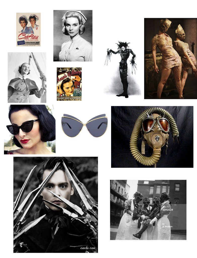
With all this in mind, we started with references to the forties and fifties, like the way her hair looks, how she stands: it was a reference to a time past. And you don’t know her age, because of her mask, but she looks like someone who could be your grandmother, or a younger person but from an ancient time, where people would have a different attitude. The teapot was a great way to express that even more, to push the "granny" idea a little bit further.
So it didn’t come all at once, it was many layers, many ideas.
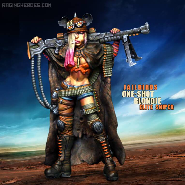
We had a similar approach with Blondie, the Jailbirds' sniper. Usually, the beautiful blonde girl is not the one you imagine as a cold blood, killer. That was the fun concept to start from. Blondie is based on building layers of contrasts: she’s the blonde girl, but she looks like a tom boy. She’s a sniper, a killer, trained assassin, but she has these ears on her helmet making her look like Mickey Mouse. It actually took a long time to find the element that would give her a funny look even if she was a deadly assassin, but when I found the customised helmet idea, we knew we had her.
When you think about the beautiful girl stereotype, you can very easily imagine her posing and looking sexy, but instead she’s looking at you with that blasé attitude, she doesn’t give a shit and it makes her look cool.
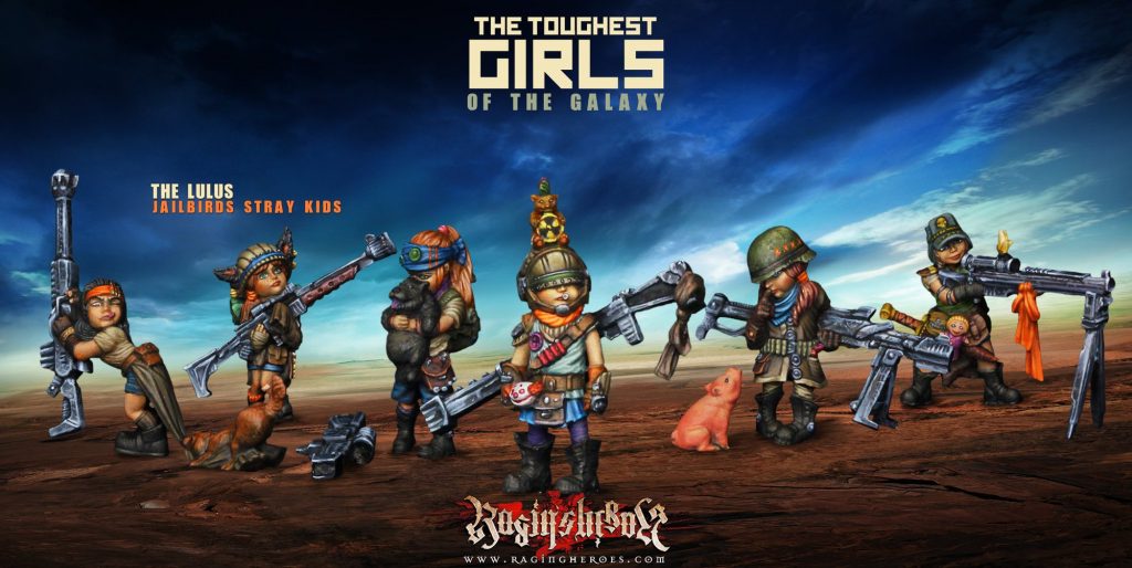
And then when we started working on other characters for the Jailbirds, we though about her possible connection with the Lulus, the Jailbirds stray kids! We thought it would be very funny to have a character that is such a loner and a badass who never smiles, to be the mascot of these little kids. The children love her, like little puppies do when they have decided that they love you, no matter how you react to them. They are a great way to show that behind her stone cold attitude, she is a nice person and the children feel that and instinctively go to her, even if she tries to act like she doesn't care. So because of that she becomes an even more lovable character.
We layered many things like that. Things all along the conception of the character and her backstory.
That’s how we work with contrast: we always have one starting point, and then we think about how we can balance it with an opposite concept and how we can build on it. This helps creating characters that are not too obvious and that have some depth to them and this way they become more attractive.
R - One of the most important things you mention is how even the simplest details can take days of hard work: an idea doesn't arrive fully formed on the page. In your experience, how have you developed the tools to take the creative vision from your mind onto the final project?
B - Obviously, it’s a long process. You develop your own vision throughout years of experience and training and looking at other people’s work and stuff like that. I have a very personal theory on all this, I’m even working on a book that maybe I will publish someday on how I work on those things. To me it relies on a few key principles:
1 – Your own personal culture: I’m always looking for references in all the areas of human creative work, whether it would be traditional art like old paintings, or pop art, or architecture of stuff like that. Anything that I can lay my eyes on, and I go on Pinterest to save stuff for later when I’ll be working on it. And at the same time that I’m working on this, it trains my brain to find ideas, to find new concepts, because people come up all the time with new ideas, so I try to get inspiration from that, to build on top of it. That’s the main thing.
2 – Developing your own vision: what do I want this universe of the Toughest Girls of the Galaxy to be about? Like I said previously, it’s a mix of fun and dark things. I try to mix stereotypes from the Pop culture with many other influences to bring a new light to stuff you've seen thousand times, to come up something a bit different. I know it may sounds a bit abstract like this, but I always try to find the mood and feel of what I want to express. Then I build on that.
3 – Visual Grammar and Vocabulary: I'm always focusing on these concepts: what does a colour express? What does a shape suggest? What does a composition mean? Yes, each colour, each shape evokes something different! For example, pointy shapes will create an aggressive sensation and round shapes remind us of softness. Something making “S” shapes is unconsciously linked to slithering snakes, something dangerous and sneaky. I heavily rely on that kind of stuff. It is at the same time simple and extremely rich and deep.
4 – My own approach to structure the composition: like I showed in the video, we build visual compositions around geometric shapes to structure the silhouette of the character and to fine tune the pose. It’s very important to me, it gives a scaffolding on which I will lay everything once I have started to work on the character.
This is the process I have developed through the years. Of course we all work with the inspiration of the moment and what comes to our mind. But this approach is always used to guide what comes out of our imagination and to try and extract the most of each idea and character.
Thanks to Benoit for the insight into his creative process. Let us know what you think down below!
Supported by (Turn Off)
Supported by (Turn Off)
Supported by (Turn Off)





























nice that was intresting little video thankg guys
I love the quality of his figures a great video.
This was great ! more please ! I very value Raging heroes and have a lots of their products