Celestial Painting Competition Update – Judge’s Comments!
June 11, 2018 by brennon
We stop in with the judges that were picked by Beasts Of War to give their thoughts on the work by the artists who are taking part in the Celestial Painting Competition which is running this month.
We have a range of judges commenting on the work throughout the competition but for today we're back with an interview about things are going so far!
Special Note From The Judges: All of these pieces have been created by some amazingly talented artists and so we may need to be more critical in our approach than we would normally be. Keep that in mind as you observe our criticism.
Sergio Calvo Rubio - Nuwa
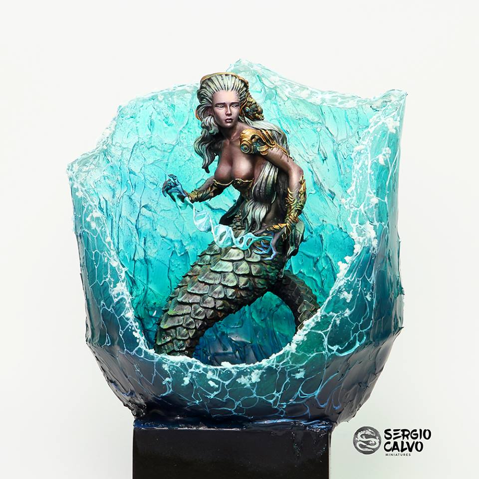
Dave: It’s wonderful to see this piece complete. Sergio’s piece has a wonderful subtlety to it, initially appearing to be pretty straightforward, but loaded with details on longer inspection. The wonderful basing gives the feeling of both a powerful wave and a shattered goblet, presenting sharp edges in great contrast to the smooth skin.
Tomas: Sergio’s piece really came together in the end. It was difficult to see what he had in mind when looking at the progress picture, but once you see how the figure is framed by that wave, it really looks great. The colours blend so nicely, making it look like there’s light shining through the water, casting highlights on her body and hair.
This for me is a really subtle piece, beautiful in its simplicity. And that’s where the danger lies. The main question is whether this beauty holds up against the wild creations that some of the other painters have created.
Ruben: From the beginning, we could see where Sergio wanted to take the figure. True to his style, which consists of sketching everything very quickly and seeing a result of what the piece will be almost from the beginning. Then it forces to have to debug and render all the finishes. In Sergio's piece I miss something more of that cleaning part since, in the case of his Nuwa, I do not see the same quality as in other previous works. I think the weakest point is the expression of the face and in particular the lips, which I personally think do not have the right outline that would have given a more natural expression.
Although the figure has a good contrast and a good intonation of colours, making the colours work perfectly with each other, but I think that with the tone so intense of the base makes you miss this. It would have been nice to add more bluish shades in Nuwa's shadows and even some reflections to make it better integrate both parts of the piece. As a summary, I can say, that in any case is a figure solved very effectively with a very good quality of paint, but that is competing with the base for attention.
Romain: Unlike Ruben, it was very difficult for me to see where this was going…the painting had been conventional, with blue-green lighting in odd places, albeit very well done. Now that the piece and base are done, I’m afraid this very simple cradle of water hides most of the piece. Is that the purpose of it?
I am left wondering. It’s lovely, but water in a resin is notoriously difficult to do, and the general shape of it is, in my opinion, a failure… at least on pictures. It looks like a broken vase, in places. The miniature itself is stunning, and I’m sold on the metals and the source lighting (although it couldn’t have hurt to put a little more nuances on the skin and face, with such a vivid and overwhelming base), but it is mostly hidden from view by the very obtrusive wave. All in all incredible… but one has to compare it to the other contestants, and this simply may not be as spectacular, or even as good as some of his previous work. But we’ll see. Was it time constraints?
Chris: I have to admit, like Romain, I wasn’t too sure where this model was going, and the scheme and style seemed not as adventurous as the other entries. I’m on the fence with the basing. I think it is perhaps one of those cases where you see the model at all angles and how the light through the resin casts colour and shadow upon it.
At the same time, I think the colour of the base is very intense and is a distraction to the model. I’m not overly keen on the colour of the scales, which seem to get lost in the resin water effect. Likewise, the flesh, while well rendered, lacks a hint of warmth to stand out a little more from the base, and while the helix is a neat touch, it utterly lost by the choice of colour.
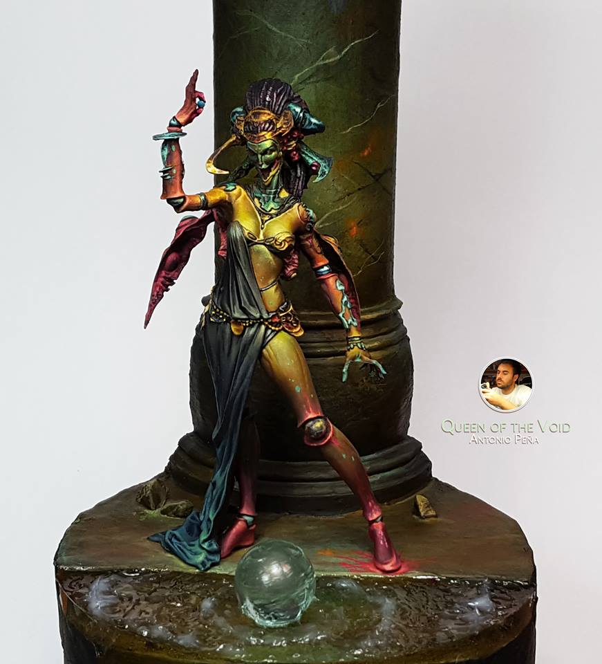
Antonio Pena Jiminez - Queen Of The Void
Dave: Antonio has done some surprising things in his completion if this piece. Initially, I was quite drawn to his vibrant yellows, and now I’m still loving them as well as being intrigued by the way he has muted to lower leg of the Queen of the Void. Bringing in the desaturated tones and darkening the piece on the extremities really forces the eyes up to the centre of the model. I love the depth and detail, but I feel the focal point is the chest, and not the face as I had hoped.
Tomas: This has turned out to be an amazing piece. I love the overall colour palette and the way he has used lots of interesting colours, while still maintaining an overall look to the model. Antonio has given his queen a lot of character, which I like. I do miss a bit of story and coherence in the overall composition though. The ball on the water, the column, the splash of red under her left foot. It feels like he is trying to tell a story, but I am just not getting it.
Ruben: From the scene of Antonio, without a doubt, I am left with the painting of the figure. A risky bet for the desaturated tones that he has chosen but that compensates perfectly with the yellow of the skin as the main thread of the whole. I really like that dark green for the face, because it manages to attract attention there by including a colour that is only found in that part of the scene.
Technically I think it is a figure that can be further detailed since we can see that part of the detail of the metal ornamentations has been lost a bit. To comment aside the base is necessary since I believe that it does not have the same work and finishes that the figure, a reason why it does that the scene is not at all natural. The texture of marble could be more achieved and the inclusion of the sphere I think it would have been more successful having painted it with paint and making it a transparent or luminescent effect. Keep in mind that when in a scene where everything is simulated with paint (lights, shadows, reflections, etc.) the eye detects and notes as strange the presence of other materials and finishes.
I also think that a composition more diagonal, placing the column a little more to the right and the sphere a little more to the left would have been better, but what I like is the history and the mysticism that follows from seeing the scene, both by the result of the colors chosen and the construction of the decoration.
Romain: Saying which Queen of the Void is the best is incredibly difficult. While others are clearly sci-fi, this one could be Fantasy. The atmosphere is completely different, and the colours are acidic and extraordinarily bold. I am not above saying this shows brush strokes on purpose, in this case…I think that’s where the artist was going. It is reminiscent of old Fantasy book covers. I really like it… I think it takes the will of an artist to refrain from pure technique like that and provide a balanced piece. But of course, I agree that lighting and integrating the piece to the base could have been done better.
Chris: When I last commented on this, we had the start of the different yellow to red tones. Was it metal, ceramic, stone, glass? Now in this final form, we have a striking figure. The spatter of greens and reds give the sense of oxidization. Is this molten metal flesh perhaps? What I don’t feel works as well is the face. At certain angles, the mirror skin effect looks fantastic, but also, unfortunately, along with the cloth, blends in too much with the pillar. Furthermore, the details on the pillar, the strands of colour to give the sense of marble, doesn’t feel as well finished as the rest of the model.
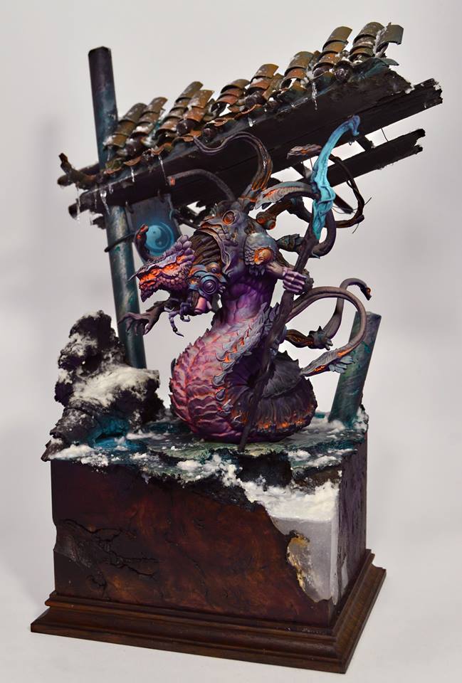
Diego Estaban Perez - X’hydral
Dave: From the start, I have loved the work Diego has done on X’hydral’s “skin”, wonderful combinations of colour and tone. The internal orange glow works incredibly well and is only enhanced by his choice of base. While Diego isn’t the only one to have created an architectural scene for his entry, his structure gives me a great sense of the world X’hydral lives in.
Tomas: I love the base and the scene Diego has set. It oozes character. It oozes story. I love the glowing skin on the model. It makes him look like a being from another world. I just don’t know if the base and the model really fits together. Although the colours Diego has used on his model are nicely coming back in the palette of his base, I’m missing a bit of cold on the model. Not sure how to put this, but the weather doesn’t seem to affect the character walking around in this oriental wonderland. I think putting some snow or colder colours on the carapace might have made an even bigger contrast with the glowing skin, which would have been brilliant.
Ruben: In the case of Diego I have to highlight the work he has done with the base. He is one of the best doing this and here he has shown it again. With the base transports the miniature to an environment where imagination can begin to generate a story. In addition, the composition is perfect, both because of the size and the diagonal lines that are generated, making the scene very dynamic.
In what refers to the painting, is where the weakest part of the piece is. Everything needs more definition work and sharpening. This allows us to see the sharpest figure by the eye, in addition to better recognize the volumes and better appreciate the differences between the different materials. Notice, for example, that metals are usually differentiated from other parts by those more intense, characteristic sparkles.
This is fundamental in terms of painting miniatures is concerned, since, given the small scale to which they are sculpted, it is necessary to facilitate the eye the distinction of all the volumes that make up the figure. As for the colour part, all tones are very well chosen and combined. In short, a great figure and scene, which lacks a finishing punch.
Romain: Nailed it… in part. This is quality work, with some anime influence that wasn’t apparent earlier. The oblique composition of the base goes well with the figure and gives it more dynamism. On the miniature itself, nothing much has been added besides subtle highlights… I love it, but considering the time spent and the quality of the miniature, I expected more detailing rather than lighting and texturing. I’m looking at the eyes and sceptre, and some of the armour details, and thinking: “is this finished ?” and while this is great work, it’s not something one should perhaps think while looking at it.
Chris: Tomas I think points out immediately what I was thinking - the model seems to sit, not inhabit, this winter scene. I feel as if the metal surfaces should have a sense of frost growing upon them. Around the eyes, or the eye itself, there could be further details added. We get the sense of warmth or some internal glow. But is just a glow. Not the searching eyes of this strange creature. I also feel that the conduits and tubes of the neck could be enhanced with some glistening, slick oil, to differentiate between the flesh and metals and joints.
Fabrizio Russo - Queen Of The Void
Dave: From the early days of the cracked ceramic look on the legs of the Queen of the Void through to his finished piece, Fabrizio has really worked to show two possible sides to the character - Power and Fragility. This Queen has seemingly just plucked the essence from a defeated Zhurong, and energy now surges around her. It think it looks wonderful, and am only concerned about the strange posing of the Zhurong model on the base.
Tomas: I have been in total awe of this piece from the beginning and Fabrizio has kept going from strength to strength, surprising me all along the way. This is by far the biggest, boldest piece of them all. I love the composition, I love the splash of colours.
I love how the model keeps surprising if you look longer at it (the textures on the skin, on the bubbles, on the base). The only danger here is that it might be too much in the end. Fabrizio used a lot of colours, effects and techniques, which might clash for some people.
Ruben: The scene of Rusto has everything. Great level of painting, the composition of the scene with some transformation of the figures involved and tells a story. The chosen colour scheme is quite pleasant, since it combines clear and desaturated tones for most of the elements, to then strike a stroke of colour in the centre of the scene, and also compensates in certain places with those blues, which make everything is balanced.
He has also played with different effects such as the cracking of the skin and the substance of the green space that give a lot of variety and makes the viewer have places to focus attention. A very complete and beautiful work, which I personally think would have gained more having paid more attention to make a cleaner finish, especially for the closest views, and having made a darker base to highlight the role of The Queen of the Void and of his poor victim.
Romain: This one has been done for a while, and it’s been more than expected on all counts. The textures, the trompe-l’oeil, the extravagant base, the conversion, the lights, the glazes, composition, balance… it’s all there, and the piece also tells a great story! I am disappointed at the view from the back of the base, but otherwise, it’s a very strong contender. I feel as if I don’t have any more to say about it, because it’s been “done” for a while now… and that’s probably wrong because it deserves praise!
Chris: Stunning. The cracked, china like skin, the dramatic sweep of colour, the base which gives a sense of ages gone. It all works together, no one thing overpowering the other, yet together telling a story. The choice to gloss varnish the joints is a nice little touch to further enhance the sense of different textures. If there was something that just doesn’t pop, or feels lost, it is the metallics that make up the headdress. From more angles, these sections seem rather flat compared to the more dramatic lighting effects that Fabrizio has suggested. However, this is a good contender for the top spot.
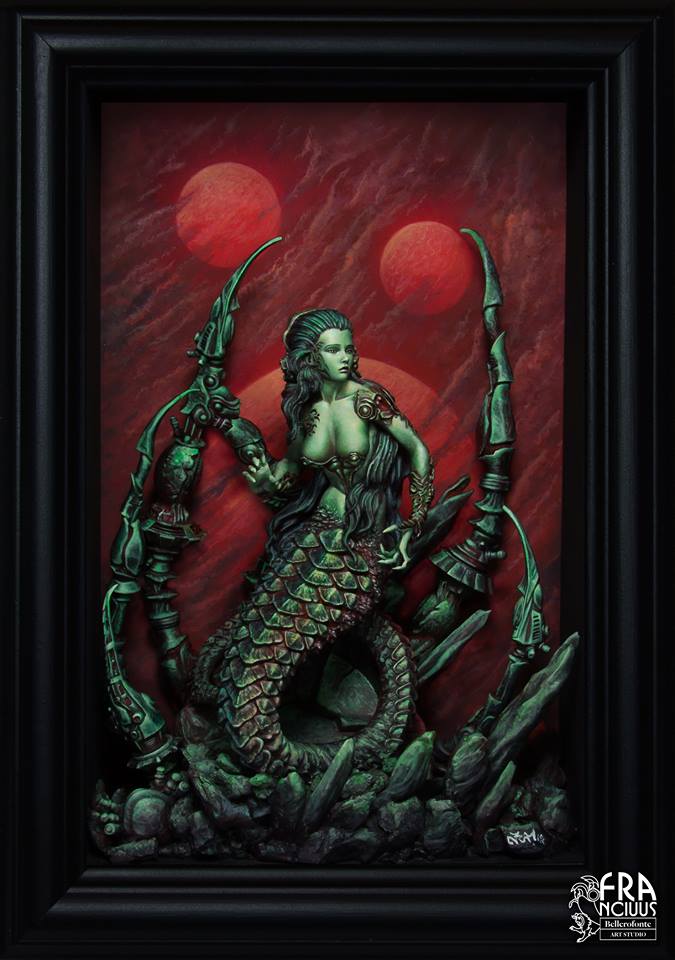
Francesco Farabi - Nuwa
Dave: It is great to see Francesco’s finished piece! For a little while there I was worried we were only going to see the spectacular basing. Francesco’s choice to present what is essentially a monochrome Nuwa is really bold, yet his framing (and composition of that frame) have really backed it all up. There is no doubt we should be looking at Nuwa’ face which has a real look of innocent desperation.
Tomas: I love the idea Francesco had for this piece. The little frame with a model in there is great. I’m afraid I feel a bit let down by the execution, though. I think it is due to the very limited palette that he has given himself. It’s all red or green, there’s nothing in between. It results in a picture where you see everything at first glance. There is nothing left to discover. No interesting colours, no little details. And that’s a real pity, I think.
Ruben: Nuwa of Francesco is one of the most balanced pieces of the contest, in the sense that it has a great painting technique, an interesting colour scheme and a careful composition. This is good because it has no failures, but no strengths that surprise me.
Technically, the definition of the detail and the volumetrics of the figure are very well taken care of. Soft transitions and definitions that always work and please the eye. The colour scheme is a basic set of complementary colours, which always works, but in this sense, I think I could have risked more, including even more red reflections of the backlight on Nuwa, to achieve a better integration of the whole.
As for the background of the scene, I think it has a degree of detail that does not make sense with something that is supposed to be far away on the scene. The backgrounds should be more blurred, to represent the depth that the scene should have. Personally, I think the clouds do not benefit the final result, and something else simpler and blurred would have been enough. But in any case, it is a great figure, resolved very accurately.
Romain: Classical beauty in a gorgeous frame. It’s all perfectly done, but the colour scheme is also classical and there’s nothing extraordinarily bold about the whole thing… as opposed to what some other contestants have done. It does seem a little monotonous. Technically one of the best (if not THE best) with flawless composition and mood, though. Will this study in green and red be enough?
Chris: It looks fantastic as if it were the cover of a comic book or movie poster. The background gives an impression of an alien world that this character inhabits. And while the use of just greens and reds for shading and highlights is executed with an amazing level of skill, beyond looking at the face and upper torso, the rest of the miniature feels like an afterthought, with the snake tail being lost against the ground and background features. The more I look, the more the suns in the background and the clouds make less sense. The feeling of distance is not present. Overall compared to other entries, while showing a great level of skill, it lacks the wow factor I was expecting.
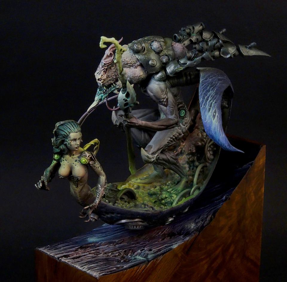
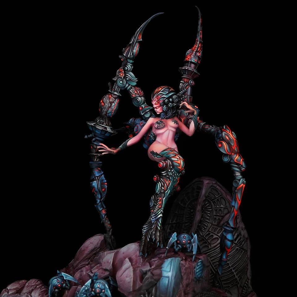
Massimiliano Richiero - G'gong
Dave: I think, for me, this entry is the one that pushes the boundaries the most. The fairly simple wave-style base help to create a wonderfully dynamic impression, and the strange “flying carpet” made of parts from what looks like the Nuwa and Zhurong models really amps up the creepy feel of the G’gong model. Massimiliano is obviously an incredibly talented painter, and it is his compositional skills that really take his work to another level.
Tomas: I love how this has come together. Massimiliano really has made a striking figure, that looks like he is surfing through a void. The cyborg lady on his sledge strangely makes G'gong even more inhuman, which I absolutely love. I do want to see more angles of this model, though. I can’t quite get my head around the colours. The green of the sledge seems to be glowing, but not enough to reach the body of G’gong. The red on the back of the sled, the purple on his face. I think I have difficulty reading the palette, but I hope that comes from only seeing one angle.
Romain: Bold. Very bold. I would have liked to see a LOT more of it before it was finished. As it is, I can’t see a lot of the details I’d like to see. I think the cyborg lady sledge is…too much, and out of proportion for that kind of composition. But points for daring!
Chris: Well let’s take a creepy dude, and make him creepier by adding on one of the other models. The plinth as a wave looks great and gives such a wonderful impression of motion to this organo-cyber surfboard. So many little hints of colour, be they the glowing greens on the woman, the dappled spots on her arms and chest, the pattern on the tail of the board. What I find somewhat unfinished is the back of G’Gong. The metallics look rather dull. I get the sense of the colours taking us on an arc, leading the eye from the woman, round the board, and up to his face. But that path feels broken by the metallics.
Ruben: He finally got it finished! This was a huge figure and also added the torso of Nuwa. The main problem with this approach is that it has a huge amount of work, and I say it from my own experience! G'gong is large and has a similar amount of detail to other much smaller figures, so it requires a lot of patience and technique to leave a good result.
Although the figure of Massimiliano has been pretty, and I especially like how the part of the head of the creature has solved, the rest seems to me that it is not finished at the same level. The metal parts seem simple to me and the part inside the hovercraft seems to have a few washes without more. In this sense, the staff is what seems most linear, has some gradients from dark to light but has not highlighted the detail. In summary, in what refers to the technical part, I think it needs more work in some parts, and it's a shame because the other parts are very good, but it leaves me wondering if Massimiliano is able to paint the head of G' gong in a great way, why has not he done it in the rest of the figure?
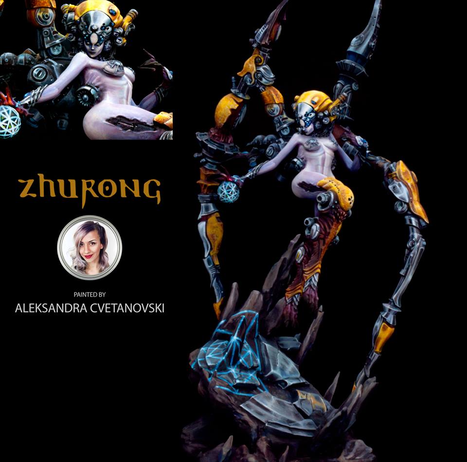
Aleksandra Cvetanovski - Zhurong
Dave: I’m a big admirer of Aleksandra’s differentiation of textures on this piece. Each item is treated individually, and her stunning color choices do a great job of bringing the eye to the focal point of the face of Zhurong. Aleksandra has decided to go for a more simple style base, but this helps the story she has created with the power orb in Zhurong’s right hand which is projected onto the scorched earth.
Tomas: Aleksandra really pulled this off. I was a bit afraid of all the stark colors at first, but when I see the finished piece, it all really came together. I love the composition. Especially how she managed to produce a counterpoint to Zhurong by putting the glowing lines on the base. It works on so many levels and immediately puts the miniature in the middle of a little story. As with Sergio’s entry, though, the question is whether this will be enough to stand up to the fussilade of textures and techniques that some other painters have gone for.
Romain: Aleksandra has been one of the strongest contenders here since the beginning. While she hasn’t shown much progress, what she has shown has been gorgeous. The finished piece in its cradle manages to exploit the natural dynamism of the figure without an overly complicated diorama, all with source lighting, painting and trompe l’oeil… a technical masterpiece, where others have chosen to sculpt, convert and model their way to narration and mood. Aleksandra’s figure doesn’t have that fancy a base, and doesn’t need one to remain in my personal favorites.
Chris: Aleksandra’s NMM is always something I will be in awe of. She is never afraid of playing with the contrasts and the reflections, to really give the sense that these are polished surfaces, or in some way corroded. What is also clear is that from each angle, you get to enjoy the model unadulterated. There is nothing confusing the eye sat behind the figure, and the choice of colours and shading has helped frame the central body. She just sits and floats there.
Ruben: She has created a very solid figure for a contest. From the beginning, she has been clear and opted to perform a very technical work, but not be cold to the viewer. The final result is a very well worked figure, with a nice and striking color scheme, where the yellows, being intense, are not the protagonists, because the skin has the adequate clarity.
In addition to all this, she has included small details to give even more interest to the scene, through small reflections in the metals of the elements that surround them, to get more the chrome effect, and the inclusion of the light effect of the orb that gives a more personal character to her version of Zhurong. It is true that she could have risked more with these effects making them more evident, and also have included other colors to the scene through tones to have more chromatic variety, which is always pleasing to the viewer, but in any case, his entry is one of the which I think is more solid for the contest.
Ben Komets - Twilight
Dave: It is an incredible shame that Ben suffered a hand injury, and I’m glad he is on the mend. Ben was definitely on the way to a masterful piece with his rendition of Twilight. Even unfinished you can admire things like his tonal composition, and the focus of the miniature. Great work, and speedy recovery, Ben.
Tomas: Man, this really sucks. I hope your hand gets better really soon, Ben. I hope you find the time to complete this miniature in time, because what you have shown here is really great and the start of a really beautiful model. I love how all the colors work together. How the blues of her armor come back in the shadows on her legs. How the pinks of the eyes on her head come back on the wounds on her legs. Really gorgeous work.
Romain: Excellentissimo! As I said, Ben Komets is here to prove that he has nothing to prove, and succeeds. I’d have loved to see more step by step from him… this looks like the finished product. All those nuances, and suddenly, those eyes on a sassy monster of a woman…I’m eager to see more, frankly. But as I understand it, he’s been injured and hasn’t been able to publish and paint as he wanted. It’s terrible for him, even though it adds a twist to the competition.
Chris: Such a dire shame, because Ben was clearly in the process of painting a superb model, and it is one that has not been tackled by anyone else in the competition. Look at those eyeballs! Or the gills. Those rosy cheeks. All we can hope for is Ben recovers fully and can finish this gem off.
Ruben: Little can be said about Ben's piece due to the circumstances that have accompanied him. Just wait for him to recover and if he can, he will finish his version for the contest as he had planned, as it would be a shame not to see it. Cheer Ben!
Sergey Chasnyk - Zhurong
Dave: Sergey has really built on the great detail work he started the project with, and has brilliantly contrasted the smooth skin with the detailed mechanical elements of Zhurong. In the second week of comments, I was wondering if Sergey would give us a strong focal point for the model. He has certainly brought that in spades.
Tomas: This is a really difficult one for me. I love the evil cybernetic creature that Sergey has made here. It oozes atmosphere. It oozes alien menace and I love it. I love the freehand work on the helmet and on the armor plates.
I love the subtle contrasts with the greens and blues on the black armor. The only thing is: I get the feeling that Sergey changed his style on the freehand style on his armor plates during the project. It feels like he was forced to do this due to the time constraints, and that is a pity. Like I said: this is a difficult one for me. I love what Sergey has done to this model, but can’t shake the feeling that he might have done so much more if he'd had some more time.
Romain: I’m a fan of the technique and of the level of detail… I love the mood and the inner light, and I love the expertise and virtuosity deployed here. Aaaaand…I don’t really like the end result. I think the skin itself simply looks fake, much too pink, and the overall impression is all the worse for it. I also don’t think it goes with such an earthy base. The base is huge, but I feel it only detracts from the whole thing, especially since the lighting and metals (while beautifully done) aren’t consistent throughout.
The figure simply feels like an exterior element just placed on that base. A lot of elements in this project, on the figure or otherwise, don’t fit together. Is it because of time constraints, lack of ideas, having to do a step-by-step, or changing plans mid-project ? I honestly couldn’t say, but since this was part of the contest, does it matter ?
Chris: It’s a fantastic finished piece. And the alterations Sergey made to get the focus on the face rather than that knee have worked. There is still the danger of it feel busy with the hard black line work, almost as if it were cell shaded. I love the sense of warmth, of energy, emitting from the armour and the eyes, and the skin, I think I know what Romain is saying, but I would counter that I like that the skin does seem synthetic, but to enhance that manufactured feeling, some sort of dirt or other more natural element could have been used, and these better connect the model to the base. Perhaps where the skin on the leg is torn open?
Ruben: The figure of Sergey has surprised me a lot in his final result. It is a piece of the most technical presented here, not only because it has a very high level of definition, but also because it has a multitude of freehands that make the miniatures even more spectacular. In the end, he has managed to integrate everything very well and it works as a whole to perfection, which was the most complicated part that he had to solve due to painting the pieces separately.
He has also added some bluish reflections in the shadows of the metals that look great on the figure, since it integrates with the base and adds chromatic richness to the color scheme. In addition, there is the base that accompanies the figure very well and creates a very good composition of the scene despite its size.
Mecion to part deserves the face. Simply spectacular.
The part that I like least and that demeans the rest, is the skin. Not for the color, but rather for the treatment of the volumetries that he has given to it. It has very marked shadows on the abdomen and under the ribs that make it quite unnatural. When we want to paint skin, we must bear in mind that it is a "material" with its own finish, and that it has a way of reflecting the lights other than a fabric, for example. When painting skins it is more natural to try to simulate those reflections in a way similar to when we try to paint an NMM, for example.
That does not stop it from being a great piece for the contest, of which I am convinced, it will make it difficult for the other competitors.
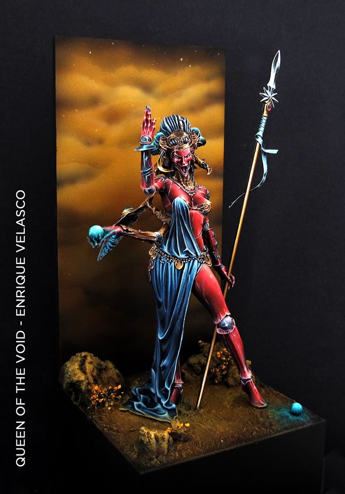
Enrique Velasco - Queen Of The Void
Dave: Enrique’s version of the Queen of the Void is simply spectacular. From his very first post, I was enamored by the red NMM Enrique was using on the primary armor plates. The rest of the model not only meets, but exceeds those first feelings of excitement I had about it. I also love Enrique’s use of the two orbs and the spear tip to frame everything within a triangle that constantly draws my attention around the model.
Tomas: This is a stunning model. I love the painting style. The stark Non-metallic metal, the bright colors, the contrast between it all. This is the way I wish I could paint my own miniatures (one day, I will get there, I’m sure). I would love to have an army of miniatures painted like this.
The thing is: I’m still wondering if I like this style in a display miniature. Much as I love contrasts that are instantly readable on the tabletop, I am wondering if I don’t prefer more subtle nuances in display miniatures. This is a hard one for me. It’s more a matter of style than it is of skill. How do you compare Rubens to Magritte?
Romain: Best use of red in that contest, by far. Love the scene, love the lighting, love the surreal and otherworldly feel of it all. Textures again, but so different from the other Queen of the Void… Less murderous and more regal. This is breaking completely with the idea that to be “display ready” you need to use broken tones and realistic nuances: I’m impressed ! It’s completely lifelike and yet very vivid ! I disagree about it being “readable on the tabletop”, I think it’s simply misunderstood…almost expressionistic !
Chris: Is there a bad angle to this model?! As I said in the early week, I knew this was not going to be ceramic or metallic skin. No, the final result is so crystalline. I love it! And the red is so beautifully shaded and highlighted to give the impression of crask and hard reflections. And this is important as the shading of the body versus the metals really shows that these are different materials. Coupled with the wonderfully detailed blue cloth, we have quite the feast for the eyes. The base and background are soft and never competing for our attention. Just wow. Can I paint like this please!
Ruben: Simply beautiful. Enrique has done it again, and as I said at the beginning, he has made an elegant and technically impressive scene that I'm sure will impress everyone who sees it, even if he does not know the world of miniatures. Believe me, do the test.
On the painting of the scene, highlight how well detailed the figure is and how colorful it is. I love how well it combines the three primary colors, turning them off just right so that everything fits. This is how many I have seen, the most risky color scheme and difficult to carry out.
As for the detail he has managed to draw, I think Enrique is a human printer! It is a pity that we can not see a close-up of the face because it promises to be impressive.
It is a matter of taste, since the miniatures resolved in a very technical way, there are times when the viewer can be cold, but in this case, I think that problem does not occur. While it is true that to solve this, it usually works to include more additional tones in some parts, which would help that everything is not only its own color and would also help make the scene even more interesting chromatically speaking.
I think Enrique's The Queen of the Void is a firm candidate to fight for the grand prize of the contest, but we must be attentive to how the rest of the contest develops and to be able to better appreciate the pieces of all these great contestants to finally know who of them is the winner!
Share Your Thoughts
So, that gives you some thoughts on the progress of the various painters right now. Make sure to get stuck into their group on Facebook HERE and tell the artists what you think of their work too as well as see the developments each week.
Which is your favourite project so far?
"Which is your favourite project so far?"
Supported by (Turn Off)
Supported by (Turn Off)
Supported by (Turn Off)



















![TerrainFest 2024 Begins! Build Terrain With OnTableTop & Win A £300 Prize! [Extended!]](https://images.beastsofwar.com/2024/10/TerrainFEST-2024-Social-Media-Post-Square-225-127.jpg)















just….. (jaw hits the floor) … amazing. This is art and for once it is art I like and could look at for hours.
Awesome plain and simple.
A M A Z ING! Some of the best I’ve seen.
wow, these are beautiful paint jobs 🙂 and the scenic bases are so creative, and really bring them to another level 🙂 worthy of galley exhibition 🙂
wow stunning paintwork on all the figures.
I really like what Ben was able to produce with an injured painting hand.
Astonishing work, and absolutely fascinating to read the criticisms from the judges too!
I think my jaw drop off got on a plane and left the country too get closer. WOW!!!!!!!!!!!!!!!!