Making & Designing Dropfleet Commander Stat Cards
December 7, 2016 by crew
A short while ago, I released onto the Dropfleet Commander Community Facebook Group a little side project I had been working on in a little of my free time since I received my Kickstarter pledge in the mail a week prior. I thought I would just release it to be helpful and contribute something useful, however small, into a community that has seen a fair amount of frustration waiting for deliveries.
The original aims of these cards were to provide an easier reference to stats than searching the rule book, to ease fleet building on-the-fly (before I found the wonderful dflist.com) and to help myself speed up learning the stats, almost like flashcards! Over time though my design was informed by recurring observations online that the admittedly pretty bases could be fiddly and hard to read.
After releasing them on the Dropfleet Commander Community Facebook Group, I expected them to be forgotten about quickly. Instead, it seemed the cards have turned out to be more successful than I had hoped, with some heartening responses, eager feedback and me being asked to write this short article about them, outlining the how, the why, and my experience making them
This guide is not a pure step-by-step, I don’t have the time to go through and detail everything I did in excruciating detail. I also believe that guiding principles are more valuable, “teach a man to fish”, and all that jazz! I really hope instead, I can encourage you to make your own accessories and find what works for you!
Accessories - The Forgotten Components
Accessories are, to me at least, a criminally disregarded component of our hobbies. From epic-scale wargames to simple board games; condition counters to character sheets. I feel that if you asked most players to list and describe the physical parts of their favourite games, they would spend the lion’s share of their response outlining the models, or board, and all the detail in those, and the paint jobs; but the smaller things, like stat sheets, counters, or trackers, would get at best, a mention.
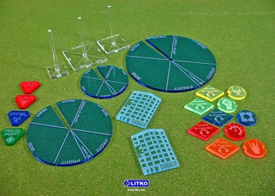
LITKO Gaming Tokens For Dropzone Commander
Maybe that’s not at all surprising but consider a miniature. I feel that well-designed game accessories are like mould line removal. A miniature with that step and without it can look almost the same. You can have perfectly serviceable game with either, and you may not even notice on the table…but your brain did. It’s the extra polish that gives a certain pride to having made your game the best it can be, and adds that subtle lustre to the joy of the game, and gives pride to our hobbies.
After all, there are no shortage of third-party accessories that are very popular, why not spend a little of your time to make something of your own, customised exactly how you like it, that’s a joy to use. Not to mention, it’s a lot cheaper!
Tools Of The Trade
Before we start, I have a confession to make. It’s not easy to admit, and you may lose what little respect for me and stop reading right here. Oh well, here goes…I made my star cards on the much-reviled and ridiculed Microsoft Publisher. It’s not an easy thing to admit, but there it is.
Y-you’re still here? OK then. In all seriousness, it’s important to remember that when you are making anything, you don’t need the fanciest tools to get good results, use what you are comfortable with and you’ll do fine. The only thing you must remember is to respect the limitations of your tools. You wouldn’t use a wash as a basecoat, so know what you can get away with.
I know that Publisher is terrible at any kind of fancy graphics, my cards will never be able to have the kind of polish Adobe could provide. I also don’t own an artist’s tablet, so I shouldn’t dream about hand drawn art either. However, I know what I like, and what my style is; and that is clean lines and bold, minimalist typography, something that Publisher can manage absolutely fine.
If you want to break out calligraphic pens, because you enjoy using them, or it fits the game, more power to you! Do what you want, so long as you understand what you can and can’t do, and work within those guidelines.
Inspiration - Starting From Somewhere
Let’s talk inspiration. Nothing is ever truly original, and everyone adapts or borrows from other works when they create. It’s just the way human creativity works. ‘But how does this relate to stat cards for a miniatures game’ I hear you ask? Well because these influences help form your design into something pleasing and functional. Ask yourself what similar items you like using, and what other systems and schemes you like the look of.
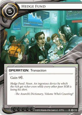
An example of a trading card, note the proportions of the elements used, the placement of the title bar, and the size of important information such as play cost (top-left)
I like to play this little card game called Netrunner. Like nearly all other successful card games it follows a few basic tenets of design that have been refined and imitated from years of experience. Why don’t we try and draw upon some of that?
First the size. There is a standard form factor shared by most CCGs (2 ½ x 3 ½ inches or 63.5 x 88 mm), it’s comfortable to hold, fits nicely into card sleeves (important if we wish to reuse them) and is of an unobtrusive size on a game table.
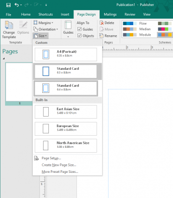
So, that’ll be the size of our cards: changing the page size is just a matter of setting a custom size in the ‘Page Design’ ribbon for me, so that’s one part down. Whilst we’re here we’ll also set a tasteful margin to provide an even frame around the card, and allow for a little leeway when cutting out, 5mm should be plenty.
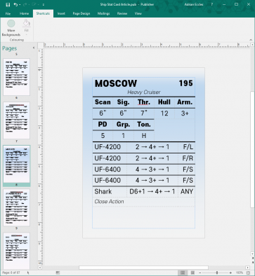
Next is the layout of the card. The name and any important stats have pride of place at the top. For my purposes, those are the Class, point values and broader class type. One of the main purposes of the cards was to have at-a-glance reference to stats with a minimum of fuss. For this reason, the title is the largest single component on the card: there’s no mistaking a Rio for a Madrid here!
Then, Artwork, something we can’t do due to our choice of tool. Thankfully, this isn’t a card game, so the cards themselves don’t have to ‘sell themselves’ as much, the ships are doing that!
The ‘text box’ is placed at the bottom. For our purposes, the text box is filled with the main event, the stats themselves. Unlike, a card game, there’s a lot more of these: split into the main stat bar, weapons stats and launch capability. The loss of a focal artwork means that the most important and consistent stats, the main stat bar, can be bolded and put in the art box’s place above the rest of the stats, which can roll out below.
Note: When using bold text and italics: always use font families. Just selecting bold in some fonts just means the computer ‘colours in’ around the letters, or skews the letter shapes in the same way. This is bad, the text looks subtly out of proportion and messy, and whilst you may not notice it: your brain will, it will just look off somehow.
The easy way to check if your font is properly configured for italics is to write a letter ‘a’ and italicise it, if it changes from the ‘typewriter’ or ‘double decker’ a to a ‘handwritten’ a (like an o with a tail), you’re good. For bold, it’s best to try to get multiple different weighted fonts, with names like 'Light', 'Regular', ‘Heavy’ or 'Black'. They look more well-balanced and provide a spectrum of emphasis, rather than just a binary ON or OFF.
Another underappreciated element is colour, card games use colour to differentiate factions from each other, and make cards easy to sort through and pull out. We could have a flat background colour, but as we’re already on track for a very minimalist design why not try to add what little complexity we can with a nice gradient of primary colour for background visual interest and depth.
This makes the cards pop out, and the colour has a bonus side effect of making text easier to read, something to which I’m sure fellow dyslexics can attest! (Yes, I’m aware of the irony of a dyslexic being into typography.)
Finally, the text itself should be easy to read, thematic, and unified. Don’t try to over-egg your design by adding loads of different fonts because they each look pretty, you’ll get a mess; just like if you try to use too many colours at once when painting. Less is more.
I used one of my favourite sans-serif typefaces for a futuristic, uncluttered look that jumps off the card. Remember, get something that you can read for long stretches, a flashy font may be a good idea for a title, but can easily get grating if used more than the bare minimum.
Guides & Flexibility - Staying True To Form
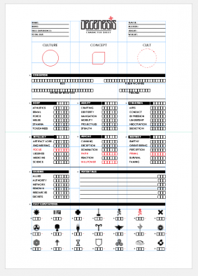
Now we have our basic layout hashed out, we can start neatening up. One important principle I want to share is the grid. Try to plan in a grid, and keep to it. Grids help guide the eye, and allow you to proportion elements nicely. In larger sheets, I would use a grid to help guide the planning of different areas. Such as in this RPG sheet...
Grids are a great tool to neaten and unify a design whilst allowing a little leeway to tweak
Luckily, this isn’t necessary, the tables we use to display the stats can serve double duty as a great way to grid out and portion the card up. A bonus of designing each card as its own page is the ease with which you can duplicate the whole thing. This allows you to batch out a whole set of cards by copying very easily, worry about formatting the cards for printing later.
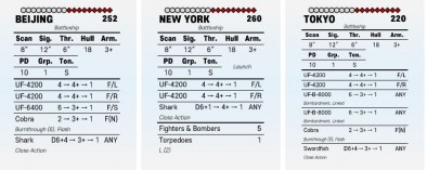
Saying this, don’t be afraid to nudge components to let things read easier, or flow better. If you look at my cards, you’ll see that nearly every card has different position for the weapon dice stats. This is because to print the weapon names and prevent them being unreadable and small, they must be shortened, but not too much as to be unrecognisable.
A superimposed image of two cards, note how the cells for the weapons stat tables are slightly different widths to fit different stats
Most of the time there is a bias to give the names as much space as possible, but other times (especially in the case of Close Action weapons) the dice stats need more room.
You’ll find a lot of give and take like this in designing your own items, and is the main reason I found writing a step-by-step guide was ultimately futile. A few times, you find tiny little tweaks that need to be made, don’t be afraid to make these by eye, don’t force things to conform too rigidly. But do try to disguise these tweaks as much as you can.
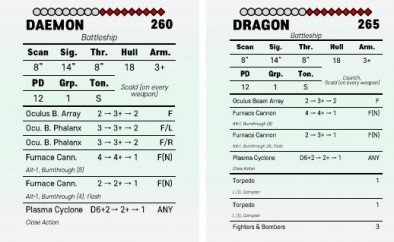
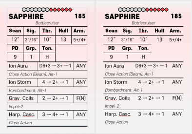
Compare how the card on the left looks busy compared to the one on the right, despite not adding anything to it's ease of readability
In my case I justified the three columns of text in the weapon stats to hug the margins, hiding the exact limit of each cell. Hiding the borders of the cells not only helps hide layout tweaks, but also helps readability. I believe a lot of people design tables and rule every single row and column into ‘clarify’ which stat belongs to which line.
In doing so, oftentimes the result is a more confused mess, akin to trying to read a chess board, adding lines to ease reading, and delineate one item from another is a great tool; but overusing lines ends up with a result less divided and more ‘sliced and diced’.
Printing & Publishing - Getting Everything Down
Ok, a few words on publishing your shiny magnum opus. Always publish to a commonly used format. The gold standard of ‘files everyone and their dog use’ is .PDF, free PDF readers are available for every OS under the sun, and are designed specifically to display and print the same no matter where you take them. Just do it, don’t use a .ai file, or .xls spreadsheet or any other file type that adds an extra step to someone else’s use of it you’re only hurting yourself if no one wants to even look at it.
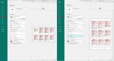
Try to add space around each card when printing, whilst portrait orientation can fit one more card per sheet, it also runs the risk of cutting the edges off the left and right columns when printing, and cutting those cards out neatly will be a pain
To export, use your computer’s “print to PDF” function if it has one (most computers will). This allows you to take all those tiny little pages and space them out on a reasonable piece of A4 (use a ‘multiple pages per sheet’ option)
If you can find them, try to add space around your cards when you try to fit them on the page for exporting, this is called a bleed, and it allows a little leeway when cutting out without affecting any surrounding cards, it also allows any background you put on (such as that nice light-coloured background) to go right up to the edge.
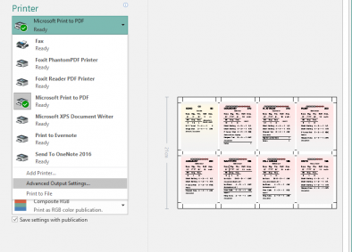
Crop marks can usually be found in 'Advanced Output Settings' or a similar option
Adding crop marks also allows users to use a straight edge and craft knife to cut out the cards without marking them and without drawing a border what defeats the point of a bleed, and are seldom cut out cleanly.
Hint: Cut between the crop marks only, you should end up with all the cards attached and aligned to the marks up until the last cut, leaving you with a paper ‘sprue’. Alternatively, users can draw coloured borders to assign colour-coded battlegroups to ships.
Virtuous Circle - Feedback
Finally, here is the most important step, more important than any other piece of advice or titbit in this hastily written guide. Listen to feedback: never assume that you are done. Especially with items such as this where you had to enter a large amount of data, there will assuredly be mistakes and oversights. If you get time, look through your work again and see if there’s anything you missed or doesn’t quite work; just writing this I’ve spotted some changes I now want to put into my next version.
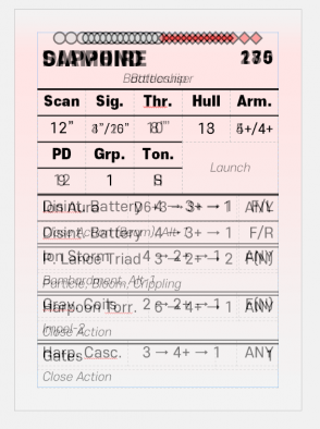
Don't be afraid to change your design, the first draft looked like this, with no health bar, and a background pointed out to me as being too dark
Try to correct factual errors as soon as possible (such as getting a stat or a name wrong), no one likes playing with wrong information. And be gracious to those who supply feedback, they have expended time and effort to provide constructive comments, thank them, you’ll get more in time, and it all helps improve your work.
And with that, I must stop rambling. I sincerely hope it is in some way useful to anyone who reads it and encourages you to search out further guides on graphic design, typography or some other field that helps you create something for your hobbies that are beautiful to behold.
Dropfleet Commander Stat Cards Download
Follow The Facebook Group & Download Ship Cards v1.3.pdf
Alternative Google Doc Download
I want to thank the guys at Beasts of War for the opportunity to write this; Dave, Andy and all at Hawk Wargames for making this exciting game we are so eager to get playing; and above all, the Dropfleet Commander Community, who when all is said and done are a good bunch and have helped me so much in making some happy little cards. I salute you all!
Adrian Eccles - Dark Star Gaming
If you would like to write for Beasts of War then please contact us at [email protected] for more information.
"I feel that well-designed game accessories are like mould line removal [...] It’s the extra polish that gives a certain pride to having made your game the best it can be..."
Supported by (Turn Off)
Supported by (Turn Off)
"Finally, here is the most important step, more important than any other piece of advice or titbit in this hastily written guide. Listen to feedback..."
Supported by (Turn Off)


































Thanks very much for the cards and the guide. I have a whole set printed and find them very useful.
This is awesome and exactly what I was looking for. I spend a lot of my time commuting without access to the internet and where it is not convenient to carry the rulebook around. This allows me to get a feel for all the ships and work out what I’m actually going to build with my Commodore pledge!
Hi Adrian, is there any way for us non-Facebook users to get at these cards?
Sure thing. I’m working on refinements at the moment, I’ll post them up on Google Docs!
Thanks theyos.
Just posted! Check the comments below.
Cool stat cards! They should have been made as a standard product by Hawk Wargames. Maybe they could have included it as part of the Dropfleet Commander kickstarter project…though if they had it would mean I still wouldn’t have any because as a Kickstarter commodore level backer I of course don’t have any of my rewards.
Here is a google docs link to the latest (1.3) version of the cards (just completed at time of writing!). Thanks to jamesk for reminding me that a world outside Facebook exists! I will contact Ben to update the article link.
https://goo.gl/o6Cgat
Thanks to multifish for inspiring me to add a scattering of relevant rule outlines on cards with space to fit them!
Nice 🙂
The one thing you could add is a card for the admirals.
The info for admirals is of limited use at this time and they probably are the same for each faction, but it might be worth preparing for future reference.
Then again … there’s something to be said for having your entire fleet as stat cards.
I can feel the need … the need for code 😉
Thanks theyos, I appreciate it.
Thanks for the insight in designing the cards. I made some cards myself for the intro ships and this gives me some good ideas on how to improve mine.