Join John This Friday 6pm BST For Painting With Contrast Live
June 21, 2019 by dracs
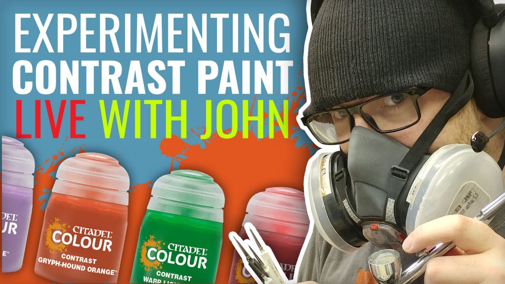
This Friday at 18:00 BST our tame painting guru John is cracking open some of Games Workshop's new Contrast Paints for a live painting session.
The Contrast Paints have been making quite the splash in hobbying lately, so now it's time to see what John makes of them. Over the course of the live stream, he'll be experimenting with a couple of different techniques, styles, and miniature types to put the Contrast Paints through their paces.
Make sure to join John this Friday and don't hesitate to share your own tips for painting with Contrast Paints.
What would you like to see John try with these? Let us know in the comments below.
Supported by (Turn Off)
Supported by (Turn Off)
Supported by (Turn Off)












































Would it be possible to use a contrast paint over a gloss varnish? I’d be interested to see what they do over a very smooth surface.
I think they’re actually supposed to work on smooth surfaces, since the primers are fairly smooth.
I’ve seen a couple of different people on the interwebs saying that they rub off easily though so the varnish is pro better used on top..
I had rather rough textured primer on my first test mini … and while it did cover in one layer it didn’t do the thing that was advertised (create shading). As such it may help to have a gloss varnish if the original surface wasn’t smooth.
I also think that bright primer colours work best.
note : I suspect the rough texture was partly my fault because I assume army painter primers aren’t this rough to begin with.
@limburger that might be a good experiment for John to try.
From a selfish point of view, I usually brush or airbrush on Vallejo Polyurethane Primer, so won’t mind seeing Contrast over the top of their grey (it is very light) or their white
I think Armypainter uniform gray was a bit too dark to be useful for this type of paint.
So anything that is lighter (or closer to white) should be fine.
I get the impression that unless you follow the instructions, you’re not going to get the same effect with the paint – which is fair enough, I guess. I’ve only a couple of colours here, and have only used them on a light, satin-finished primer, but they worked fine. However, I can understand that, because they’re semi-translucent, on a darker or a grey base you’re not going to get the highlights that a white/pale base would create. On a “regular” (rough) primer, the paint won’t flow properly – because rough primer is designed to “grab” the paint and keep it… Read more »
I’m not dissappointed, because I know I made mistakes 🙂
I probably underestimated the ‘rough’ surface texture of primer
I primed these with the Scale 75 grey primer.
https://www.instagram.com/p/By3qr7IHBlF/?utm_source=ig_web_options_share_sheet
I think the end result is just right.
Why not try a pink on a tank…….
So far I’ve tried a few base coat combinations so it’ll be interesting to see what you come up with John. Definitely be tuning in as I might be able to get some hobby time in this Friday. ??
Black armor, please and use both base colors. I hesitate to call the Wraithbone and Grey Seer sprays “primers” because no one officially has said they’re designed to go first thing on naked minis (no pun intended).
I was going to say Primer on the can, but you are right it actually says Undercoat
should be a great video to see what john thinks of this new paints.
After a huge amount of testing it’s clear to me anyone that already has a lot of acrylic inks and washes only needs contrast medium and none of the paints. The functionality is identical. Try any Vallejo, Scale 75, Artist, or Green stuff world ink plus contrast medium. I think they made a business error releasing the medium. Also in my opinion Green stuff world wash ink plus contrast medium outperforms the whole contrast line.
I don’t think they would have been able to sell the range to existing painters without releasing the contrast medium (or whatever it really is) as well
You are probably correct. I just didn’t expect every one of the 100+ inks I own to be instantly changed into contrast paints. I expected to see some differences. I am not kidding, take a scale 75 yellow or Daler and Rowney ink and add contrast medium, functions exact to contrast iyanden yellow in every way.
I’m sure they act the same way as you say just as I’m sure GW hasn’t re-invented the wheel with these
I’m sure they have there uses but I doubt I’ll ever buy any
Will be interesting to see what everyday product acts the same as contrast medium and costs half the price!
I think its either a flow aid or maybe some sort of glaze medium
would just like to See Johns thoughts on Cygor Brown. I find it too dark to show any highlights and it just looks awful.
I find the darker tones work well if you do a 50/50 mix with the contrast medium. Then you can build them up in layers if you need to or focus them into the recesses on a second coat. Doesn’t live up to the ‘one thick coat’ marketing line but it creates a nice effect in most cases.
Found the stream very interesting and enjoyable to watch. Thanks, John.
So I missed the end of the stream and it was very interesting. Did @johnlyons say if he would use them again or was once enough?
Im all for using this more in the future, both for painting armies and for an extra tool in my regular painting.
Great show! It confirmed/corroborated things I had seen on other videos. Things like “It’s not magic” and “Another tool to use” and the sleeper hit of the evening “The transparent nature of the Contrast does ‘interesting’ things when colors are layered.”
I found the sections where Twitch muted the audio because of “copyright concerns” vexing, but I’m sure that you are already aware of that situation. 🙂
the blue necron looks like an alien.