Wyrd Show Their Miniatures in Painted Splendour
July 20, 2011 by dracs
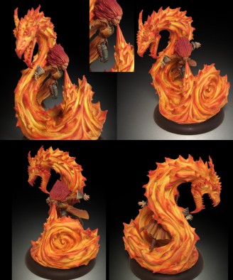
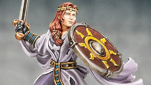
Wyrd have put up pictures of one f their GenCon releases in all its fully painted pride.
I may not be an expert at painting but I have to say I think they did a great job painting this fiery little mini. The effect of the fire is particularly striking.
How do you guys find it? Is there anything you might have done differently in painting this mini? Let us know your thoughts in the comments.
Supported by (Turn Off)
Supported by (Turn Off)
Supported by (Turn Off)










![TerrainFest 2024 Begins! Build Terrain With OnTableTop & Win A £300 Prize! [Extended!]](https://images.beastsofwar.com/2024/10/TerrainFEST-2024-Social-Media-Post-Square-225-127.jpg)












WOW, just wow! Thats a stuning figure.
The paint job is fantastic, if i were to paint it my self i would go for a much darker tone on the character and paint the flames either blue or green to give it a etherial look.
Deffinatly worth picking up just to have a crack at painting it
Funny
that was my first reaction too! lol
Second reaction has to be, someone put a tad too much spice in the vindaloo!
I can see this being a bit of a hit!
ps agree with Mundens, below
Nice figure, but they’ve made the same mistake many miniature painters (including professionals working for large companies like GW) seem to make with fire, they painted the fire colours the wrong way round. The darker colours shoud go near the centre, the lighter colours are on the edges. The reverse style as shown here makes what you’re looking at look more like magma than fire, as magma is hotter and brighter at the centre, and dark where it’s cooling at the edges.
Well observed, @mundens, you’re absolutely right ! But of course, it’s quite striking that way, if a bit cartoony… It looks more like an explosion, where the edges of the fireball are darker because of the smoke and debris.
(sigh)… I guess we’ll have to do a video tutorial about fire, as well…
You know what ? I just love my job !
BoW Romain
not entirely right guys ^^ as the fire becomes “thiner” the more you go to the edges there is more and more of the background shining through if you look at a normal campfire it will be the brightest in the middle
however you are right that most flames tend to be the hottest and brightest on the top but that only works for small fires like the fire of a lighter or a match.
I’d say, on a miniature, just go with the look you think will go best… Both can be accurate. You’re painting the mini, you get to decide which part of the fire is the hottest… Especially if it’s a magical fire !
Or just paint the whole thing blue, green, purple or whatever, and say it’s magic. That way, you avoid the main risk when facing gamers and geeks : nitpicking…
Don’t take it personally, I’m the first one to do it !
BoW Romain
what ? No ! o..O why should I take it personally ? …I am just saying that this fire is actually painted the right way …nothing more ^^
Very, very nice. Love that model and the paint job is brilliant
“That’s a-one spicy meat-a-ball!” 🙂
Seriously, I’ve had a few curries like that in my time, but usually the flames erupt lower down 🙁
Great mini, great paint-job (technicalities aside) – very ‘elemental’, I like it.
Have to disagree with mundens about the fire. Look at anything that burns and tell me it doesn’t darken as it cools. The hotter the flame the lighter the color, why else would you say something is white hot?
Check out the Wyrd Miniature forums is you want to see more of the Avatars and Alternates coming out at Gen Con and the months after.
Quite right
Don’t know why but I thought Mundens said it this way round *brainfreeze* DOH!
But like Romain said, it’s whatever looks coolest iyho no wait… what looks hottest! lol
When my daughter was younger she painted the Firebird (as in Stravinsky) blue and green with some yellow and red
I asked about the blue and green and said that is what colour flames are.
She was right of course! Bunsen burners for example? lol
Add in some magic and well who knows 😉
Have to say that’s a sweet looking mini
Its a magical jet of flame. Normal laws of physics do not have to apply, the whole thing could be white hot, blue, green, whatever. It struck me as being very graphic in the way its been rendered, and the flame here is modelled in such a stylised manner. I think it suits the model. Painting it the other way would look garish and too bright, this way round it picks out the features of the flame elemental quite well and makes it interesting to view all round. I didn’t notice the woman though till I looked again, maybe I’d… Read more »
Do you think she lights her farts as well ? Ew…
You’re absolutely right on every account… Still, if I were a fire wizard, I would wear blue or green, for a nice contrast, and to confuse the enemy, or black, so the robes don’t get ruined by charring…
That said, I could probably wear any color I want, and fry anyone who disagrees.
BoW Romain
Personally Im going to say she has a bad case of projectile vomit after eating a large bowl of pho soup. In that case I’ll paint it slimy. But.. would the white noodles be at the tips or in the centre recesses?
At the tips
Diced carrot at the centre
I’m not sure about the Malifaux Avatars I’m really not. They don’t really grab me in the same way as some of the original line does / did. This screams Phoenix at me it really does and I have to say I’m not a huge fan of huge flames being sculpted on miniatures as I tend to think its a very difficult thing to sculpt without it becoming too cartoony or lame. However as always I’ll reserve judgement until I see them in the flesh.
That is a very special mini. I like it alot.
THATS A SPICY MEATA BALL!!!
besides that, awesome minature, love the paintjob on the fire, very hot. pun intended