BaneLegion Introduce the Utterly Unpronounceable!
July 9, 2012 by brennon
BaneLegion have a monstrous BaneBeast ready to stalk onto a battlefield looking for prey. Check out the concept and model for Gynroch ap Roch below and try and get your mind round that tongue twisting name...
Maelstrom strive to help you pronounce the name here...
"Gynroch ap Roch, Wocor of Powys should be pronounced Gun-roch (as in loch) ap Roch (as in loch), Wock-or of Pow-iss!"
So what do you make of this winged monstrosity? I personally would have liked to see it in the stance from the concept art, although I suppose you could also argue that it would have then been a little static.
So will you be heading into the swamps to hunt Gynroch ap Roch?
Supported by (Turn Off)
Supported by (Turn Off)
Supported by (Turn Off)































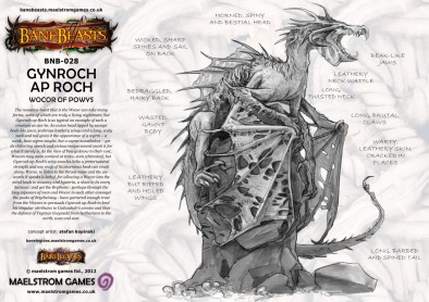
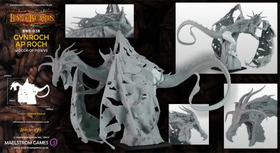


Looks ok in the concept art but a bit of a mess in the actual mini – it’ll probably look better painted …
I agree about the concept pose Ben, it looks so much better TBH I don’t like the sculpt because of the pose which makes no sense to me. You may be correct Kane about the painting, but again I agree. The model is just a pile of parts stuck together with no aesthetic or narrative rationale. It looks a bit like it is drunks and trying to stop itself falling of a rock it doesn’t know why it has climbed upon. The sculptor has a lot of talent and I can only assume that the decision to pose it like… Read more »
That sculpt is actually rather good. By the way, what exatly is he? Dragon?, Drake? Wyvern? Something other than those?
@mecha82 “The nonsense beast that is the Wocor can take many forms, some of which are truly a living nightmare, but Gynroch ap Roch is as typical an example of such a creature as can be. An avian head tipped by savage beak-like jaws, scabrous leathery wings and a long, scaly neck and tail gives it the appearance of a wyrm – a weak, lean wyrm maybe, but a wyrm nonetheless – yet its chittering speech and vicious temperament mark it for what it surely is. As the men of Powys know to their cost, Wocors may seem comical at… Read more »
Wow the concept looks great but the final model is off the mark. It looks a bit to confusing and the stance is off or unbalanced. Hope it’s just an error like some others they did and fix them by the time a painted version is posted.
It IS a well sculpted model – the leathery skin and the fur texturing in places are finely done, and there’s no ‘blobby’ or ‘chunky’ look to the piece. However the pose doesn’t work as the beast is clinging too awkwardly with just its legs to the rock it’s mounted on, plus there are gaps to be filled where the textures on both sides don’t match. The nature of the beast itself is odd to me too, there’s something very Jabberwocky-like about it, being vaguely draconic but having a beak and comb a bit like a chicken. It’s not immediately… Read more »
Too spindly and awkward. The pose is stiff as well.
The concept art wasn’t bad…
It may look better with the wings filled in a bit. At least it doesn’t have oversized plastic boobs 🙂
Actually, you can’t really tell from the photos ….
ARRGH! My mind…. it BURNS!!!
Concept art’s pose looks like a lizard sunning itself on a rock. It’s drawn well. It doesn’t seem very intimidating though. The sculpt’s pose is hard to get a read on. I think it has been photographed from the worst possible angles. The front-angled photo looks like a lizard high-centered on a rock or possibly getting into position before “planking”. The rear-angled photo looks like a lizard falling off a rock. I’d really like to see this photographed from a better angle. I think the pose might be done well, but the way they chose to showcase it sure isn’t… Read more »
Things is though Mpoke, it is a free standing sculpture and should look good from all angles.
True, but a photograph is always a limited abstraction of a 3D object. Some things are hard to get good pictures of but still look good in person. Brancusi’s Bird in Space, for instance, is incredibly tricky to photograph well because of it’s reflective surface and minimal form. Even the best photos of it are largely underwhelming, but it’s a really intriguing sculpture when encountered in person. Because the wings on this sculpt end up obscuring so much of the detail of the body (in the angles presented at least), I’m willing to give them some benefit of the doubt… Read more »
I can still get enough from the photography to ascertain that the overall composition is poor. Sculpture as you know is not simply about localised details but how the parts work together and make up the whole. The two main photographs provide outlines of the sides. Imho it is weak. The sculpture has tried, unnecessarily, to put some movement into the pose. Sadly it looks silly with its belly on the rock It just looks like it is drunk and slipped off. I totally disagree with your observation about the concept. With the greatest of respect the sunning itself on… Read more »
Now that you mention it, the back shot looks like my westie terrier humping his woobie.
Woobie Doobie Dooooooo!
heheheheheheehehe!
Good Job I forgot to mention Shaggy! Phew!
With the exciting headline I’m a bit disappointed to find that the name isn’t that unpronounceable…
Model isn’t half bad though.
That name looks like Welsh… where’s a genuine Welshman when we need him?
Where’s @glyndwr1974 ?
ap is the same as Mac or O’ in a name.
So, Gynroch ap Roch is Gynroch son of Roch.
According to Google Translate it means Gynroch ap Roch! lol