Concept Art Bringing Wizard’s D&D Next To Life
January 22, 2013 by brennon
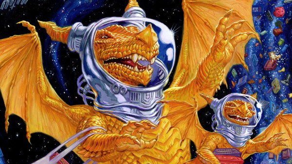
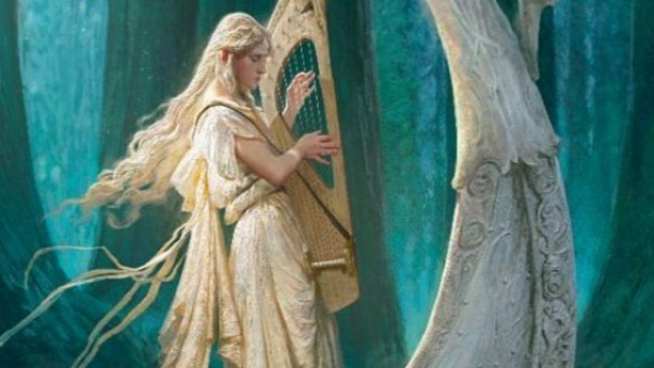
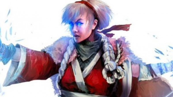
If you're a fan of Dungeons & Dragons and you've been playing the playtest material over the past few months you might want to sink your teeth into all this Concept Art which has been shared by Wizards of the Coast!
Races...
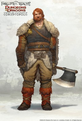
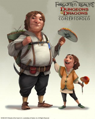
Above are some of the pieces for the races you'll be seeing in the Forgotten Realms of Dungeons & Dragons. Obviously I had to include a Dwarf in proceedings, and the Halflings just looked too fun not to have around. There are plenty more pieces via the link above though if you want to see Elves and Gnomes!
Monsters...
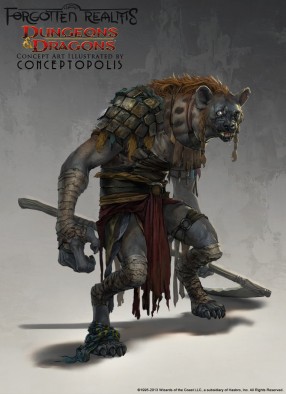
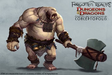
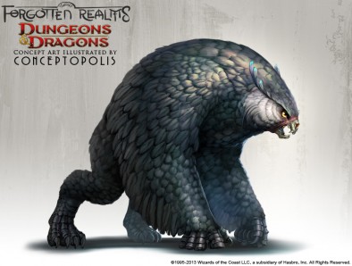
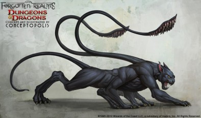
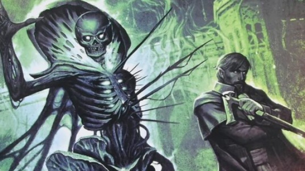
And if you're a Dungeon Master then you might want to see what the enemies are going to be like too! Artwork is such an important part of role-playing as it helps to build a picture of the world around you.
Plus if you want to scare your adventurers into a fuss then just show them a picture of that Displacer Beast!
Are you looking forward to more from Dungeons & Dragons?
Let me know below.
Supported by (Turn Off)
Supported by (Turn Off)
Supported by (Turn Off)




























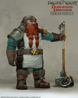







Not sure tbh
They look ok but too much like mainstream CGI animation to me.
I hope the models are not going to be like that. Personal taste and all that.
The monsters are looking better and could use some gnolls, so will keep an eye out to see how they develop.
The troll suffers from top heavy syndrome. (Waits for @cpauls1 to comment on the weapon! lol)
There are loads more if you follow the ‘Concept Art’ link by the way. Far too many monsters and racial pieces for me to add here lol.
BoW Ben
LOVE the Owlbear. Lets see that as a mini asap please!
I quite like this art style, it has a fresh feeling to it. I do like my grim fantasy but it’s always nice to see something in this high fantasy feel and I reckon they have captured it well.
BoW Ben
Love the monsters, hate the troll weapon, as chibi suggested I would :-). Looks like he can’t even lift it. You could always knock off the blades and make it a more believable club…and at least his foot isn’t up on a rock.
Does anyone know…Is all this wonderful concept art destined to be turned into that nasty prepainted gooey plastic rubbish, or will these be actual pewter or hard plastic mini’s?
The current art style of D&D always felt a little disconnected to me, like an industrial design sketch, like the drawings were attempting to convey the shape of things very clearly but without any real drama. This art still has a little bit of that same feeling (but it’s excusable at this stage because they are literally trying to define the shape of things for the new edition and probably some minis eventually). I think I like this better because the exaggerated forms communicate character and drama in a way that the art style does not. I wouldn’t mind a… Read more »
Always felt if Wizards of the Coast wanted to portray D&D as a ‘living, breathing world’, they should really flesh out their monsters cultures/societies. “The Orcs raid and maraud around… and the Gnolls raid and scavenge, while the Ogres… maraud and raid…” merely keeps them as the same creature, but with different threat levels against the players stat-tiers.
The Gnoll is the one I like the most.
I have a problem with this artwork, namely it being Forgotten Realms. Dungeons and Dragons Next is Greyhawk (Most of the Artifacts like the Sword of Kas, and it’s history are Greyhawk, not Forgotten Realms. This could be artwork for the new Baulder’s Gate 3 being created.
I would like a return to elmore style artwork but it’s ok. But as i played the ad&d game set with the worst artwork it all looks good to me. (birthright) great game. Piss poor art work.