Bone Rattling Skeletons Shuffle Into Sword & Sorcery
September 4, 2015 by brennon
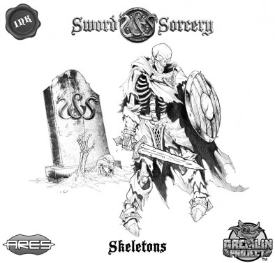
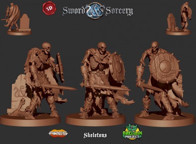
Ares Games show off some more previews for their upcoming Kickstarter board game, Sword & Sorcery. This time we're looking at the staple undead enemy of many dungeon crawls, the Skeleton.
The skeleton is looking superb and if you think the concept art is good the render is even better. I love that they're going to be incorporating the piece of scenic base onto the back of it and the full model for the Skeleton is so incredibly detailed compared to what I assumed we'd see.
If the models we're seeing here come out looking as good as they do in the renders and in a reasonable material then we're going to be a very happy bunch of dungeon delvers. The monsters so far have looked better even than the heroes.
What do you think of their Skeleton design?
"...the full model for the Skeleton is so incredibly detailed compared to what I assumed we'd see."
Supported by (Turn Off)
Supported by (Turn Off)
Supported by (Turn Off)































like.
Those look really good.
they are nice indeedy.
that’s a great looking skeleton 🙂
hopefully they can capture all those fine details when they cast it up 🙂
That skellie looks very similar to one of the ones from Dungeon Saga to me; if they’re in scale with each other I think they’d look good mixed together to break up the repetitiveness while also retaining some uniformity 🙂
My thoughts as well – or even as a hero-unit leader in KoW
Just what I was thinking!
Stunning stuff!
Yep.
Very nice renders, it’s great to see skeletons that look very dark and comic looking. I hope they come out looking as good as they do in the renders.