Siege Of The Citadel 2nd Edition Unveiled By Modiphius
May 5, 2016 by brennon
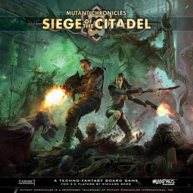
Modiphius have now released details and the amazing cover art for Mutant Chronicles: Siege Of The Citadel 2nd Edition! The original designer, Richard Borg is joined by veterans of the industry like Kevin Wilson and Eric Lang, in bringing this new edition to life...
So what's new about this particular edition of the game?
Inside The Box
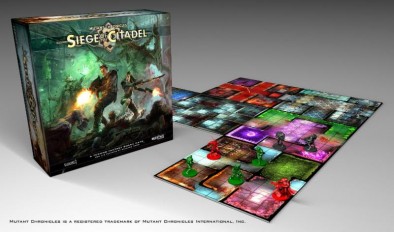
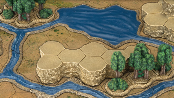
Within Siege of the Citadel you're going to be getting a whole host of new and polished components including double sided tiles for exploring the Citadel, new rules and new creatures to face too.
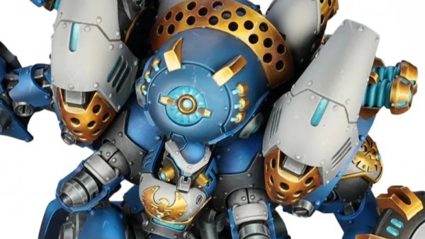
The original game engine has been rebuilt and re-purposed allowing you to fight out battles within this complex. Two to five players will be facing the likes of the Praetorian Stalker as well as other members of the Dark legion including Undead Legionnaires, Necromutants, Centurions, Razides, and the terrifying Nepharite and Ezoghoul!
One player will take on the role of the Dark Legion (if it's anything like the original) whilst the others command Doom Troopers who must battle through a series of scenarios. You will upgrade as you go too which is always fun.
Miniature Heroes
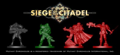
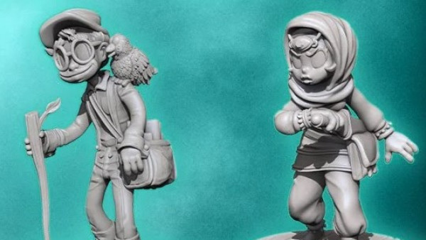
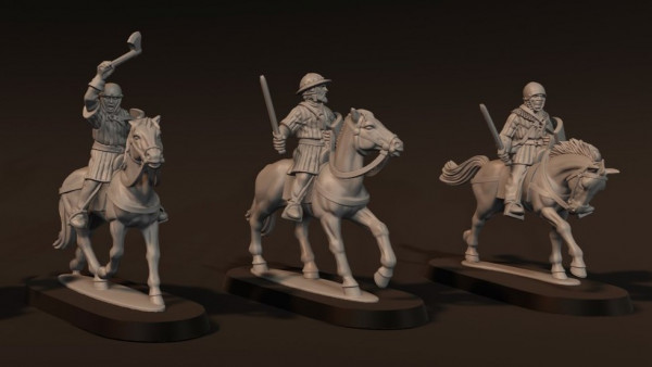
The game of course is going to come with miniatures like you can see below in coloured plastic.
Hopefully we'll see some of the miniatures in their final form soon but if they turn out looking as good as the Stefan Kopinski's cover art that you've seen above then we're in for a rather cinematic treat.
Keep an eye out for more news on this soon...
"Two to five players will be facing the likes of the Praetorian Stalker as well as other members of the Dark legion including Undead Legionnaires, Necromutants, Centurions, Razides, and the terrifying Nepharite and Ezoghoul!"
Supported by (Turn Off)
Supported by (Turn Off)
Supported by (Turn Off)





































Loving that cover art. I also hope the minis are the same scale as the Warzone ones (I imagine they will be) because I really want that alternate Max Steiner sculpt 😀
I’m not sure about the garish floor tiles though. I know it’s consistent with the original but I was hoping for something a little grittier.
It is decidedly old school!
Yes. Yes it is.
Hmm. I tend to disagree. I don’t get the old school vibes from these.
Sadly so, since that might have been very nice.
I think of the Old School era as all about the primary colors.
These colors are bright jewel tones, and much brighter than I was expecting (I thought we’d be seeing something like Space Hulk).
Minis, of course, are miles beyond the original.
To me just the general layout seems in line with the original floor pieces. The pictures floating the aether indicate the original colours way less harsh to the eye.
Also, this alegedly “modern” standard of gaming boards brimming with extreme contrasts in brightness really messes with your sight and focussing. What the heck happened to subtlety and the holistic approach?
Indeed, it’s a fantastic cover!
The sculpts seem o.k. That varies between them I think.
I still harbour high hopes for the sculpts of the Ezoghoul and more Dark Legion evilness as well as the Mishima and Brotherhood doom troopers.
I cant see any reason to keep it old school with the tiles if the minis got a major update .. hope they wont look like that
Siege of the Citadel! The game that got me into tabletop gaming. I really should revisit and pick this up.
Looking forward to this.
Loved the original. I really hope that this is a top quality upgrade.
The original was an amazing game. This should be sweet!!!