Puppets War Sketch Up Some New Heavy Armour
April 24, 2013 by dracs
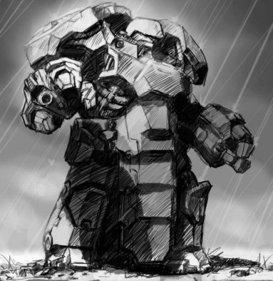
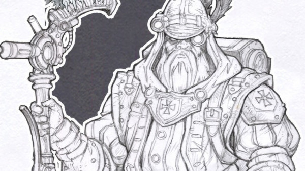
Puppets War have put up a new sketch image which previews what looks like some seriously heavy duty sci-fi armour.
It's hard to tell just how this could look from this sketch, but two things are certain: it's going to be big, and it's going to be bulky.
The armour looks incredibly thick and gives the impression of this soldier having been turned into what amounts to a walking tank. Although it does show off my pet peeve; massive shoulder pads!
What do you guys think this could be like in miniature form?
Supported by (Turn Off)
Supported by (Turn Off)
Supported by (Turn Off)


































What immediately comes to my mind is an affordable version of Studio McVey’s Utility Carapace power armour.
On further inspection I like it a lot. I think the chunky, angular, very masculine style of their armour lends itself nicely to a suit with those proportions. If I’m looking at it right, the gauntlet (the right one at least) has an integral weapon, around which the fingers close. It looks cool in the art, but makes me wonder if the gun will be noticable on the tabletop.
Not sure what the carapace dangling between his legs is protecting though
Don’t go there… I know what you lot are like lol
Like the Yorkie bar chunkiness but not the lack of ergonomics.
This is where shoulder pads,armoured tea towels and massive hip displacement really don’t do it for me either. I know I should suspend my disbelief. lol
Depends on how big it ends up being.
I’m looking at it and seeing a ‘not contemptor’ dreadnought, where others are seeing terminator.
I say that because puppets war already has a line of walker arms (blood talon alikes and all the rest including soem very like that drawings arms) that would fit onto that body if it were the bigger size.
Given the position of the head and size of the body I assumed it is more Terminator than Dreadnaught.
It would still have problems with the armour severely restricting movement
But it is only a working drawing so will be interesting to see how it develops.
I will have to agree, regardless of size the “carapace loincloth” it a bad design, especially at that length.
Overall it looks good, but scale reference and other sides would not hurt to see.