Dark Jade Necron Army from Worthy Painting
February 6, 2012 by brennon
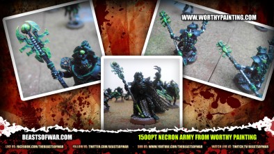
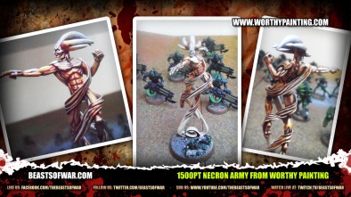
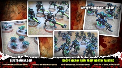
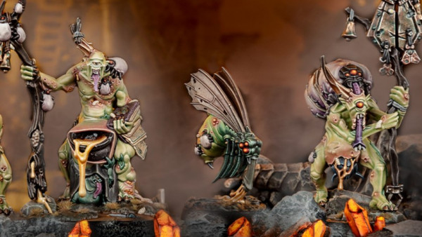
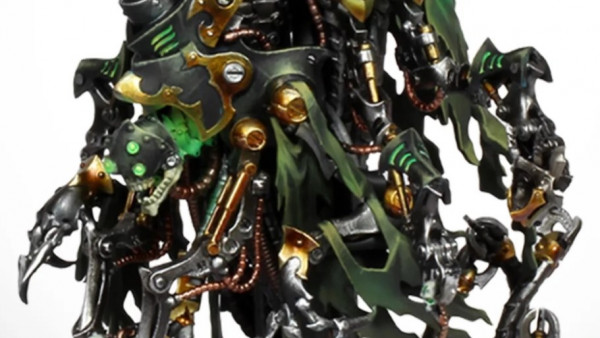
Check out the video above of a run down on the latest project from Worthy Painting, a 1500pt Necron Army.
Looking pretty good with a paint scheme that certainly keeps the evil theme going.
What armies are in the works for you?
Supported by (Turn Off)
Supported by (Turn Off)
Supported by (Turn Off)



































they look really good.
As always Worthy Painting do it again with another great looking army 😀
Looking great as can be expected from Worthy Painting.
Very boring.
To reliant on Green and the painting quality is atrocious.
LOL – Dark Jade Army and they’re too green!
That’s like saying you didn’t put enough red in those bananas. The paint quality looks spot on to me, but the crazy zoom makes me hanker for my old acid days. 😀
I wouldnt say atrocious…
but I have to admit – especially when they zoom in on the scarabs – it looks very rushed and rough its basically just a dark green with very hard light green accent …so its just two colours with no transition + the brush-strokes are quite strong …so not atrocious, but just tabletop standard ( not talking about that its still good hard work to paint even on a tabletop standard )
Hey Thanks for the comments guys, This army is painted to tabletop standard. think the zooming on the camera did not help showcase some items as it got distorted. Just messing around with the new camera! The paint scheme was chosen by the client and was very specific on how he wanted it done. if you would like to see some higher end work we have pictures on our website. Thanks Nick
I liked the shard the most. I was painted rather nice with the blending.
You can use other colours to break up the monotony and still have a green theme. Even if it’s different shades of the the same colour, The use of a single colour just makes it look a tad on the bland side. As for atrocious – It was the first word that came to mind and to be honest I admit it was a bit too harsh. I just expect somebody that makes a fuss over their painting and goes so far as to make a load of videos, to actually put a bit of effort in. Just seems that… Read more »
Started the last before you guys replied…
If it was what the client wanted then fair enough. I guess there’s no accounting for taste.
I know you guys can do great work, it just comes as a shock to see a video of something like this when it’s only done to tabletop standard and isn’t really the best you can do by a long stretch.
What is the new camera you are using? As I am going to get one for battle reports and yours seems to do its job nicely.
Also I agree the painting is bland on this commission I would have uses more metallic tones to accent the black as they look dull and monotone.