Dropfleet Commander Boot Camp – Saturday

Talking Dark Op’s Dropfleet Dashboard With Tanya
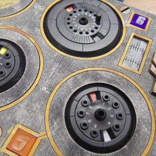
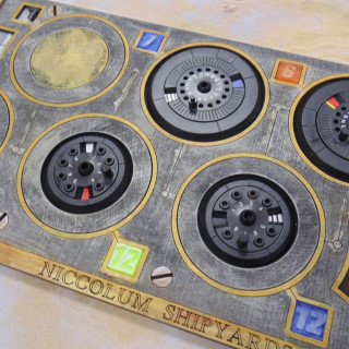
We see how Tanya has been getting on with the Dark Op's Dashboard. It was a bit of a fiddle getting all the things ready but when they're done they look awesome!
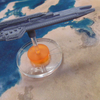
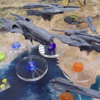
The bases do look very nice as does the painted dashboard!


















































Hi Tanya hope your having fun 🙂
Really liking the dashboards.
Yeah, adding numbers would help the color blind accessibility as well.
It’d probably be helpful to have the other Fire arcs on the base too!
Yeah, especially front narrow
Nice idea. Not too fond of the transparent colors.
Those are some good suggestions from Tanya. I am glad it works pretty good and makes table a little more clutter free.
Numbers on the coloured rings to match the square inserts on the dashboard
I think the fire arcs are etched on the clear base but thay are harder to see unless you are watching in 1080p on a good sized screen
If you had a bigger battle you might need more than 1 dashboard per player
Even just for a 1,000pt fleet I’d finding myself needing 2 of those dashboards, and my understanding is that tournament standard would be 1,500pts.
I think that having numbers etched into the clear base makes sense so they can lose the coloured rings.
Instead of having the ship type etched you could have the number sets relate to the ship type.
e.g. 90-99 Battleships, 01-20 Frigates, etc.
great idea
Wonder how Dave from Hawk feels about these dashboards considering the amount of work they put into the bases…………..
Well they are still being used it looks like just not exactly as intended . I assume you still track your stats conditions and “health” on them. The only downside I see is your opponent may lose track of what has happened to each ship and it would be slightly more difficult to see the dashboard from the other side instead of all the info on each ship.
Those dashboards look like another MUST HAVE to play with now.
The board would help me for sure. I tend to get a little disorganized with my stuff when playing and I am a “little” clumsy so my opponents would appreciate me not leaning over the table a lot.
interesting. but colors instead of numbers?
Nice! Think I may have to grab one of those once they become available!
Dashboard loks great
Interesting product. Gotta try the standard bases first and see are they too fiddly.
One option with the numbers would be to paint or decal them to your ships.
Interesting, I like the dials on the ship’s bases but this looks quite useful.
clear etched bases are they way to go!
Yeah, that would be a great add to the game.
is the board big enough for tournament sized games?
stunning idea and very good product, +1 for tanya suggestions
And, that looks pretty good too. Nicely made.
Again, interesting concept. I wonder if they could modify it so it could signify battlegroups as well? Or possibly colour code part of the bases for the ships to signify battlegroups. I do like the idea of clear bases for the ships though. Black bases only really work on space backgrounds…
Hello all thx for the feedback, originally we looked at numbered bases but the problem arose with how many different numbered bases you would need and would rule out using your own. This way you get numbered squares for the dashboard 1-12 for each ofvthe 4 colours (will be solid colours on release) and 1-12 numbered discs for the bases. This sorts out your battlegroups and ties a dial to a ship at the same time. Hawk are fine with it slso as the logos and use of certain text is licensed through them. I think once battlegroups are looked… Read more »
Would you eventually do other colors? That way if a large or two player game all the battlegroups would end up with different ones.
Good idea, wargamehub.
Maybe add another 4 colours to your range, @pezzapoo?
Good idea but I think it would add more confusion and more chance of using the wrong dial.
Etching would be awesome.
Looks like essential kit to me. good job.