Savage New Age Of Sigmar Orruk Images Appear Online
April 18, 2016 by brennon
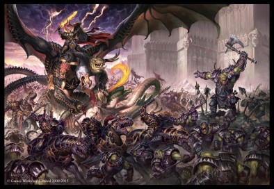
Some fantastic new Orruks images have appeared from an upcoming White Dwarf for Games Workshop's Age of Sigmar. I have to say I wasn't overly convinced to begin with but see what you think now...
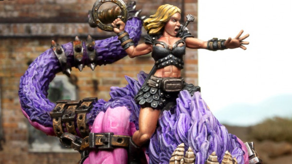
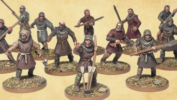
You can check out the images HERE where you can see their characters, like the Warboss atop that awesome beast, and the Shaman who is calling on some insane powers from the other side.
I genuinely think that if you got rid of the yellow armour these warriors would be looking fantastic on the tabletop. I'd love to see someone go with a a deep bronze for the armour contrasting with the light green of their skin.
Thanks to War Of Sigmar
What do you think now we've got a better look?
"I'd love to see someone go with a a deep bronze for the armour contrasting with the light green of their skin..."
Supported by (Turn Off)
Supported by (Turn Off)
Supported by (Turn Off)

























That’s it! I am starting an army in AoS!
I’m honestly not sure what to make of these Orcs/Orruks. I think I need to see an unpainted one up close. The mount certainly seems a step up from the recent Sigmarite mounts.
The mount looks terrific- full of character.
The rest of them look like Space Orks in ‘Eavy armor to me. Maybe it is the Bad Moon paintjobs they all have.
I could see a cool diorama with the one whose directing air traffic.
OTT. These are better, but that same thick armour/pudgy build ruins it for me. The pigeon toed shaman isn’t helpful. I’m guessing the cost will be in keeping with the rest of the AoS models. Pass.
I love that orruk on a wyvern
I agree the yellow is a bad colour choice because as soon as you see the warlord in black it looks awesome. All irregular hand beaten look which is completely opposite to the Stormcast’s curved style and very utilitarian in contrast to Chaos’ rather fancy style.
I like them.
Yeah, that big yellow armour which is really throwing me off getting a good feel for the mini in those photos.
So far, it seems that a lot of people have said the yellow paint scheme has to go. These models look OK, but I don’t think I would be using yellow myself if I got them.
I can’t help to think that those would look so much better in those pictures if they armor was not be painted yellow.
Much better up close. Looks like I have a new faction I want to collect. Though I think I’ll go with bare rusted metals for the armour. I like the hunched up almost bulldog like pose for the maw krusha or whatever it’s called, gives it a more menacing look.
I quite like them. Minus the paint jobs. But, I’ve never been a fan of GW studio paint jobs. Hit all that armour with metallics and add a bunch of blood and dirt and weathering.
The armour appears to be not-great-quality “bolted on” armour.. so that’s much better than the earlier appearances of perfect full-plate armour. The yellow is jarring and a few aspects threaten to display that typical AoS cartoon/childish aesthetic (in contract to the former fun-humuorous aesthetic of their former selves) but for the most part the designers seem to have refrained – thought here was panic with that first pic and that stupid faceplate for the mount! So long as the superior Black Orc models are still available then this is all good as OH hang on, where have the Black Orcs… Read more »
Black Orcs are being repacked as ‘Ard Boyz in boxes of 15 with round bases.
If that’s the case then count me in for Ard Boyz!
hmmm … phrasing ….
I think I’m looking at the basis of some amazing 40k Ork conversions.
I really like the look of them. I think I’ll go for a rusted and beaten dark metal armor with hints of dark red to break it up. Then match it up with a black orc skin complexion for the flesh.
The boyz of the Bad Moon Klan wil WAAAGGGHHH! all over youz gitz for bad mouthin the Bad Moonz!
I know more then a few 40k Orkz players that are really excited about seeing these new models.
These are the first GW orks in a long time that I could honestly get behind. I love the Wyvern, I like the ones on foot, and I like the sorcerer very much… I don’t really like the other mounts, but I can see it still being in theme and not badly done. As someone who usually casts aspersions at GW for a lot of things, I do believe they have seriously upped their game !
Each to their own, sorcerer is the best of the bunch
Can’t argue with that… I do like that sorcerer a lot. It’s just the small fluffy mounts that i have a problem with. They look like they’re out of an episode of the Muppet Show.
Do you remember the 80’s show Alf – the cat eating alien living with an American family
Yes I do… Oh dear, that’s it.
I agree as I really like the motion that sorcerer has. It’s one of the few single models as of the recent AoS releases that I can see purchasing.
A totally mixed bag, for me. They’re all wearing power-armour, which is to be expected at this point but is still enough to put anyone to sleep. So you’ve got mega-nobs riding a catoblepas… and some kind of “Orruk” directing runway traffic. A bunch of uninspired, static-posed meganobs on foot. I’m assuming that’s not a wyvern anymore. So, the “Azyharmite Wyventrak” or something, with the rider… Well, credit where it’s due that rider actually looks quite amazing. Other than the space marine armour profile, or the ridiculous shoulder pads, the “Orruks” underneath look decent. Too bad somebody sat on that… Read more »
“A totally mixed bag, for me. They’re all wearing power-armour, which is to be expected at this point but is still enough to put anyone to sleep. So you’ve got mega-nobs riding a catoblepas… and some kind of “Orruk” directing runway traffic. A bunch of uninspired, static-posed meganobs on foot.” I can’t disagree too much. They’re competent, but they’re basically the same old (oooold) aaargh-face Brian Nelson orcs in what looks like beat-up space marine armour. It’s difficult to get excited, no matter what colour they are. I sorta-kinda like the sorceror and the wyvern, though. I’d guess the latter’s… Read more »
Yes! I forgot to add that I think the skinny sorcerer is actually quite an interesting model. I would consider getting him for Fantasy, though he’s likely going to be a very expensive clam pack miniature.
I still can’t get over how awful that ‘wyvern’ looks, though. He’s so flat, and so wide, it literally looks like someone took a picture of a wyvern into photoshop and played with the dimensions without using “constrain proportions”.
Look at the size of his fat fingers! Why does a dragon have fat fingers the width of an orc’s leg? Sorry, Orruk’s leg?
I have to say, I like these. Stormcast and chaos left me feeling cold but I can see me picking up this and maybe playing the game or failing that a bit of 40k conversion would work.
Not a great fan of the yellow (reminds me too much of the Evil Sunz), like others have, but photo’s of pictures in a magazine probably isn’t doing the colour scheme any favors. That said, I think it’s nice to see a colourful scheme vs Chaos being rather grimdark in black and dark red. I think the Wyven looks fantastic, I actually like the boar boys, and it’s nice to see the rank and files be a bit more dynamic in their poses, which they couldn’t have been if they had stayed on square bases that needed to rank up.… Read more »
sort of like these models but there was something about them that just didn’t seem right then it came to me add a gun in 1 hand and they would be awesome 40k orcs but aos is still meant to be fantasy right?
Many people, me being one of them, would say having models that can easily be converted is an added bonus. I use loads of fantasy Orcs for 40k Ork conversions. It’s the nature of the orc player to mash kits up!
Mmmm, not really doing it for me. Though that could very well just be the colour scheme, had that same issue with quite a lot of the End Times stuff. Once folks got their hands on it, they mostly looked pretty cool. GW does seem to be leaning rather heavily on the massively vibrant side of army colour schemes lately, doesn’t do the models much justice half the time. Still, the ‘puny head, overcompensating weapon’-syndrome of Age of Sigmar is getting a tad out of hand. I guess it’s at least a fairly consistent look, but to me it’s more… Read more »
I am just replying here to see if that might trigger your e-mail, there is a message in your inbox from me. Please reply asap.
Not bad, but there is alot of metal going on here. AoS battles must just look like walls of plate mail mashing together at this point. I’m not sure about the big wyvern beastie. He is very chunky looking, cant decide if it is characterful or clumsy.
These look awesome. Orks have never looked so good. The yellow is a big, eye catching and probably a gimic to draw comments. It’s the equivalent of click bait.
Works though.
Then its been a ‘gimmick’ color for decades, that is the colors for an Ork Klan forever. It that most use a less eye drawing color for their mobz. They just gotz so much teeth they like to show off their wealth.
It feels unnatural to praise the great satan, but this time I think GW did good. Except for that horrible yellow colour. That’s absolutely horrible. Painted in other colours, darker ones would be my choice, I think the orcs can look pretty menacing.
The black armour colour scheme is immensely superior top the unfortunate yellow version most of the models are in. The sheer difference it makes needs to be seen to be believed. The latest images of the Maw Crusha show it of to advantage as well. The model looks rather good and extremely appropriate as a mount for an Orruk, being very much blunt and unsubtle like its rider. I also prefer the colour scheme of the Maw Crusha with the black armoured rider – the whole model just works in a way the other colour scheme does not. So, time… Read more »
I’d like to see them with grey or crimson skin and more darker armour with lots of blood splatter effects. the big monster thingy looks pretty good.
Oh… crikey! I take it all back, my early criticisms of the blurry images, almost all of it. This stuff looks BOSS.
I’m not at all a fan of the yellow but they do look pretty damn savage, especially the giant.. err lizardy dragon/wyvern thing! 😀
I always had a green spot in my heart and these guys fit right into it.