


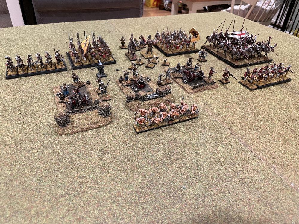
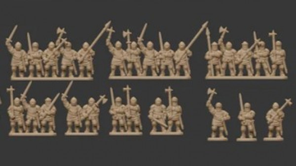
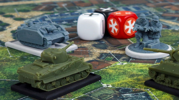
The Empire Responds to the invasion of the Uruk Hai


The mercenaries are coming together
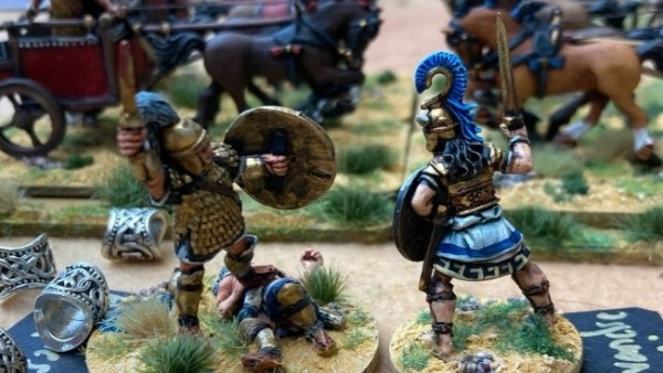
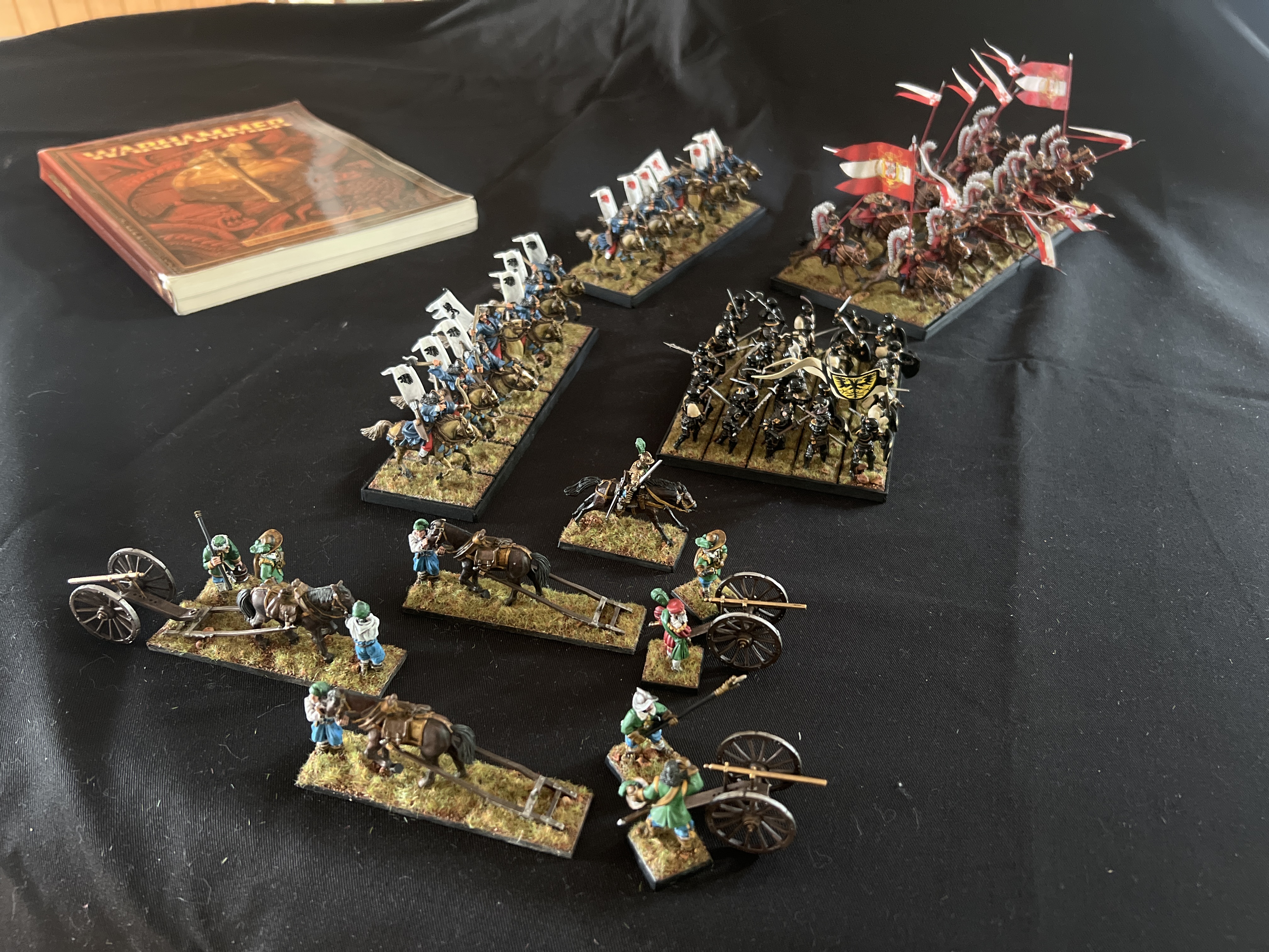 I’m really pleased with the warlord games galloper guns being used as Bronzino and crew. The games workshop Khandish horse are very pleasing as horse archer proxies, quite happy there. I adoooore the hussars!!
 The foot knights are fantastic miniatures but I think I’ve fucked up the paint job somewhat. I don’t fully know what I’ve done wrong but the skin is not right, the shields are not right, the banner is not right and overall the unit feels……Meh. What could I do to remedy the situation? All thoughts are desired please!
 Go red team! Go blue team!
 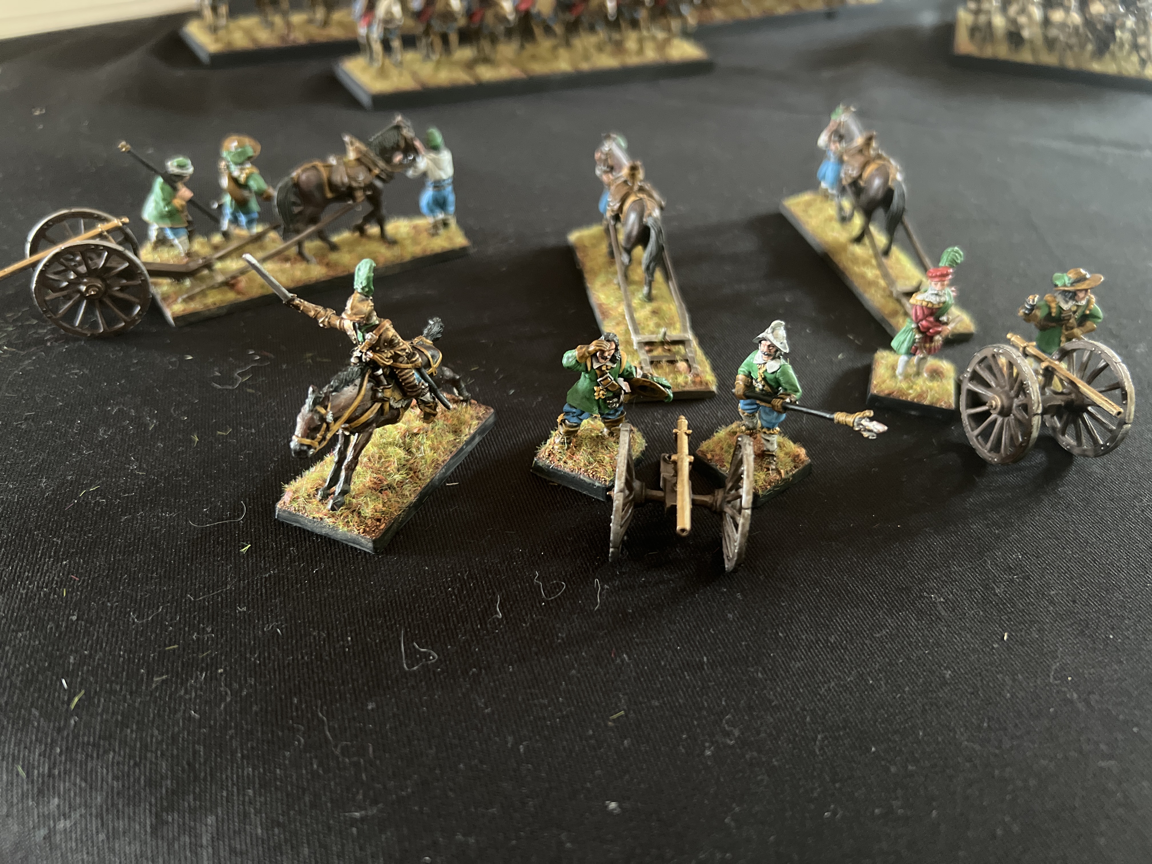 Go Green team!


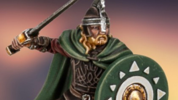
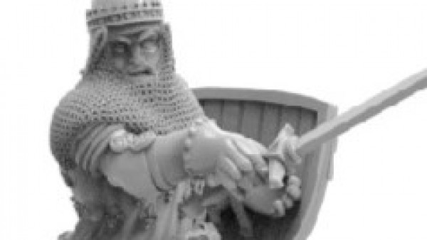
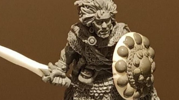
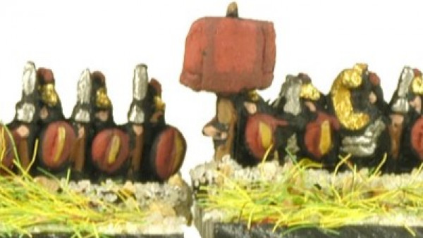
I think you’re being a bit harsh on yourself with the foot knights, I think they look very good and make a nice visual impact. To try and offer a suggestion, the black & white colour choice is quite stark, so you might need to push additional colours to be a bit brighter to compensate. Skin might need to ge a bit ruddier in colour to stand out from the off-white. Maybe try a bright white highlight and push up the brightness on the plumes?
Ta muchly for that Scribbs, I will put a stronger brighter purple on the plumes and a different flesh tone on the skin. The white highlight, is that the off shite tunics you mean?
Yeah, just a small highlight that might lift the figures a bit by adding more depth to the range of colours. I think the stark two tone scheme could be why you’re giving them a frowning face. The gold might not be distinct enough from the off-white to offer enough contrast, so putting some cooler brighter white highlights could make the gold pop more.
This is all speculation mind. Or maybe consider weathering the whole thing with some mud and grime? Or a bright tuft on the base, like a Heather to compliment the plumes?