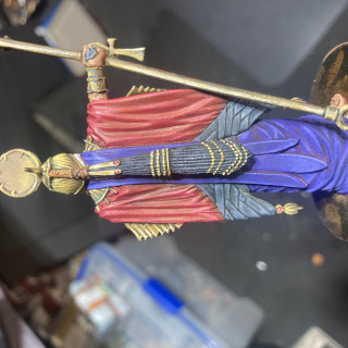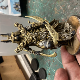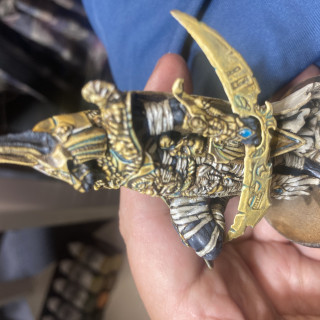
Ankh
Recommendations: 348
About the Project
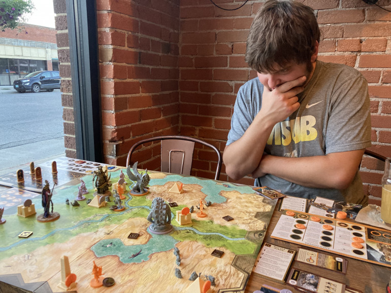
Finally got this to the table and…boy did it beat my expectations, in a positive way. I thought maybe one Blood Rage was enough and this would be superfluous. But no! This is a wholly different game that scratches a wholly different itch. So now I have to paint the whole thing.
Related Game: Ankh: Gods of Egypt
Related Company: CMON
Related Genre: Fantasy
This Project is Active
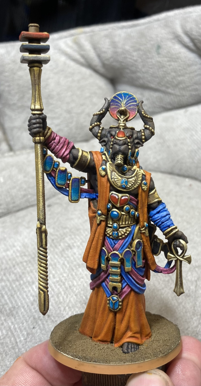
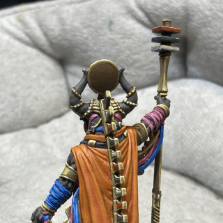
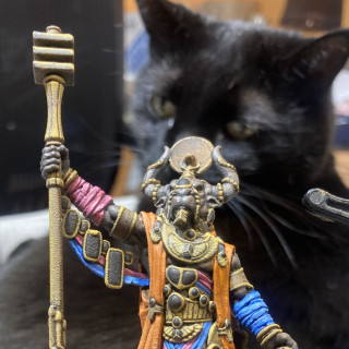
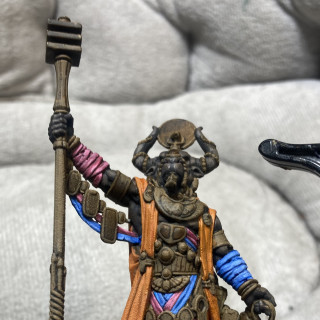
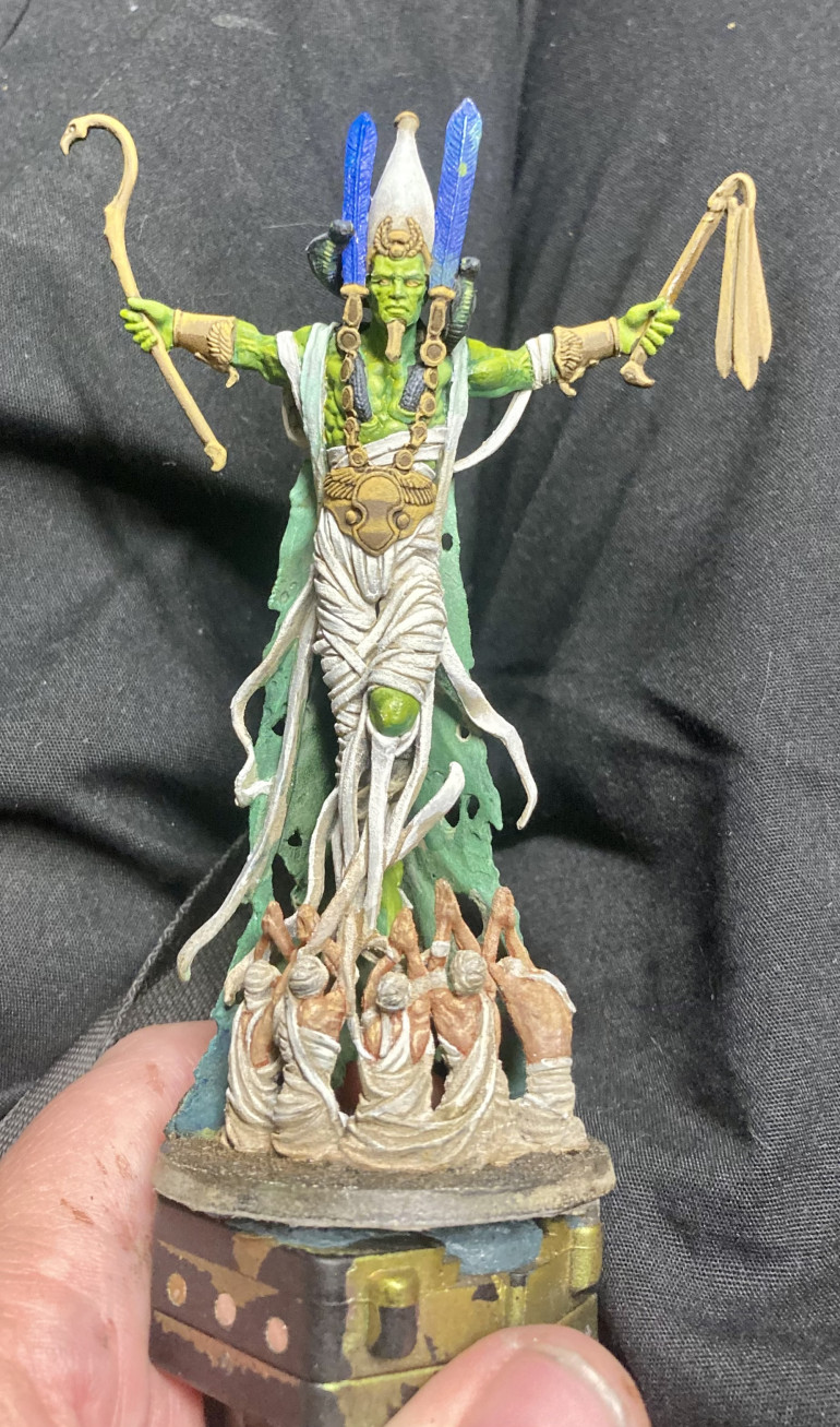
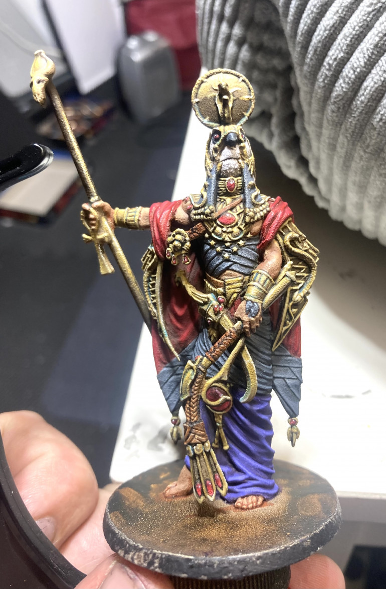
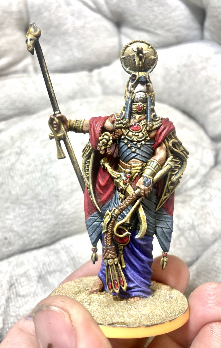
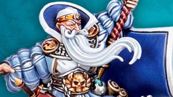
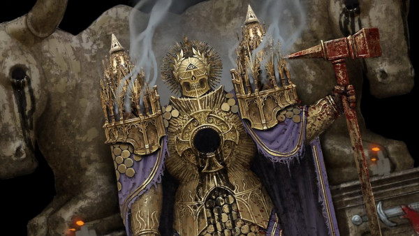
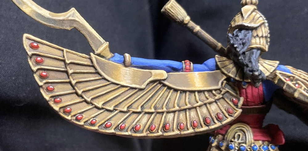
Ptah
Took me a dog’s age but now Ptah is done. And with that, all of the gods from the core box are painted.
Next up: the monsters.
(Edit: I neglected to shade his chin beard and the gems under his left arm so I went back and did that. Also, I decided to make the broad bits under his right gems and so went back and put in the bright white reflections there, bringing them into line with the rest of the gems. Whew! Now my OCD can take a break!)
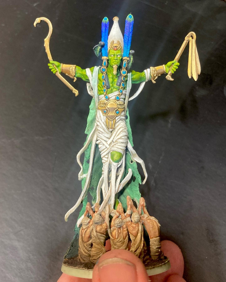
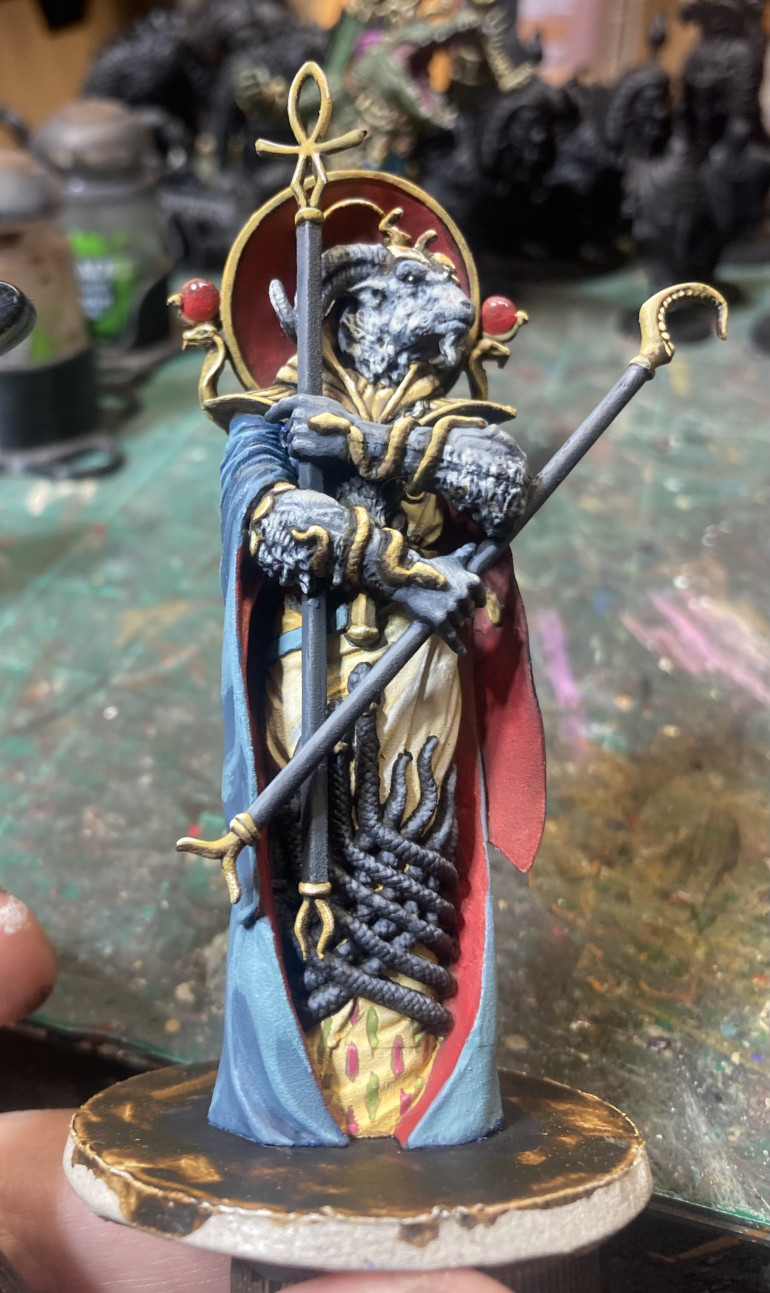
Osiris is done
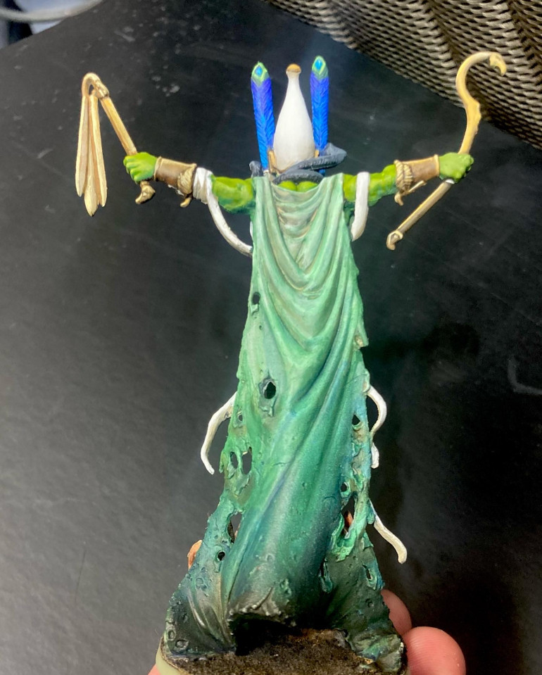
In the end I’m pleased with how he turned out. Nice gradient on the feathers, nice gradient on the back of his cloak, overall a dark and menacing, or at least somber, tone as befits the god of the underworld.
Jewels are good, NMM is so so. I may have to hit the NMM and his right eye again (it feels off but only in the picture) after I live with it for a bit.
Only one more god (Ptah) to go from the core set before I move on to the guardians. Hippos with nipples here I come!
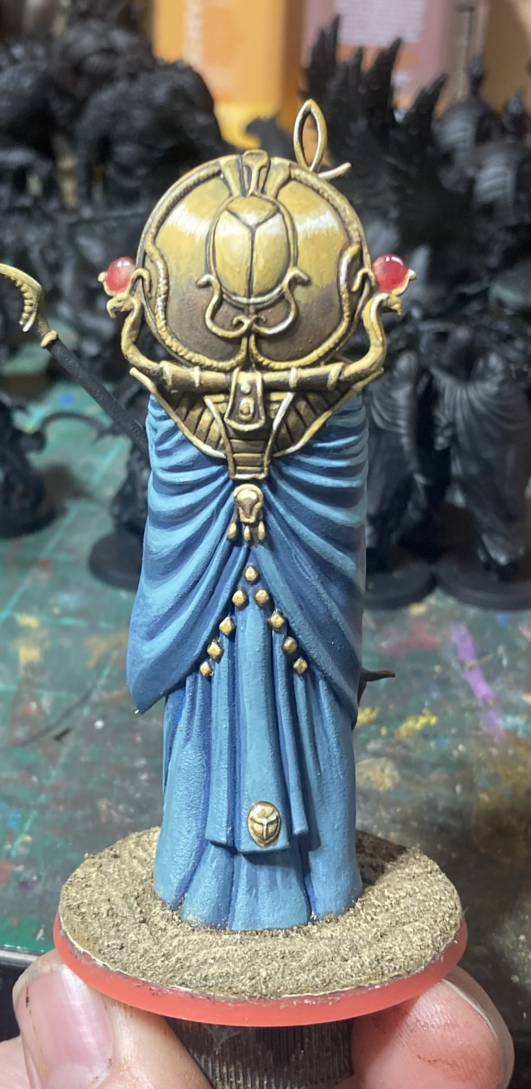
More Osiris
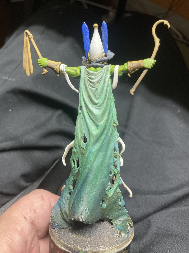
Still have to finish the NMM and his feathers. However, I think I’m happy with the cloak, particularly from the Lloyd perspective. I may mud it up a bit on the edges but I haven’t decided.
I had fun playing around with trying to create a gradient. I just kept using washes/glazes (I don’t really know the difference)—really just very thinned out coats of various colors. I could have used the airbrush but this was oddly relaxing for me.
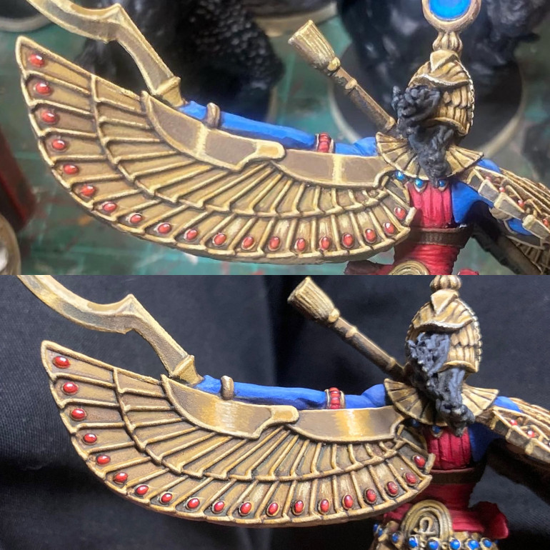
Another go
The top bit of the wing just wasn’t sitting right with me so I took another stab and I think I’m getting my eye in on this NMM stuff.
My new rule is that if it looks like metal when you catch it out of the corner of your eye then it’s good. If it catches your eye in a weird way then it still needs work.
Not sure if that was the bit that was bothering Gerry in the Hobby Hangout but I’m a lot happier with the result.
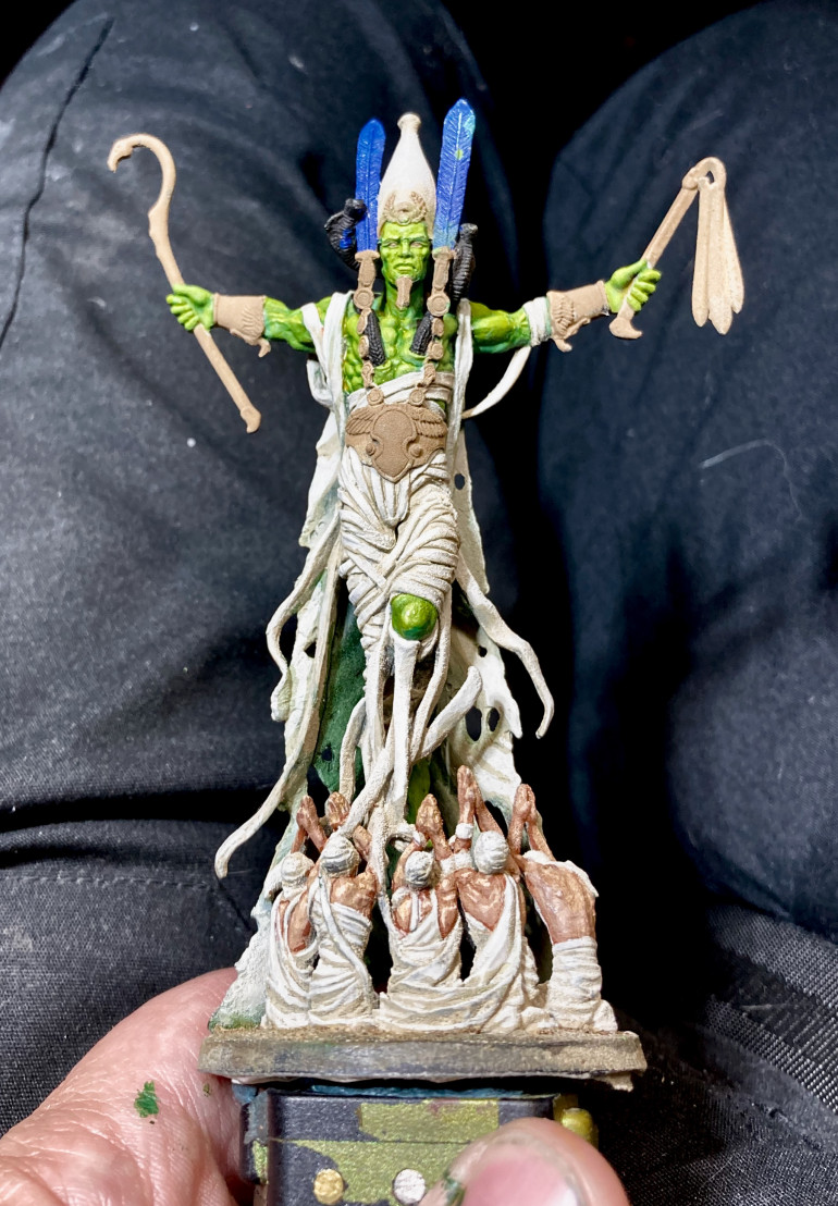
Osiris WIP
Osiris is a neat sculpt but, his garment(s) are pretty one note. I obviously still have a way to go on them but I’m trying to decide on a way to make him a bit more striking/interesting on the tabletop.
My current thinking: given that he is the god of the underworld (in CMON’s careful scholarship on Egyptian religion and culture–no really, as far as I can tell they didn’t name any of the gods after Kiwi farmers like they did with Rising Sun) I’m thinking shade up (literally: dark at the bottom, shading to bright/white the higher up him you go) from black to brown-green and then to the white/off-white of his wrappings.
Other suggestions are entirely welcome.
Also, I think my poor priming shows up here. It’s particularly bad on Osiris (though Ra was pretty bad as well). It was Army Painter white and I’ve had really good results from them most of the time. I suspect I didn’t shake the can enough and I’ve gotten a shaker that attaches to my electric drill to keep that from being an issue in future. However, my main plan to avoid similar issues is by priming with an airbrush–which, of course, will just shift my struggles to fighting with my airbrush. But at least I’ll learn a bit more about my airbrush and immediately see it if I have crap coverage.
Hold on now!
Woah duplicate posts! Woah I say!
I definitely did not do this. I’m guessing the server is having mega-issues.
Instagram PSA
It turns out that the Instagram gods don’t like it when you caption a post simply as “Isis.” At least, that’s why I think they removed my post. ?
Instagram PSA
It turns out that the Instagram gods don’t like it when you caption a post simply as “Isis.” At least, that’s why I think they removed my post. ?
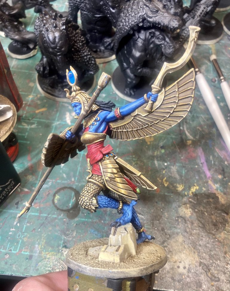
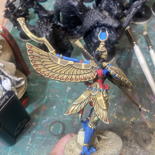
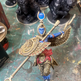
Isis
Another one done. Better pics to follow at some undefined point. I know, “promises, promises.”
For anyone who is curious, I’m pretty much just using the paint scheme laid out in the “How To” pamphlet that came with the Vallejo NMM paint set. If you want the pamphlet message me and I’ll send it.
I did take some “step by step” pics on this since it seemed that the XLBS consensus was that the NMM was worth the time and that some folks might benefit from my struggles with it. I’ll try and get those up soon.
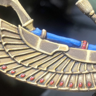
On this one there is a LOT of gold. And much of that was unnecessary as there’s a lot of gilding (red and blue) in the concept art. However, since I’m using this project as an opportunity to improve my NMM…I went full gold (never go full gold). And it’s working. I’m getting a bit better at capturing that ineffable metallic sheen. I can’t do it consistently yet but some bits on this definitely read as metal when you catch it out of the corner of your eye.
Next up: Osiris. Not much metal there but I get to play with green, maybe my weakest color…after blue? So that’s something to look forward to.
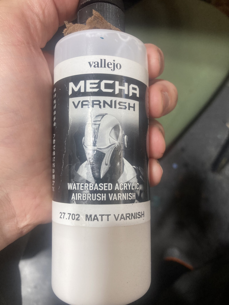
Varnish Issues Resolved
Thanks to Gerry for his suggestion to shake my varnish vigorously. One aggressive shaking/stirring later and the Vallejo Matt [sic] varnish goes on well and properly matt [sic].
So for all of you out there with similar struggles: just shake the crap out of it.
Okay…so the pictures don’t really capture the difference. First world problems. ?
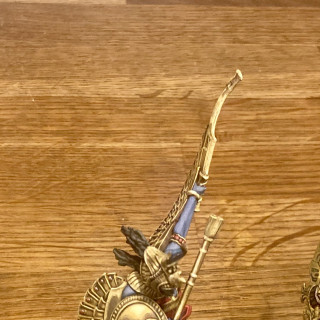
Amun
Definitely chose to keep some things gold here just to get more practice with NMM.
Overall, I’m really pleased with how this one turned out. I’m not sure what it is but a bunch of things seem to have come together. It has this soft, almost blurry, feel to it. Not sure what that is or how I did it but, for this game, I’m not hating it.
I feel like I get just a tiny bit better each time. The metal on this is better and the gems are pretty solid. The small amount of freehand on the skirt also worked out better than on Sobek.
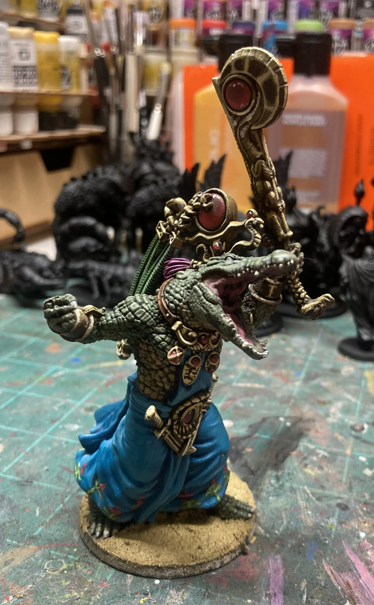
Sobek
I think the gold is a bit better. Still not sure. Many more to go to get practice.
Since this is turning out to be such a learning experience, let’s add another thing: freehand! There was such a big open stretch of skirt I decided to bite the bullet and paint in the flowers on the hem. Don’t know that it was an improvement but…I’m telling myself that the point is to push myself and to grow. I suspect that if I keep at it I’ll improve. Fingers crossed!
Ra
I think I did a slightly better job with the NMM on this one. Little by little.
I’m noticing a trend on these towards a more muted colour pallete. It wasn’t intentional but I don’t hate it. On the board it works well, though in other contexts I’d like things to have a bit more pop.
…and yes, I know these pics are mediocre at best. However, they do capture the weird rough/gravel texture I ended up with from the rattle can primer. I’m switching over to priming with airbrush whenever possible (ie whenever I have patience-#though that may be not be a big ask now that I finally figured out how to properly clean an airbrush) so that will hopefully solve the issue in future.
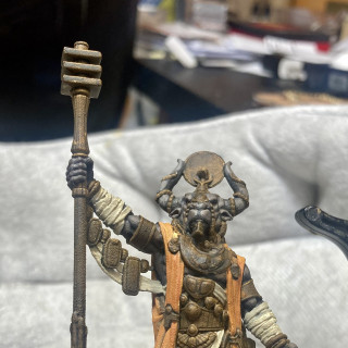
Anubis
Here’s a few poor shots of Anubis. He was a bit weird to paint given his very limited color pallete.
I’ve decided these Ankh minis will be a good chance to work on three skills I’ve been neglecting/haven’t really mastered to my satisfaction:
- NMM: I’m still not sold on it being worth the hassle but…I don’t know whether or not that’s because I really can’t do it well. Given the amount of gold on these minis, I’ll either have to master it or Detol them when I’m done.
- Gems:Up until now I’ve always taken the easy way out of painting a bright silver and then just using an ink. This is, again, a good chance to work on 5e we given the number of them on these models (Anubis only has a few compared to the others)
- Dry brushing: aside from rock/cement I’ve never used this technique much. I don’t know how much I’ll use it here but I’m hoping to learn. Maybe I can find some of that Brain Matter Beige everyone is always talking about.
I’ll say I’m not wild about the gold here in Anubis. However, that is hardly surprising as it’s maybe the second time I’ve tried this. I’ll keep at it and hope to improve. And though the pics seem to have been taken by Gerry, I’m pleased with how the gems turned out. Some work to do there but I was happy to see that they really aren’t that tricky. Just a bit of time and they really pop. Definitely painting my gems this way from here on out
Any suggestions/tips/tricks are welcome.
Help! Varnish issues!
Any suggestions would be appreciated as I am having serious airbrush varnish issues. I sprayed on the Vallejo matt [sic] varnish and it’s definitely semi-gloss at best.
Am I just spraying it on too heavily? Did I get a bad batch? Is this stuff just junk?
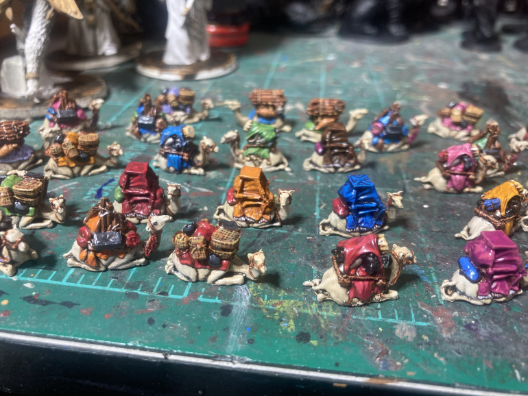
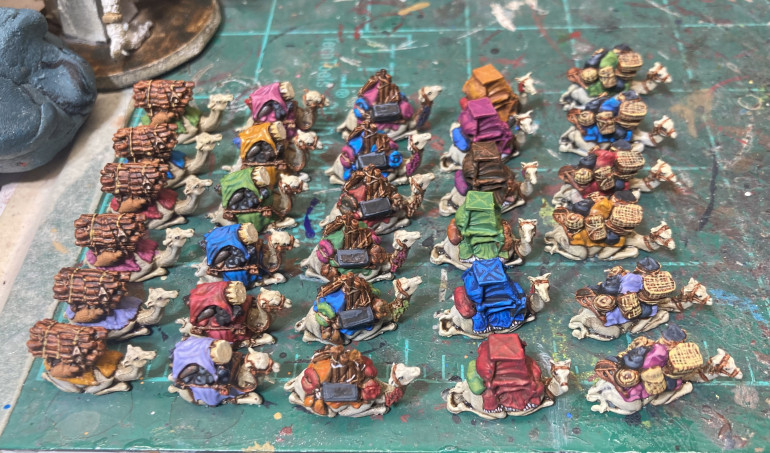
So many tiny camels.
I wasn’t sure I’d paint these. I definitely didn’t think I’d paint them with any care. Then I realized that these camels, the monuments, and the action markers are the only pieces guaranteed to make an appearance in every game. So bit the bullet and painted the little bastards up.
I hadn’t realized that there were 5 different sculpts. Seems like overkill but not in a bad way. I guess these got me ready to start painting 15 mm?




















![How To Paint Moonstone’s Nanny | Goblin King Games [7 Days Early Access]](https://images.beastsofwar.com/2024/12/3CU-Gobin-King-Games-Moonstone-Shades-Nanny-coverimage-225-127.jpg)
