Bot War Infesters Project
The true paint scheme begins
Colour theory is an odd thing, truth be told I’ve never actually owned a wheel but I do know how it works (and honestly I can find them free online) But this truly was the first time I actually sat down and decided that I would use it instead of just my eyes to help make my mind up.
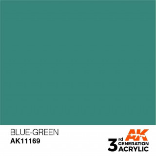
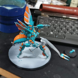
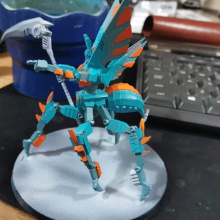
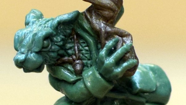
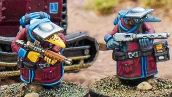
As inspiration hit me I knew one thing, a teal or green/blue or whatever other name you wish to use was definately where I wanted to start but it was a question of which tone, Id purchased enough of them, I still wanted light colours, not quite pastel anymore but I knew I wanted light to help compensate with the black lining that would follow when things were complete.
I turned to google to pull up a quick colour wheel and began to look, pinks? yellows? Well the wheel told me I was wrong, the wheel said it should be orange, Id used blue and orange before I knew it worked but it had to be the right shades and so I pulled out paint after paint until I found them
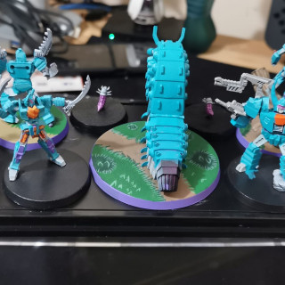
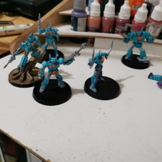
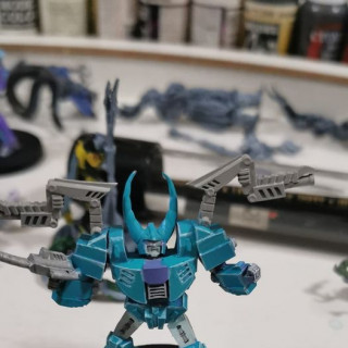
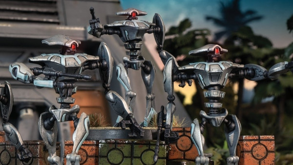
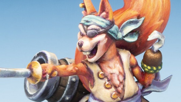
From the moment I started showing off the new versions of my Works in progress people were asking what the lovely blue was, honestly I’ve completely fallen in love with it, the main focus on the entire force it truly felt right but of course it was only half of the equasion.
Radium Red is such a weird colour, reminds me a lot of Wild Rider Red from Citadel but the opacity of these paints are just so much stronger across the entire range Ive toyed with so far. (Far from the entire range)
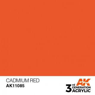
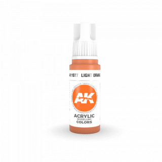
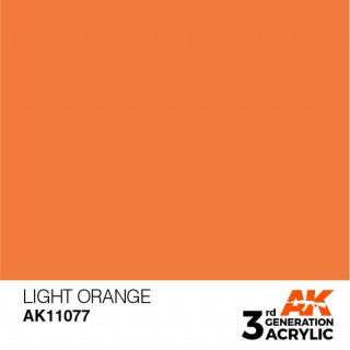
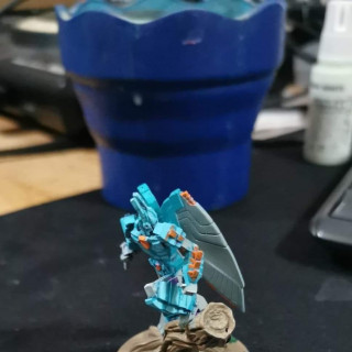
But truth be told in the case of my orange the highlight was the more important part. Light orange, something about the colour made me feel I could get the look I wanted, its a nice sharp contrast and it works for me nicely, so long as I don’t go overboard with the placement of my colours.
Its much lighter than it looks in the images, now I should point out a believe I have when it comes to paint brands very quickly.
AK Interactive 3rd Edition is just the paint range I am enjoying on these bots right now however I own a wifd range of paints, I am not here to sell you on them merely show you what I am choosing to use. If you are new to this hobby my genuine advice would be to try the brands available to you until you find the brand that suits YOUR STYLE of painting.
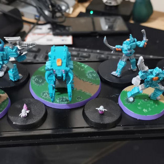
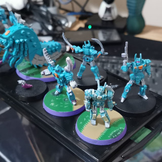
So this is what brings us to the current day right? Well yes. Largely blocked out colours and some strong highlights have begun but nowhere near finished yet.
I am not the most confident in the comic book style but this is something I am doing to push myself, it wasnt supposed to be easy.
So I hope that gives you a good indication of the progress so far, I still have a long way to go but thats why I am starting this now.



























Great write up.
I love the few AK Interactive 3rd Gen paints I have, I used them on my Destroyer and only have their yellows so far but that Blue-Green looks awesome!!!
The Blue-green and red/orange combo is really striking!
What surprised me about the line was good to use the usual weaker colours were, you mention yellow which for most lines is the weak point but I found it good to use as well. I ahvent used everything obviously but I’m still waiting to hit the lines weakness.
To the point where I felt like a salesmen writing my thoughts on it lol