Myth Week: How To Paint The Soldier Part Two
November 19, 2014 by elromanozo
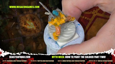
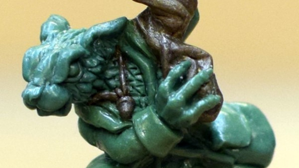
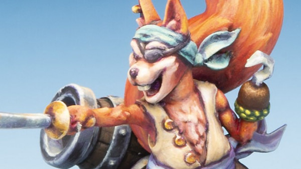
Romain continues with this painting tutorial on the Soldier from Megacon Games' Myth adding another level of painting to this hero bringing him to life on the tabletop. Have you been following along with this one?
Don't forget to comment to win!
How to Play Series
If your enjoying Myth Week make sure and check out all the How to Play Videos Below:
Supported by (Turn Off)
Supported by (Turn Off)
Supported by (Turn Off)

























@elromanozo hey man i noticed that you have a vast line of blue tones in your paint layout on the desk, is that just random or is that down to your own choice?
Ah, well… That’s just because I did a lot of blue in another tutorial, and we kept the set ! I generally like to spread out my hues in an orderly fashion where I can reach them, preferably the choice of tones I think I will be using. It helps when you don’t have to rummage through paint mid-tutorial ! 🙂
Some unique color choices. It’ll be interesting to see what get’s done to each and how they develop.
He’s starting to look good
yep, starting to look better
Looking good always interesting to see the process that leads to the end but I’m sure that end will be amazing as always
Can’t wait to see to final result.
Interesting choice of colors
Wonder how the final colours will look
Are the colours not deliberately bright and punchy to go with the game style and look? Looking good so far 🙂
Thanks for noticing ! 🙂
Yes, Part Two. Now Part Three pleeeeaaassseeee
Wow, some of the Myth videos are logging me out when I pull them up to watch so I cannot comment on them. 🙁
They look like great sculpts to paint
Will you please do longer videos…. these may be short and sweet like a roasted maggot but longer is longer…. to paraphrase Warren
Ah, well, that’s up to the editing team… Also, you can’t please everyone. Some people like it short, some people like it long…
Lets see when it is finished, so far Its veyr well painted but the colour scheme is just too bright for me.
It gets darker… But this is a cartoony figure, so I wanted to keep it kind of exuberant, not too dark.
Coming along very nicely
I wish I could paint minis better.
Not a big fan of the color scheme… Waiting for the finished miniature. 🙂
A bit right for my taste. Will reserve judgement for now though
(y)
That’s my Wednesday fix of Romain painting taken care of.
I was looking forward to seeing how Romain would do ginger hair for this guy. Having looked again at the basic color scheme so far, I can understand how green hair will look better considering the “cartoony” nature of the sculpt.
I think Romain should have his own regular hour-long show. I for one would love to put on the old smoking jacket, pull up the paint table next to a warm fire with a glass of fine beverage, and listen to him wax lyrical about painting technique and sundry musings. These ten minute clips just aren’t enough.
I heartily agree.
I have to agree, please give Romain his own regular show, ten minutes really isn’t enough.
Thanks for the support, guys ! Glad to know a weekly tutorial on backstage isn’t enough for you… lol.
I was worried about the choice of a redhead after you opted for an orange hued brown. The switch to turquoise makes sense for contrast.
Personally not a manga fan but I see why it works.
Eagerly awaiting part three.
Looking great! This may be the first time I actually try to mimic exactly what you’re doing in a tutorial.
Looking forward to seeing the finished product
I love the bright colours, looking forward to see the final result.
bring on the myth magic