Home › Forums › Painting in Tabletop Gaming › What Painting Method do you Use and Why? › Reply To: What Painting Method do you Use and Why?
Not sure if I’d be the best instructor. But digging up an artisans colour wheel somewhere would be a good start.
First thing is not to overdo it on the shading/highlighting. You add just enough of the adjusting colour to change the hue. That means that you can definitely shade yellow with purple, but you don’t add so much purple to the yellow that it no longer registers as yellow (meaning very little, as purple is a very strong colour and any yellow is easily outdone).
Some knowledge would include complimentary colours, which are colours that are close to each other on the wheel, contrasting, which are opposites and know the difference between warm and cold colours. Including huge parts of the latter on the model can clash, creating an inconsistant tone, depending on what you’re going for.
Red and blue are basically polar opposites. If you shade both with the same purple, you can make the model look easier on the eye. Seeing as when you mix red and blue, you get purple, you could even use them to shade eachother.
With this knowledge: you can also use colours on the cold side of the colour wheel to make a model look colder, which often fits darker themes. Even if you give a chaos warrior a red bright red cape: shading with blue can create a more sinister look. Than use white to highlight, careful to not get to pink and get a nice de-saturated look. I maybe would even use a light bone or even an elven skin colour
Remaining close to red and shading with ‘redder’purple, will retain the red’s colour value. Make it pop with yellow and it will be nice, birght and heroic.
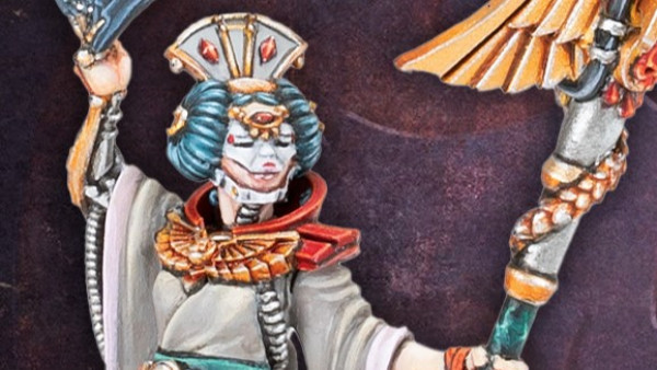
Using the same colour for differen parts of the model allows you to use high contrast while the model still feels as one whole. I’ve painted a model in a turquise kimono with a reddish sash, opposites again, but using the same blue to shade and the same yellow to highlight, it becomes a lovely piece.
You can also experiment with shading with black for a de-saturaten and natural look if the material requires it. Even browns (Not that some browns do have a reddish hue). Use whites for the same, or grey (some greys have a blueish hue).
The weird thing is I’ve concluded, you can basically mix anything: You can shade yellow with green, blue, purple, red, brown or black for instance. They just all create a different effect. That might make it more confusing, but you just have to learn what effect you want for your model.
Green will make it maybe a bit sickly, maybe fit for some nurgle mini’s
Red will make the colour really vibrant and warm. Good for rich clothes or flowers
Purple and blue will cool the yellow. Making it easier if combined with a cooler scheme.
Brown and black will de-saturate it and create more natural feels. Good for many plants or subdued clothing.
I’m not an expert painter and this is just at the top of my head. If you experiment a bit, you’ll get a feel for it. I mix al lot of paints these days. If I use anything strait out of the bottle it’s the base coat, but even that’s rare. Hope this helps.












![How To Paint Moonstone’s Nanny | Goblin King Games [7 Days Early Access]](https://images.beastsofwar.com/2024/12/3CU-Gobin-King-Games-Moonstone-Shades-Nanny-coverimage-225-127.jpg)


