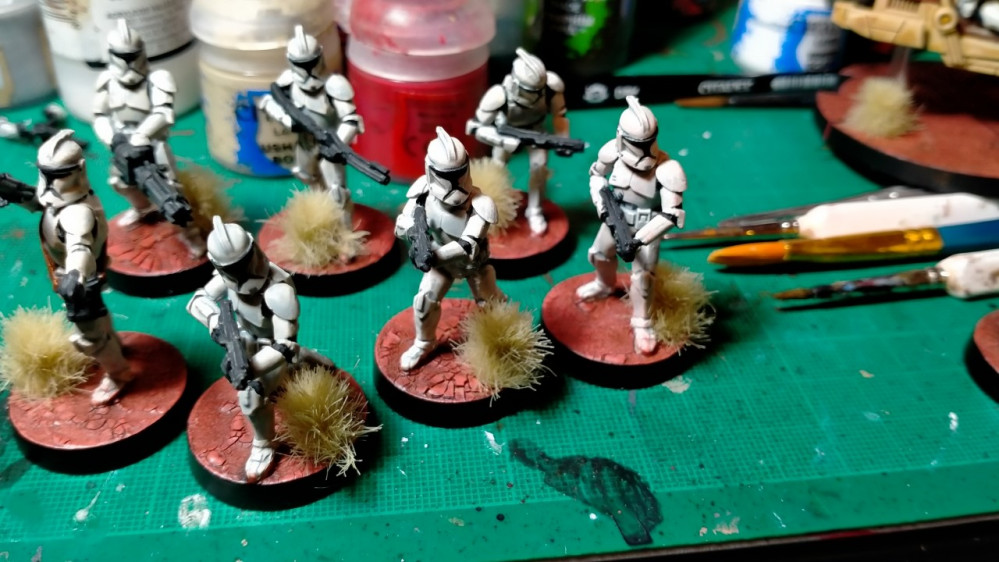
40K and Sci Fi Projects
The good the bad and the ugly
Prime these two white
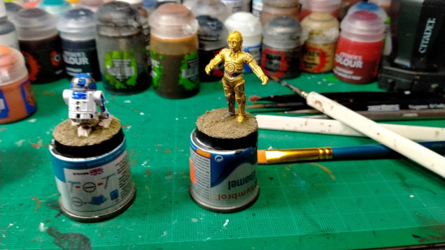
Thanks to the white undercoat when I painted C3PO in Leadbelcher and Retributor Gold the white undercoat showed through on the highest edges and naturally worked as a hightlight. (It doesn’t show well in the pictures but it works).
Khorne Red and Ultramarine Blue are up next to pick out a couple wires around his midriff.
All in all C3PO came out pretty good.
For R2D2 I used Ultramarine Blue and Lead Belcher, with some Nun Oil for the vents. Ultimatelt I think the colours are in the right places (even though it was more difficult than you’d think fo rdecent shots of R2, especially his rear) but they are a bit too dark for my liking. So not too bad.
If I were you doing this again I’d layer a light blue and steel colour over the top to brighten.
Prime White
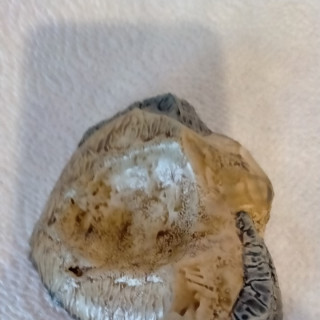
Skeleton Bone Contrast for Sand
Basilicanum Grey Contrast for Rocks.
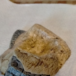
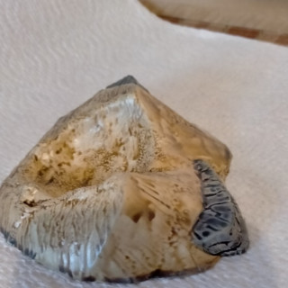
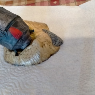
So as you probably know and now I do too, the contrast paints do not work well on larger flat areas. Even adding more washes a dry brushes do not help. I’d also recommend not using white primer and stick to Wraithbone, I believe this makes the problem more aparent and I found the paint did not adhere well to the surface.
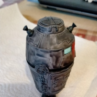
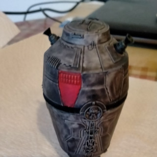
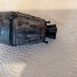
Ok so this mini was one massive pain in the arse,I had no enjoyment whatsoever. It be ugly and I’m not going to fix it, but here is my cack-handed way not to do it. On an asside watch when applying Black Templar to a pure white undercoat, it gave the contrast paint a greenish tinge. Also large flat panels, verticallity and cylindrical shape means that tide marks and streaks are ridiculous when using contrast paints on this model. Also the paint was adherring so badly it was almost impossible to drybrush without the brush or my fingers removing paint. It is now wrapped in kitchen roll to protect it until spraying weather returns.
Basilicanum Grey – the main body of the pod
Black Templar – thrusters and base
Blood Angels Red – a couple panels to break up the grey
Aethermatic Blue – Windows
On a final note I used two or three coats, it did not help, don’t waste the paint.
So there you have it, the good, bad and ugly in the latest part on my project. The next task is actually convincing someone to sell Starwars Legion stuff.
I’ll keep this updated between now and next year.
































Leave a Reply