Starminer Builds…Crimson Fists Display Board
Recommendations: 136
About the Project
A step by step instruction and pictorial project report of how I built my Crimson Fists (or Ork if I feel cheeky) display board. Useful for displaying miniatures and armies for tournaments, displays, and photography. While specific to one army, you can use the same techniques to build something more generic, or purpose built to your own custom themed miniature army.
Related Game: Warhammer 40,000
Related Genre: Science Fiction
This Project is Completed
Part 1: A Vision and a Plan
Introduction
This is not a new project, being completed several years ago to participate in a friend’s tournament, but as this is my first project blog (I’ve been very quiet in the hobby scene for a while due to life changes), I figured I would bring something that, to me, is a timeless piece of 40K lore to a little bit of life.
The Vision
If you are like me, you enjoy displaying your army in a unique themed way. Especially if you are playing in a larger public setting, like local tournaments, narrative play events, or in presentation competitions, such as Games Workshop’s Armies on Parade. Often, such events recommend, if not require, a display board of some sort.
As a grognard who has played Warhammer 40,000 since 1st Edition, I have always had a Crimson Fists army of one iteration or another. And though I’ve sold off, gifted, or traded many units from the army, they have always fascinated, and been a chapter I have loved for that nostalgia factor.
I continue to grow it as new models appear that grab my attention and would make suitable narrative story additions. It’s gradually grown and changed over the years but one thing remains, their stalwart determination to recover, rebuild, and overcome overwhelming odds time and time again.
The narrative of the destruction of their citadel on Rynn’s World tells their whole story in a single moment, and can be captured in a single image. So what better narrative for a themed display board for this army than a ruined Crimson Fists chapel, or administratum building?
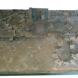
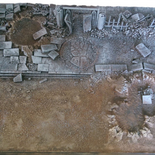
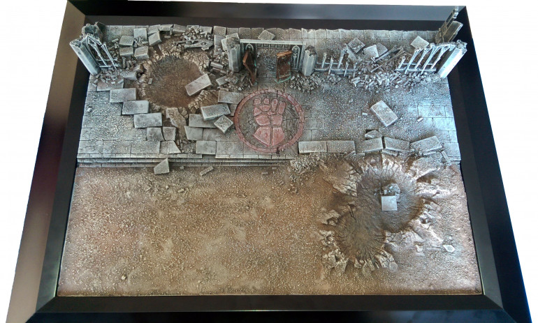
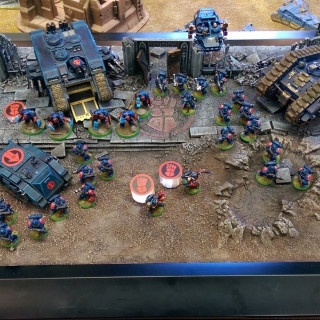
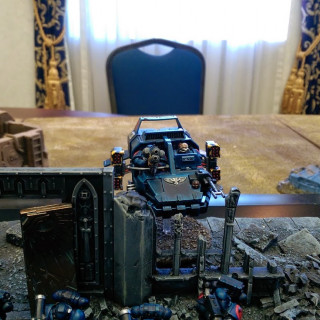
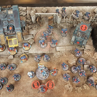
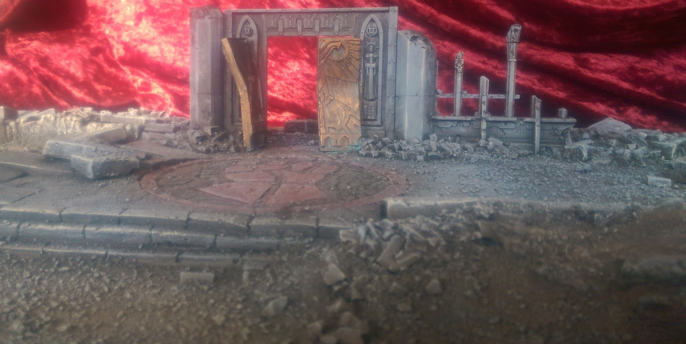
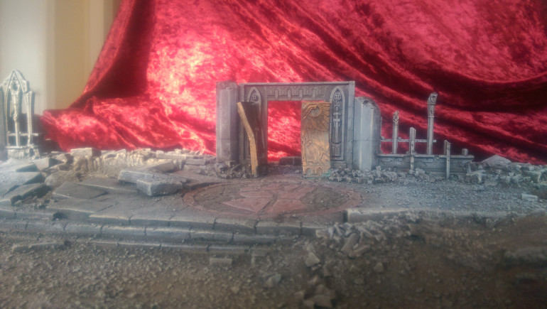 The completed board. This Ruined Crimson Fists structure sets the scene for a timeless narrative of their driving lore.
The Plan
Now that I have a theme and image in mind, I needed to come up with a plan to bring it to fruition.
You don’t always need a plan, and freeform terrain building is fine. But there is usually a vision that drives that, and often you find yourself shifting gears as plans formulate in your head when you get to work. That’s a perfectly valid, and fun way to build terrain. But for this, I had to meet certain criteria.
So, I listed my goals:
- Tell a narrative story.
- Display a reasonably sized Warhammer 40K army.
- Conform to display size limits for tournament or army painting competition.
- Easy to build.
- Portable.
- High quality finish.
I already had my theme sorted, so the narrative story followed. I planned to have the army emerging from the ruins of a chapter building, with their chapter heraldry prominently displayed.
The size followed. As the most important thing for me was to be able to use it for GW’s Armies on Parade, it had to conform to the maximum size of 24″x24″. This was handy, because most reasonably sized Space Marine armies at the time could easily fit in that space.
Making it easy to build would be sorted by sourcing a wooden art canvas and frame of suitable size from the local art supply store, which was sturdy, light, and had a nice finish.
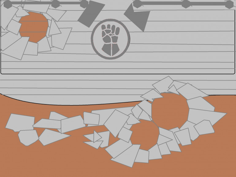
Being armed with that information, I sketched out my concept to approximate scale.
Part 2: Solid Foundations Never Fail...
Building the Display Tray
Before I could begin building the display board, I needed to build the base of the board.
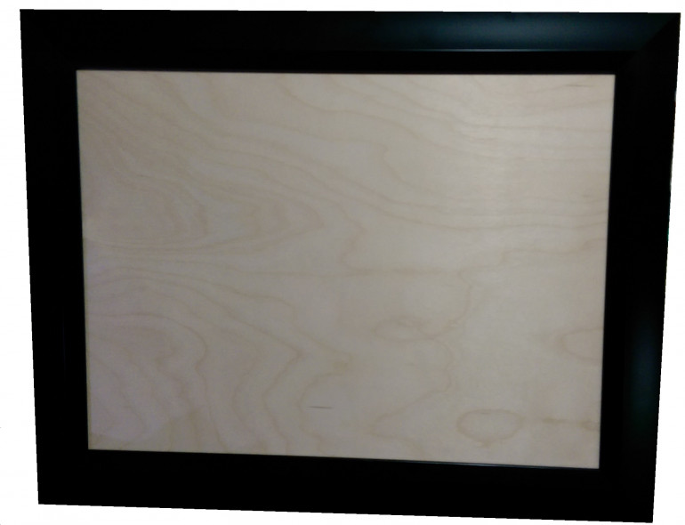
As mentioned in Part 1, this had to be both durable, and portable, and look good at the same time. As this was not intended to be a playable board section, I knew right away the best starting point for this would be a wooden painter’s board and a simple sleek black frame.
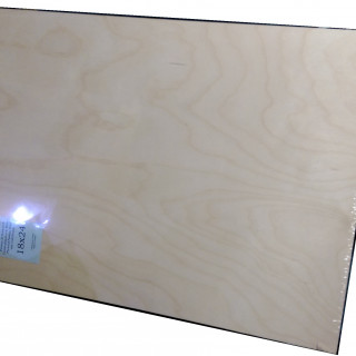
The board was a thin yet sturdy birch ply mounted to a square pine frame. The picture frame would give it a nice finish, and act as handles to carry from table to table during a tournament.
A trip to my local art supply store had that quickly sorted.
To remain within the 24″x24″ maximum footprint, I selected a 18″x24″ board and frame. The reason for this was two fold.
First, there were not any frames in stock at 24″x24″.
Second, I felt it would be awkward to carry around at that size, plus the display frame adding a few extra inches in each direction.
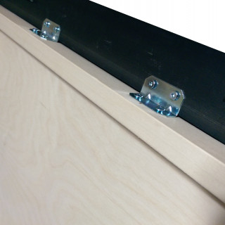
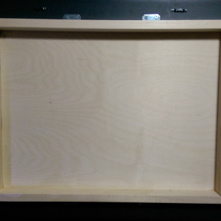
I then grabbed some angles and wood screws from the local home improvement store, and mounted the board to the frame. To avoid splitting the frame, I drilled pilot holes for the screws, then screwed them in by hand.
I used a total of 8 brackets, 4 per side, to ensure maximum security and stability.
Satisfied with this, the next step is layout.
Part 3: Best Laid Plans
Laying Down The Layout
Now that I had a strong sturdy board and frame assembled, it was time to draw the layout on the board.
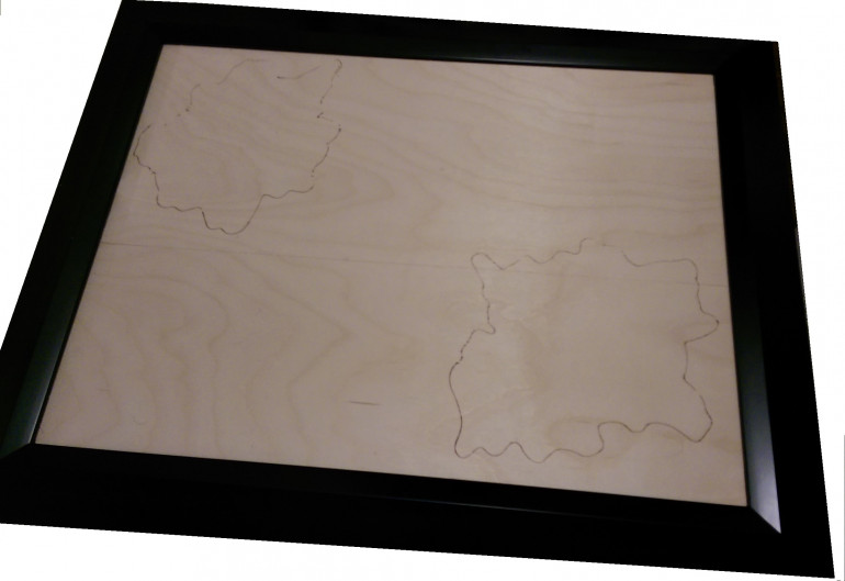
Referencing my original concept drawing, I grabbed some suitable Games Workshop plastic craters and positioned them roughly where I wanted them. Here, I just eyeballed them for what I thought would be best aesthetic, positionally. I also laid out some of the walls to determine my preferred position.
When I was satisfied with the crater positions, I traced them out on the board so that I would have reference for when I began gluing everything down later.
Breaking Ground
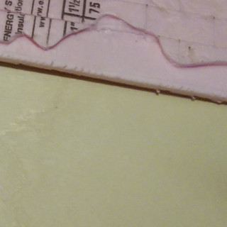
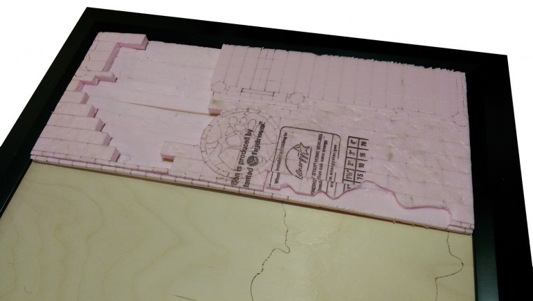
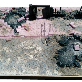
I then started cutting the foam insulation board to the desired length and width, and with the aid of the layout, overlaid the craters and traced them onto the foam. After drawing the rest of the detail on the foam, I started cutting and shaping the foam.
To do this, I textured the foam using various rough stones from the garden, focussing on the outside of the wall, as I wanted the inner stones to feel more refined as stone floors. I then traced my drawn out detail with a hobby knife, about 2 mm deep. Following that, I used an embossing tool (a ball point pen works perfectly for this) and traced all of the cuts to give it a little more depth and shape.
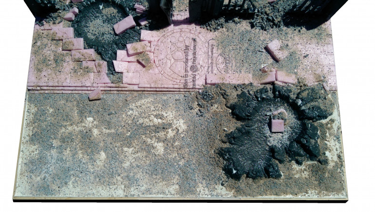
At first I cut following the exact perimeter of the crater, but then I realised I wanted the craters to look like they had sent the large stone paving slabs flying, as the bombs penetrated and detonated below the concrete.
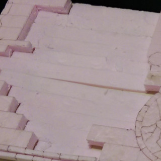
So I cut the rectangular blocks more deeply around the crater perimeter, then ran the knife under the surface by half the foam thickness, prying up the blocks a section at a time. The blocks with irregular shapes would later be cut down into additional rubble.
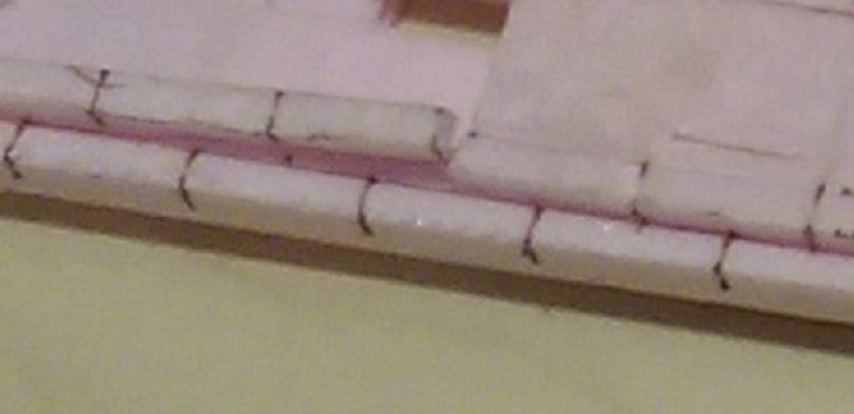
For the step curb, I measured the foam, then divided it by thirds. I cut a square long strip from the edge that would be the curb. I later glued it into place to make it a uniform 3 step curb, to make the building feel like it was elevated above the ground grade, without it being an out of scale curb.
With all the foam cutting and texturing complete, I was ready to move on to gluing everything down and building up the ground textures, the ruined building and rubble.
Part 4: Terraforming
After the foam insulation was carved out to my satisfaction, I was ready to move on to gluing everything down and building up the ground textures, the ruined building and rubble.
I first glued down the foam using some construction adhesive from a caulking tube. On top of that, I repeated the process to glue the craters down onto the foam and on the wooden base of the display.
I blended the edge of the craters using an air drying artist fiber clay from a local art supply store. This stuff was not cheap, but it was easy to use, and stiff enough to shape and sculpt almost right away. Now, I would probably go with the Sculptamold stuff, or similar product you can self mix, for the cost, as the effect and method of shaping is essentially the same. When it’s starting to dry, smooth it out with a few drops of water and your fingers or a tool.
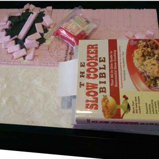
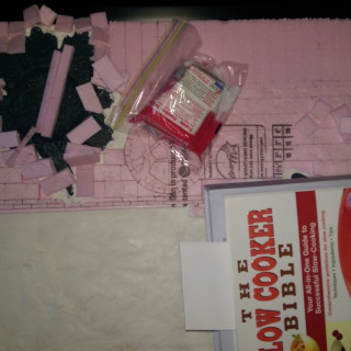
Here you can see it drying. As the double crater was sticking up, I weighed it down with some heavy cook books until the construction adhesive cured. I arrayed the broken blocks around the craters to get a feel for how it might look.
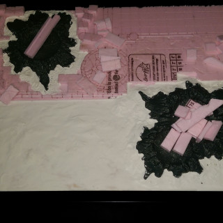
After the craters and the clay were dry, I added additional clay around the crater to further blend the edges, as they were slightly off since the crater kept warping. And while that clay was drying, I began gluing down the ruined stone slabs and the ruined walls of the building.
This was followed up by adding finer rubble made from chopped up plastic sprue mixed into a course and fine sand mix. I glued it around the walls most heavily, and around the craters, where there was structure. I purposely didn’t add too much here, as this was meant to represent an older ruin which would have a lot of the debris blown and cleared by storms, and because I was planning on adding more mixed sand mixture across the board to add textural interest.
I left this to bake in the sun and overnight until the glue was fully cured. Misting it several times with watered down PVA, to ensure a good solid surface texture.
Going back and looking at the original sketched plan, I was very happy when the proportions and basic layout were actually very close to original concept!
Once it was dry, it was ready for paint!
Part 5: A Lick of Paint...
As any good Real Estate agent will say, “A lick of paint will really spruce it up! It’s practically move in ready!”
With that in mind, I broke out the craft paints, big brushes, rags, and a big pot of water and went at it with gusto.
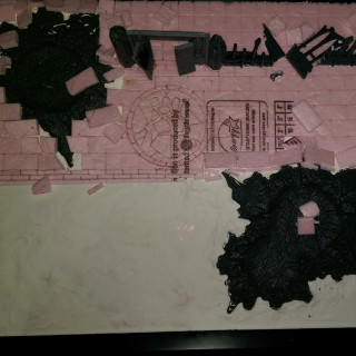
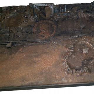
I started with a full black base coat. I just poured the craft paint directly onto the terrain and spread it out with a damp brush until everything was completely black.
While wet, I then blocked in the other colours, a blue grey for the walls and stones, a mid-tone brown for all the earth and craters, and a medium red for the Crimson Fist icon. Again, I did this with a big sloppy brush, and very wet paint. Finally, I gave the whole thing a focussed black wash in the areas where a little scorching or lots of pitting would be effective. Here you can see the before and after while wet and dry.
After the basecoat and wash were completely dry, I then started working on building up the colours.
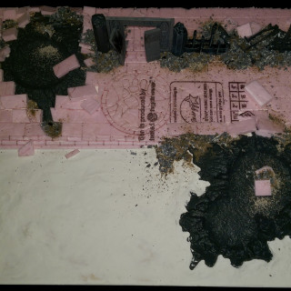
This was all done with drybrushing and a large 2″ painters brush. The earthen areas were drybrushed the medium brown, progressing up to equal mix of brown and tan, then a final lighter drybrush of pure tan.
The stone and walls were drybrushed with the original blue grey, then an equal mix of the base colour with a pale grey, and finally a light touch of pure pale grey.
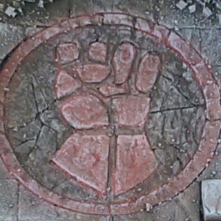
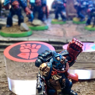
The icon was drybrushed similarly, to give it the impression of aged tinted stone. I then went back and with a heavy dilution of the original colour, stained the icon again, so that the lighter grey underneath naturally highlighted it. Finally, when dry, I gave it a very light drybrush with the pale grey.
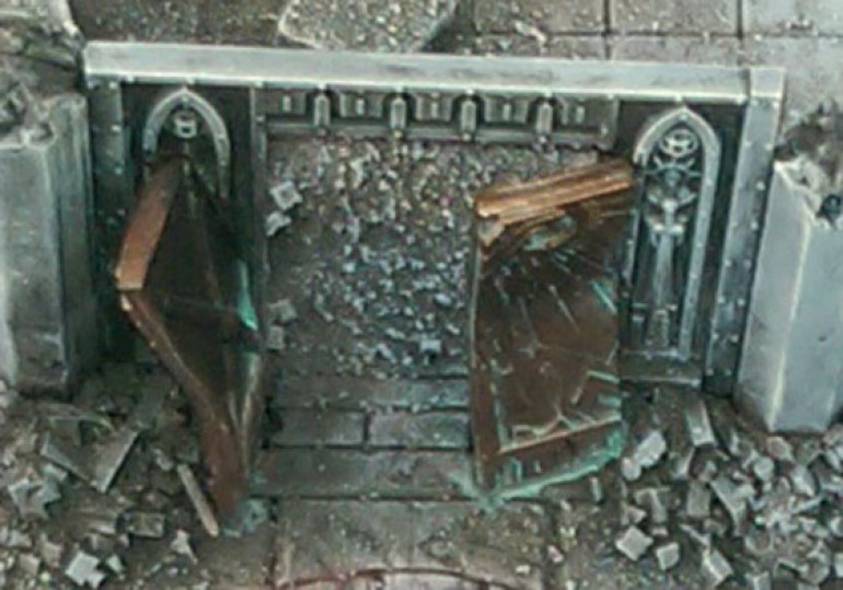
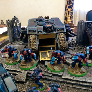
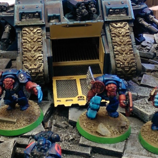
The doors were painted in a solid dark bronze, then drybrushed to highlight with a pal old gold. This was then given a heavy wash of a pale turqoise. Followed up with black stippling on the side that appeared to take the blast, forcing it open.
I touched up the rest of the board stippling in black in the same areas as I had done in the earlier part of the painting process. This reinforced the scorching, without making it look too fresh, helping convey this was an older abandoned ruin.
Finally, I painted the wooden base in solid black so it would blend in nicely with the frame.
Once painting was complete and dry, it was a simple matter of mounting the display board to the frame, resulting in a simple yet effective themed display board which can do triple duty as a display for my reclaiming Crimson Fists, my conquering Orks, and my Imperial fists sent to recover lost artifacts.
To say I’m pleased with this display board is an understatement. It has served me well at many events, including an Armies on Parade or two.
Next time, I’ll post some photos of the final product proudly displaying some miniatures! Move in ready indeed!
Part 6: Field Parade
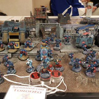
All of the build and painting of this display board was for participation in a friend’s tournament. And I got it done just in the nick of time. The paint was just barely dry when I packed it up and set off for the tournament.
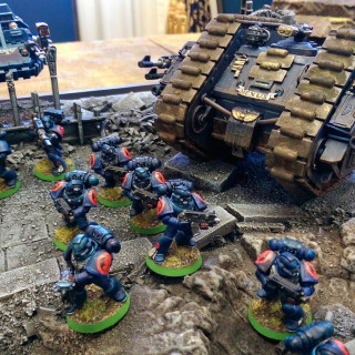
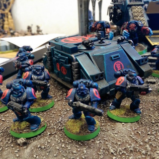
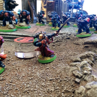
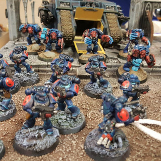
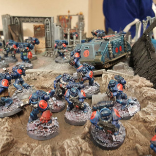
Unfortunately, I still had not updated my bases, and they still had the retro green rim. I always hated green edged bases, from when these were originally painted for 3rd edition and I was determined to change them to match the new display board as soon as possible, including a nice size upgrade.
Shortly after that, I went and updated the bases for the whole army. They were built with the new standard 32mm round. I piled them up with resin GW ruined city basing bits, and covered them in grit and sprue rubble.
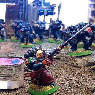
They were painted in much the same way as the display tray. However, to differentiate squads, after a base coat of dark brown, I drybrushed onto the wall rubble various different colours. Each squad had a unifying colour, as if they were marching through the rubble of a specific building. I used a muted red, a muted green, muted blue, etc. This was all then drybrushed over with the same greys as the display stand.
This is one simple trick to help more obviously differentiate different squads, especially those that forgo squad markings. And helps keep things more clear in the heat of battle.
This wraps up the project thread. I hope you all enjoy it, and find something useful that you can use to build your own display board, or even adapt into terrain building.
Happy gaming!

