Lonkelo's Burrows and Badgers
The Knights
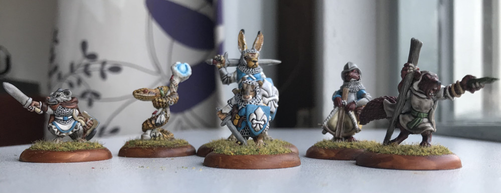
I went with the Starter Warband A from Oathsworn, which lends itself as a good starting force for Royalists. I decided to go with trying to build an Order of the Crown force. I haven’t found much additional information on this faction, except for the short description in Sternpaw’s Almanack, issue 1. They did give a few colours that are normally associated with them, and among those is the blue scheme, that I picked.
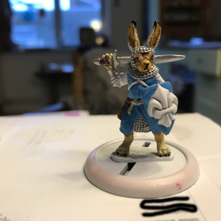
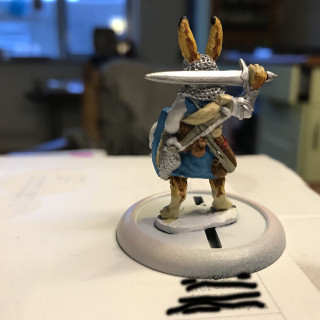
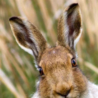
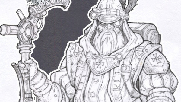
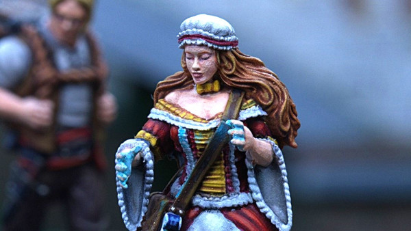
I started off with painting the two knights. The first is the Hare Knight. What I really like about this miniature is that it has a nice contrast between the hare as a feral animal and a role in society that is defined by a code of honour and duty. I’ve been trying to represent this by the clean blue/white theme of the livery and the wild colours of the hare’s fur. My main reference can also be seen in the image galery above.
The idea is to use a dip to finish the mini’s off. It has worked out nicely in the past for me, especially since I’m a bit of a lazy painter. I’m going to dip them all at the same time, I think, once I’ve finished painting them. After that I’ll do a matt varnish spray and maybe pep up a few highlights. That’s the plan anyway.
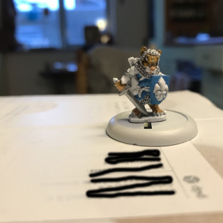
This is the Mouse Knight; the smaller equivalent of the hare. I’m still working on painting this one, as you can see. For the livery I’m sticking with the same blue and white. Note that, like with the hare, that the sword’s crossguard is the same colour as the blade. Until now I would usually paint it gold or bronze, but it didn’t seem right to me this time. A knight would want a crossguard just as sturdy as the rest of the blade. I think/hope the dip will accentuate their being different parts of the sword in the end.
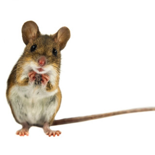
For the mouse’s I’ve tried to go with a standard brownish colour (see the third image). It turned out a bit more wild-looking, which I think I like. I hope it contrasts enough with the hare in the end and won’t look too much like a ‘Mini Me’.
















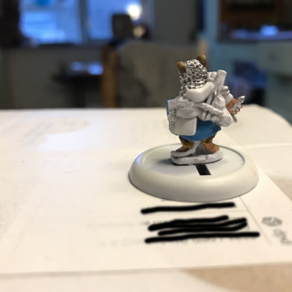




You might want to edit the pictures with your postal address on it 😉 Nice paintjob though 🙂
Hah, well spotted! It’s some company’s address actually, so any fan or hate snail mail will unfortunately (or fortunately) reach them instead.
I should perhaps remove it though. Otherwise I’ll have to charge them for the extra publicity ;D
Wonderful work on the hare’s ears. Looking forward to following your progress.
Thanks! I was quite pleased with that myself 🙂