Nemesis Painting Project
Recommendations: 65
About the Project
The Nemesis Boardgame figures are worth painting to improve the value and fun of the game. This project will take the figures from bare plastic to wargame quality pieces. Unfortunately, I erased the picture of the bare plastic; thus, the project starts with zenith primed figures. The figures were spray primed Army Painter black, zenith primed from a 45 degree angle with Games Workshop which is a light sand color. The final zenith priming was from almost directly above with Army Painter White.
Related Game: Nemesis
Related Company: Awaken Realms
Related Genre: Science Fiction
This Project is Active
Contrast Paint: Crew, part 1
The base game has six characters. Each are identified in an unpainted state with an ugly color plastic ring: Yellow, Blue, Green, Purple, White, and Red. I was asked to paint each of the crew to match the color associated with the color ring assigned by the card stock character card.
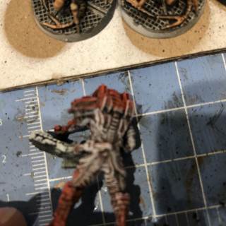
Each figure was primed black and zenith primed sand with a final direct highlight of white…my normal technique. Little did I know that the Games Workshop Contrast Paints have varying efficacy with my preferred priming method. The results of the first coat of contrast colors was satisfactory for the highlights but areas that should be shaded, came out looking messy with poor coverage for Yellow, Blue, and Red; while Green, Purple, and White looked fine. Not great but fine. The flesh also came out poorly. Please reference the first three pictures to see the results. Obviously, correction was needed.
I looked over the figures and determined some targeted dry brushing might work. Using first grey and then white, I covered the shadowed murky areas. My last few pictures of this entry show the figures ready for another attempt at Contrast Paints.
Addionally, you can see the results of the first coat of Purple to the carapaced aliens; flesh to the facehuggers; and, metallics to the bases.
I’m still not a fan of the process. Tune in later to see the corrected crew uniform colors and a second attempt at the flesh.
Uniform Colors: Iyanden Yellow, Talassar Blue, Militarum Green, Shyish Purple, Apothecary White, and Blood Angel Red.
Human and Facehugger Flesh Color: Guilliman Flesh.
Alien Color: Shyish Purple.
Metallic Colors: Gunmetal (base) and Chainmail (highlight)
Step Two and Three: Test Paint and Preparing the Bases
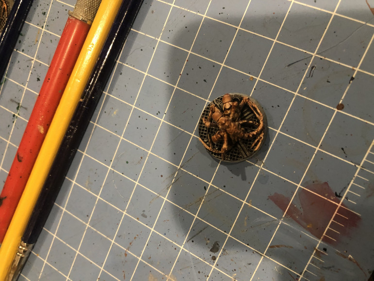
 Each of the bases is painted with Gunmetal and then dry brushed with chain mail. I prefer to execute this process early because dry brushed metallics can get everywhere. Then, I correct any overpaint on the dry brush with the priming color...once again, I misplaced that photo but this test paint captures the base nicely. I had been requested to paint the adults purple. By using a diluted purple similar to the Games Workshop Contrast paint process, the purple settles nicely into the primed crevices taking care of most of the shading.
 By the way, I tried the Contrast Shyish Purple on another adult and was surprised the results were nearly identical. I will be using the GW purple on the rest of the figures.





























![How To Paint Moonstone’s Nanny | Goblin King Games [7 Days Early Access]](https://images.beastsofwar.com/2024/12/3CU-Gobin-King-Games-Moonstone-Shades-Nanny-coverimage-225-127.jpg)
