A Mighty Orc Takes Command In Twelve Elements Of War
July 14, 2014 by brennon
Sword & Board Games have shown off a rather awesome looking render for their Orc Chieftain that's been named Phebrickid (such a strange name) by a competition winner. See what you think of the render below for this mighty warrior...
I think the miniature is looking very cool and I like the mix of tribal gear and that sword that looks like it's come straight out of a Conan story. Once again the miniatures have had a lot of care and attention put into them and it really shows. It's great to see more from these guys!
Once again I might end up falling into the trap of picking up miniatures just so I can end up painting them and having them on the shelf!
What do you think?
Supported by (Turn Off)
Supported by (Turn Off)
Supported by (Turn Off)



















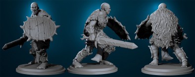





His fancy armour is at odds with the crudeness of his shield but I like that his face is less cartoony than other orc ranges (not just *that* range either :)).
I was thinking something along the same lines as you where about the face not being cartoony. The only problem I have noticed with the 12 elements of war range so far is that many of the races look to much alike. I am fully aware that each faction has a mix of all the races, but the races seem to only have some slight variances that can be spotted up close.
really like the armour on this 🙂 the fur looks really cool too with all the curls too 🙂
really glad to see these guys got the help from the
” secret unnamed miniatures company ” 😉
looking forward to painting some of these guys, especially the mining guild troll 🙂
I’m delighted with how he’s turned out! He looks so brutal and terrifying, everything that I was expecting from his initial description and more. I got to name the fella’ too, which was pretty exciting! It is a bit of a weird name Ben, I’ll give you that, but I’ve always liked it for Barbarian and Nordic characters because of the harsh ‘k’ sound in the middle and a ‘Ph’ is always preferable to a boring old ‘F’ as far as I’m concerned. 😉 Phonetically I would pronounce it something along the lines of ‘Fee-brick-id’ personally, if anyone was wondering.… Read more »
I quite like it. I agree that the shield seems a little out of place with the rest of the gear but otherwise I’m pretty sold on the mini.
Each faction has its own distinct style, rather than racial design, which makes sense when factions are interracial.
The more naturalistic face is a big plus imho over the usual square jawed look.
Agree about the cloak texture, but hopefully that will be one of the things to be tweaked, as mentioned on the webpage in the link
I would remove the spikes from the top of the shield though. No point trying to damage yourself when there is a bunch of dudes trying their level best to do that for you lol
oops I should have said I disagree about the cloak texture, Sorry not a fan of the curly, though if the individual locks get some texture that would help a little
Looking a tad too much like Chthulu’s tentacles atm
I certainly agree with you on the cloak- it just look odd. I mentioned it to Tristan on the facebook page and he did say there were still some tweaks to be made, hopefully the fur texture is one of them.