The Founding
Colour scheme
I want a colour scheme that is very easy to do and still looks good. but i don’t want to be spending my time painting all the little details. I have a habit of spending far too long when painting, being a bit of a perfectionist, If i ever want to complete an army i have to learn when the right time is to do all the fine details.
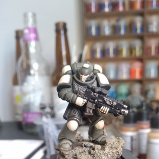
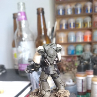
So a couple of months ago I was thinking of an idea for a colour scheme for marines that you don’t often see. I wanted something that was more muted in tone but still bold, since these are space marines. So I went to my favourite colour to paint with, german field uniform grey from vallejo, it’s more green in colour than grey. I always try to find a way to use it, it’s just a great colour. So that’s my muted colour sorted, that will be the base colour for the power armour. I then decided I wanted an off white colour for shoulder pads and the odd knee pad, its bright enough to stand out but doesn’t look stupid with the greeny/grey for the armour.
Now to try and make this as quick and easy as possible I have used army painter dark tone dip to give the armour it’s shades and highlights with minimal effort. In the future I will use a spray can of german field uniform grey from the plastic solider company to make the process even faster than airbrushing, and the shoulder pads will be painted separately then glued after the power armour has been dipped.
I’ll attach a photo or two bellow of the test model, it’s very rough and ready and there are improvements to be made but for a proof of concept it’s got the ball rolling.








































THanks for sharing your thought processes, I got a lot out of it