Drazhar Comes To Steal Your Life In Warhammer 40K Preview
October 1, 2019 by brennon
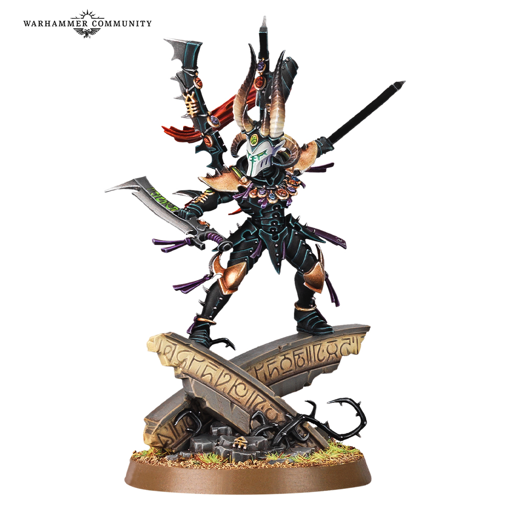
The counter to the flurry of blades that is Jain Zar has come from the Drukhari (Dark Eldar) as Games Workshop previewed Drazhar, the master of the Incubi, for the upcoming Phoenix Rising set in Warhammer 40,000.
Shop Warhammer 40,000 @ Store.OnTableTop
Much like his lesser kin he has a clutch of shattered spirit stones around his neck from the various Exarchs he has slain over the years. No doubt that is because he has been slicing them down with the Executioner’s Demiklaives which can be used one-handed or doubled handed for when you need to switch up your fighting style.
He also has the special rule of Lethal Precision which allows him to use unmodified rolls of a six to wound to up his damage characteristic by two making him a dangerous individual indeed. The model does look very cool, stood atop Aeldari ruins that he has no doubt conquered each time they have tried to win them back.
This is a neat showing as to what we can expect for both the Aeldari and Drukhari as we move towards the start of this massive campaign set within the world of Warhammer 40,000. It will be fascinating to see how it all unfolds and what new models are around the corner for these armies and others.
Are you tempted by a new Drukhari army?
"Are you tempted by a new Drukhari army?"
Supported by (Turn Off)
Supported by (Turn Off)
Supported by (Turn Off)

















I’m so behind on my 40k fluff. Times were simpler when the Chief Astropath of the Ultramarine was named after a tennis player and was half Eldar.
Don’t worry. I remember a time when I could have most likely done a Mastermind session on the Old World and done fairly well…now, I’m very much behind the curve. I know the core of what’s going on but the details of it all evade me heh.
Steal my life? Hah, jokes on him, I ain’t got no life! *muahahahaha*
…not even under torture! Do all the minis have to be standing on huge bases? Then again, they need to justify the silly prices of these ‘toys’. The new staff uniform should be a striped jumper and “Robin” style mask. It makes handing over such large amounts of money less humiliating. Go and look at the old version. It was so much better. More dynamic, looked really lithe and followed the style/look of the race. You look at it and you know just how capable it is…less is more and the quiet ones are always the ones to beware of.… Read more »
I think when it comes to the larger scenic bases this one at least looks more interesting than ‘foot on rock’ and tells a story to help develop the narrative of the model. As for the new model versus the old, it’s personal choice of course, but I think the old one looks like someone spooked him and he’s lept up in an ‘eeeek’ pose. The new one at least looks like he is in the midst of a duel with a character below him/in front of him. He looks a lot more dynamic in my opinion here than he… Read more »
I just looked at the old model and He does look mildly spooked. I wanna put a tiny mouse on his base. Best Dark Elder model ever.
The large and scenic bases make sense as they really add a sense of depth to the character and almost create a “story in a model.” As GW is making their models much bulkier to make them more accessible to new hobbyists and incorporate more detail so they don’t look flat, they need the bigger bases so that they can still be handled on the tabletop without looking silly. Remember when terminators used to be on 25mm bases? Besides, you’re not obligated to buy every single model coming down the pipeline; if you don’t like it, just give it a… Read more »
It seems like virtually every character figure from GW now has to be standing on a big pile of stuff. It does make them more impressive for display purposes but for gaming it makes all the characters look as if they’re playing “the floor is lava”.
I have the old metal versions of Drazhar, Lelith and Kruellagh. Really nice minis. My paint jobs never did them justice though and they’re at the top of my “strip and redo” list.
Yeeeeah….I gotta say, the old one was waaaaay better. This one looks like a cluttered mess.
Now I can tolerate a scenic base provided it looks utterly amazing or doesn’t interfere with the model’s gameability….this is just crap. Whats the point? To make him look agile? To tie it thematically into the campaign?
Generic looking eldar ruins, model looks awkward on top….
I like some of the new gw stuff, but this….
Is it just me or does he remind you of the Horned Rat?
weirdly looking for a picture of the old model to remind myself i found this blog:
https://garethnicholasblog.wordpress.com/2017/08/03/drazhar-master-of-blades/
in my opinion a much better model, GW should have just bought the file from him! haha
Probably fall in the camp supporting the old version, but I think this new guy is suffering from a paint job that doesn’t suit him.
Lose the gold and keep the armour black, cut back on the other colours used and I think he’d look a lot more focused and threatening.
Keep the mask B&W with just simple red lenses.
Much like the last reveal on the previous Dark Eldar model, not liking this at all. Again the head seems to big to me, and the bizarre devil goat horns don’t seem in keeping with the rest of the armour.
He does look great.
I see someone went too far with the copy and paste in CAD.
Standard GW of late.