New Navigation Starts Today
February 28, 2014 by warzan
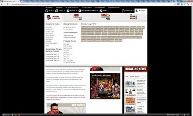
So today saw the deployment of the first of a plethora of improvements and new features we have planned for 2014.
It all starts with navigation.
The new top bar allows us to deep link to all the coolest parts of Beasts of War, and will enable you to jump directly into the games you love. (Which is going to become important over the next weeks)
It's a work in progress so please bear with us as it will change and improve as we fix things and launch new 'stuff' that will live in the menus.
The site may well look a little disjointed in places over the next weeks as we gradually transition things, but it shouldn't effect your browsing experience, which we hope will steadily improve with every iteration we launch from here in.
So give it a play and see what you think and feel very free to post your ideas, impressions or issues below, so if there is anything we haven't spotted we can jump on it.















































It’s smaller … which I like. With the old top menus it was sometimes possible to click a link and not see anything change on my laptop screen.
One thing I might miss is a link to the forums (all the forums – I see I can still get to “my” forums).
A good start IMO
Forums is under the ‘Community’ menu 🙂
A-ha! Cheers.
hey guys, looks better. the only thing that I dont use is the forum, I find it too busy, not clear to read, pickup subjects. Is it going to change?
At first I was not sure. However now I have had time to play around with the new set up I like it. I think the community drop down for forums is excellent for finding the subjects I am interested in quickly, as there are several cross-over topics between the different game systems, such as advice on painting, that I want to read. It’s nice to see them in all in one place rather than having to hunt around.
All you guys need now is a calendar bar showing dates for upcoming gaming events and your appearances/travels. May I suggest each month you feature one of twelve “women of Beasts of War”………yea baby…..just a random thought.
Calendar is on the todo list.
If we do a ‘Beast Babes’ we’d have to do a ‘Beast Blokes’, your welcome to be Mr March if you dare 😉
Two thumbs for the new menus. Much easier to dig out an old news story or find a video.
That wasn’t supposed to be posted there lol. Any chance you’ll be enabling comment deleting 😉
I am ready with my speedo mate! LMAO!!
…..I really like “Beast Babes”…….sweet!
I’m a little guy so I’ll be February
Fit Looking Club
I like it overall, just nitpicking but it’d be nice to have Warmachine and Hordes combined since they’re two flavors of the same game really. You could put them in both scifi and fantasy …but it is weird to me to have completely separate pages for each
I am really digging the new look and navigation!!!!
I love the new look. I have a question though, are more games likely to be added to the list show in the drop-down bits? if so what criteria put a game up there?
This look is FAR less cluttered, I like it.
OK, where did the videos go? I used to be able to click the TV icon and go through the back catalog of 3 Colours Up.
Click on the hobby tab at the top of the page
So far so good . I’m viewing on my tablet and phone. Love the way you can now navigate straight to a given game. Looks and feels clean and simple. Simple always works best.
I see the Hobby hub has a link inviting you to visit the hobby forum. Hope you plan to add this feature to the other hubs.
Ah changes… that explains the sudden plethora of forum notifications hitting my inbox. Don;t worry, I’ve found the groups settings to turn them off!
I like the new look!
Is there a way to filter for “weekender” videos? I think that might be a useful addition?
I like the new lay out. Just watched the vids on painting the Ork Stompa warren your a curl curl man the pain on john’s face says everything. Very nice paint job out of the ordinary with floor polish. Could you use standard gloss varnish instead?
I like the direction of the new look; it’s easier to find other topics to games that are not in my primary focus (FoW, Infinity)…. I do hope that the “Home” button returns,since I like to see what goes on elsewhere on the site…
I did have a bit of trouble (as in, it took a few minutes as opposed to seconds) finding an old episode of XLBS that I had missed for a particular week, if that’s any help to you folks. As I didn’t know what subjects it was particularly talking about, I didn’t know what to go looking for.