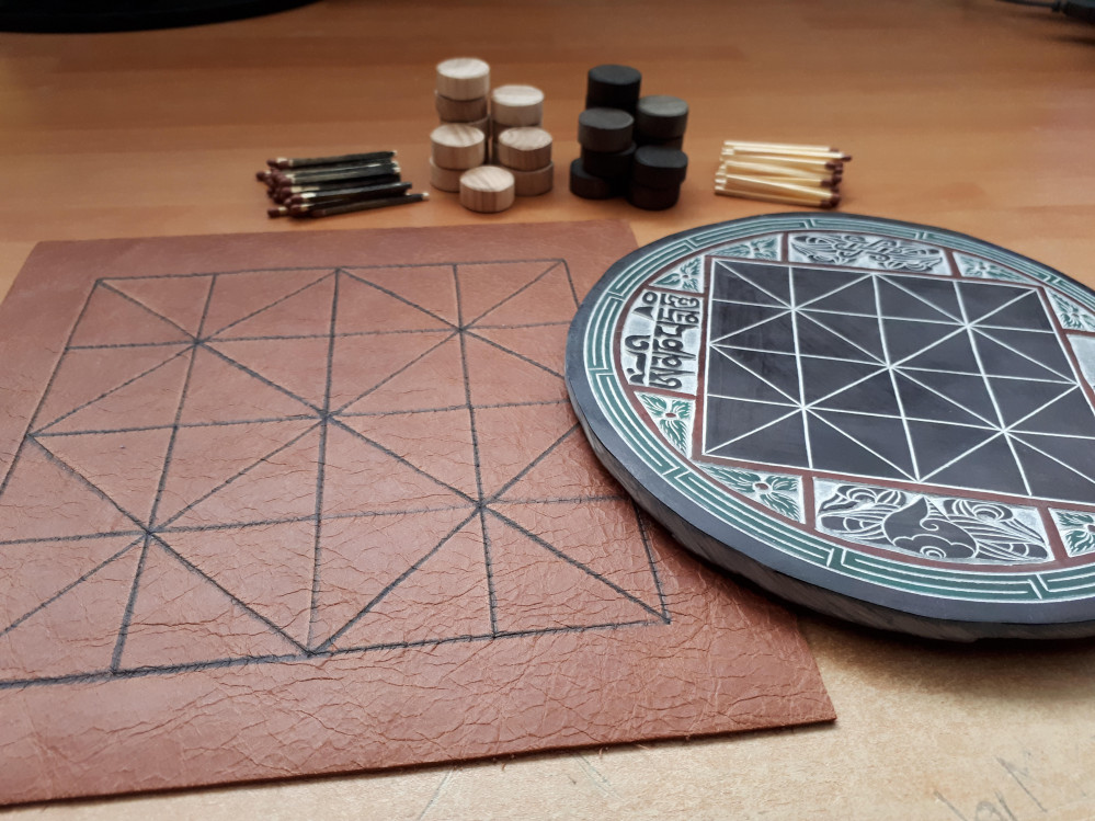
Bloom // Game Design
Recommendations: 55
About the Project
Oh hai there friends! This is Ryan from the OnTableTop team and I'm super excited to be doing my first project on the site. I'm trained as a game designer but I've mostly gravitated towards academia. Now I want to get back into design and get much better at it. So, to do that, me and a friend will be making board games and sending them to each other every 3 months. This is the very first one :) I'll be creating a game on an Alquerque board. Alquerque is a game from 10th century Spain, but the board finds its origins in Ancient Egypt where it spread both East and West. The deadline for this project is 12th October. In this project I'll post about: - The game design - Making the board and components - Making the rulebook - A final postmortem video to cap it off
Related Genre: Strategy
This Project is Active
Rulebook Design
Hoy ahoy there friends. This is the penultimate post on the Bloom project blog. This was the final piece of the puzzle: writing and designing the rule book. This was a particularly interesting challenge since I am by no means a graphic designer. And I had to turn my day job of comprehending rules on its head to actually explain rules in an easy to understand way (a difficult challenge for an academic writer). We’ll look first at the visual style I pursued for this rulebook. Then we’ll tackle how I approached writing the rules.
Visual Style
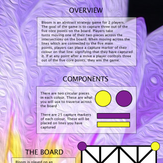
This was a difficult one and I checked out a bunch of colour palettes and looked at colour theory. But I couldn’t escape that I’d gone for two incredibly bright colours that, when put together, don’t mix with others terribly well. So to get around this I decided to use a picture of a purple and yellow flower then blur it in some way that it doesn’t detract from the text. I managed to find a beautiful picture of a purple lotus flower that had yellow stamens on the inside. To abstract it, I used the oil painting effect on photoshop that gave it a really beautiful dynamic (almost crashing my slow laptop in the process because rendering it took a while).
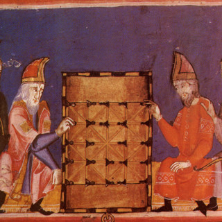
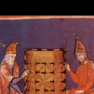
Instead of finding a different picture for each page, I just used a quadrant of the ‘lotus flower oil painting’ picture. The rulebook was only 8 pages long so there wasn’t too much repetition. On the back cover I wanted to find an old picture of an alquerque board that I’d seen in a board game history book I have. This was so I could tie the history of the Alquerque board in with the game I have made.
Layout was an interesting thought that I’d never had! I am used to walls and walls of dense, impenetrable academic prose which isn’t a great style for a rulebook! So how do you create an inviting and appealing layout for people to get stuck into? I had no idea so I just took a stab at it for the first rulebook I’d ever written (I promise the next one will get a lot more research put into it)
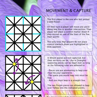
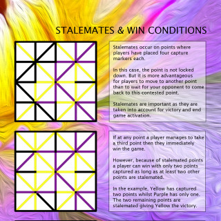
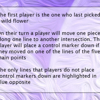
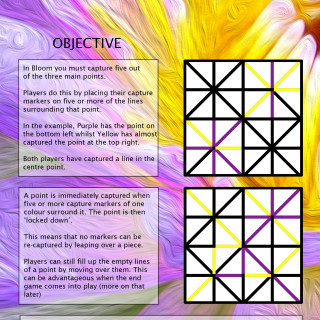
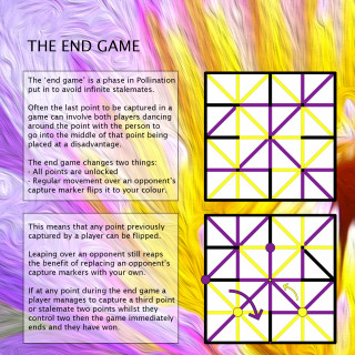
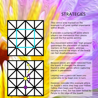
For the main layout, I decided to divide each page in half vertically. One side would be used for a text box and the other side for a visual example which would explicitly show what was described in the text box. It was a very simple approach that cut down the idea of a wall of text. In practice, I think it may prove difficult for a new reader to take time to understand what is going on in each picture. So I may use less in future rulebooks and just have one or two very well designed diagrams.
I created a template of an Alquerque board in photoshop to use in each visual example. Any time I needed to explain something I used a combination of arrows, circular pieces, and colouring in the lines with the fill tool to denote captured lines. For the text, I discovered that just putting black text on top of the image didn’t make it legible. So I needed a way to make the text legible without obscuring the pretty lotus flower in the background.
To do this I created a separate layer on photoshop above the background, created a mask and coloured in a few text boxes in pure white. Then I reduced the opacity on that layer so that it provided a transparent space for the text that didn’t obscure the background.
Writing the Rules
This was a super interesting part of the process. I’ve devoured quite a few rulebooks for both my work and for fun. There are some crucial beats I try to hit when I’m explaining the rules of a board game to people who don’t know how to play it. And this is the main structure I try to follow:
- Who are the players and is there any narrative information?
- What is the objective?
- What do the players do on their turn?
- How might they best achieve this?
I chatted to a game designer a couple of weeks ago and they validated the first point for me very well: humans follow stories much better than the explanation of abstract systems. If you can communicate a compelling reason why this is taking place then it becomes easier.
Once they understand their place within the world, foregrounding the objective is crucial as it is the direction they are moving towards. What actions they can take towards this objective starts to form a picture of where they fit into this game. But it is useful to contextualise all of this by suggesting scenarios of play and potential tactical and strategic considerations.
This is the structure I always try to keep in mind when explaining rules to people. So I made a checklist of things to include in the rulebook that aligned with these objectives:
- Overview
- Components
- Board breakdown
- How to move
- How to capture
- Point capture
- Win conditions
- Lockdown rules
- Stalemates
- Late game changes
- Strategies
- History
Because it’s only a small game and I didn’t want the rulebook to be too long I stuck to 8 pages. So there was quite a lot of information to communicate in a small space which paradoxically makes the job a bit easier. It focuses the writing and trims off the fat. Any additional or extraneous information can easily confuse people so it’s important to focus on the absolute necessities.
A couple of the categories on the checklist got trimmed a bit. The history of the board was entirely optional so I converted that to a picture on the back cover. Strategies were trimmed a little so that players could explore how to best to play the game for themselves.
I tried to pair each text box to a visual example as best as I could. But there wasn’t a lot of space for explaining the rule and then explaining what was happening in the example. This left a bit too much to interpretation for the visual example. Writing to a tight constraint suits me well since I like to write things as efficiently as possible (this project blog aside).
So that’s my rulebook! It didn’t take longer than a few days to pull together. But unfortunately, that shows! There are a couple of errors in it which are frustrating. But that just teaches the importance of having critical distance from your work. Getting something like this done as early as possible so that you can comfortably visit it a week or two later and pick out all the mistakes is so important!
Thanks so much for reading this if you got all the way down here. The last post I’ll make on this project is a final video on my youtube channel which will be a post-mortem on the design of the game, picking out what it does well and any design flaws which hinder it. So I’ll create a new post here when that uploads and embed it in!
Component Design - The Pieces
Hoy ahoy there friends! I’m writing this quite a while after finishing the project but finding the time to finish this blog is proving difficult as I’m knee deep in the next game I’m making. But I’ll try and finish this project blog off!
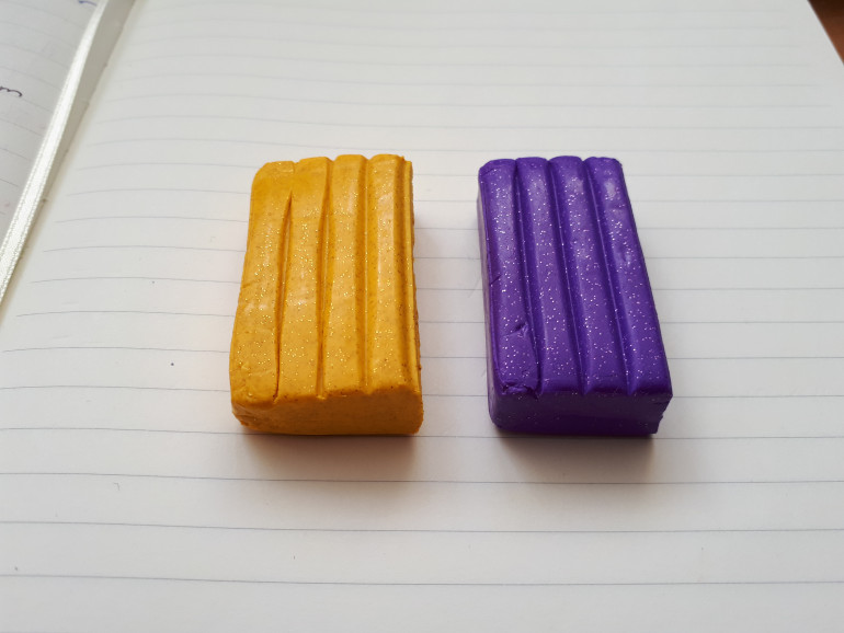
So making the pieces was one of the easier parts of this project. Taking advice from the friend who I was sending this game off to I decided to make the pieces out of fimo clay. Instead of taking a lot of time to learn how to whittle down and source wood pieces, it was far quicker and economical to make them from coloured clay. It also made the game super colourful which is positive!
I decided to abandon traditional colours like black and white or red and blue. I went for glittery purple and glittery gold, because they’re fabulous!
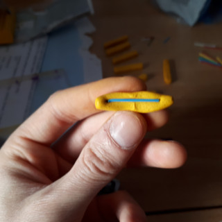
So the pieces were split into the circular pieces and capture markers. Designing these pieces also meant figuring out the optimal sizes of them in relation to the board. With the 20x20cm board design both the circular pieces and capture markers all needed to fit on the board together. From this, I calculated that the circular pieces needed to be 1.5cm in diameter and the capture markers needed to be no more than 3cm in length and 0.5cm in width. With these dimensions, if all the pieces were put on the board they would fit together nicely and not make the board too cluttered.
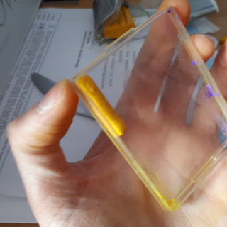
Making the circular pieces was easy but I needed a mold of some sort to make the capture markers rectangular. A plastic container did a good enough job but I’ll definitely look for alternate options next time as getting them out of the corner definitely mangled them a bit. However, to give the capture markers a bit of structural integrity I put a paper clip in the middle of about 2.5cm in length.
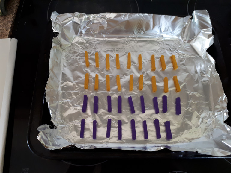
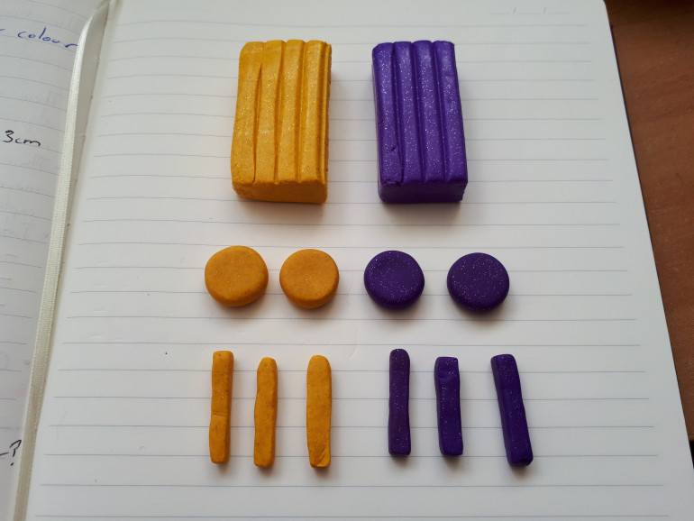 I made two circular pieces and 25 capture markers in each colour. It didn't take too long as I maybe made 10 at a time.
 The only thing remaining was to place each piece of fimo in the oven at a low heat for about 20-25 minutes so it could harden. A final little bit of quality control was all that was needed to square off the edges and take out the worst of the imperfections.
And that’s pretty much it for the pieces. Fimo made the whole process cheap, easy and colourful. there were lots of imperfections which is definitely down to my inexperience and lack of skill in modeling and using fimo, but for a prototype is works really well.
Thanks for reading. I’ll be back hopefully soon with a rundown of how I went about creating the rulebook for Bloom!
Component Design - The Board
Oh hai there friends! I want to get stuck into how I made the components this time around (since I’ve actually finished them). There were only two parts to the components I had to make: the board itself and the pieces. Continuing on this project of making and sending games back and forth to my friend, I want to get into woodworking. This informed how I approached the board as you’ll see below.
Board Design
So I wanted the board to be made of wood. Asking around the office, Justin – as a former carpenter – gave an interesting bit of advice: take a softwood like pine and etch your design into the wood with a soldering iron.
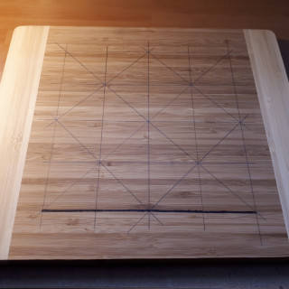
The next part of the design was to nail down the dimensions of the board. The prototype I had been using was an Alquerque board drawn on an A3 piece of paper. The drawing was large so that it could be picked up on camera for my game design streams on Twitch. The problem with this was that the board was so large that it emphasized the space in between the lines (the triangles) and not the lines and intersections themselves as this was what the game would be played on.
This prototype was a 27x27cm design. My Alquerque board was 15x15cm which was much too small for the capture markers that would be placed between intersections. So I settled on 20x20cm dimensions
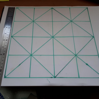
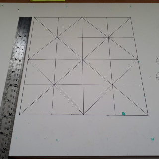
The one on the left emphasizes the spaces in between lines whilst the one on the right is the right size for game pieces and allowing players to take the lines into account.
The next thing to sort out was procuring wood for the board which proved difficult. Finding local lumber suppliers wasn’t possible since they all concentrated on building materials that were either too thin or would need milling which wasn’t a service provided. The dimensions I wanted (25x25x4cm) were awkward for pine. So I decided the next best thing was to get a chopping board of the right dimensions. Going into a home store near me I managed to procure the perfect one.
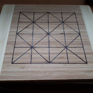
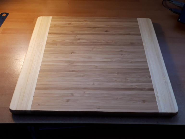 The chopping board had the perfect dimensions in the centre, and the lighter edges provided a space for players to put their pieces
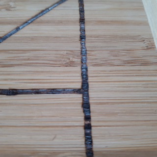
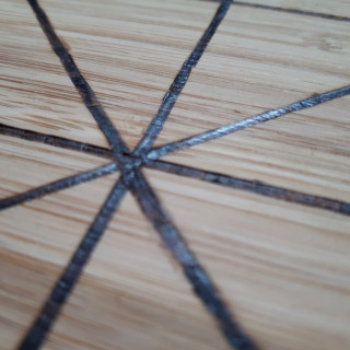
With the board procured I marked out the lines for the Alquerque design and got to work with the soldering iron. This proved a little difficult, however. The soldering iron was a great idea if I managed to get a softwood like pine, but the chopping board was bamboo and so there were difficulties in etching the lines in. I had to turn the soldering iron up to its maximum temperature to even make a mark (400 C) and press quite hard on the board. Though I managed to finish the lines if you look closely it’s very rough and you can see where I had to stop and start. For future games, I might carve out the design and then use a bit of black paint.
And that’s the board! It’s my first time making something like this so even though it’s a little rough around the edges, I’m still happy that I actually made something!
Next time I’ll do a short post on how I made the pieces and how fabulous/derpy they look! 😀
Game Design
So, for my first game design project, I wanted to put in place a few constraints. If you present yourself with the vast, unending possibilities of anything at all you can really stall your project. So I wanted to build upon some ancient board games because I love them so! I am particularly fond of one called Alquerque. Its board design is super interesting. So allow me to explain how Alquerque operates and a bit about the history of the board itself.
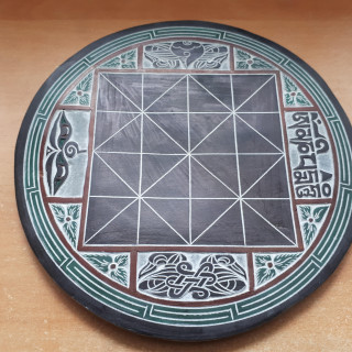
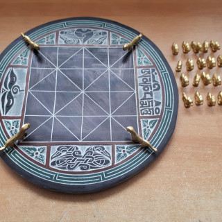
Alquerque came to the Iberian Penninsula from the Moors around the 10th century. It is known as the precursor to draughts even though it features a very different board. Its origins are found in the Temple at Kurna in Ancient Eygpt started in the 14th century B.C. The board travelled both West into Europe and East into Asia giving rise to completely different forms of games. In the East there are asymmetric examples such as Bagh Chal in Nepal and Rebels in China. In the West it became Alquerque.
History of Alquerque and the Board
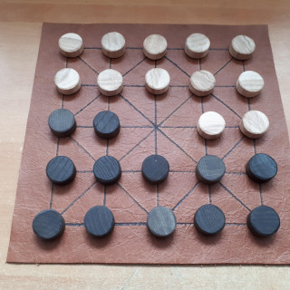
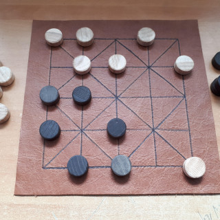
In the images above we see how the Alquerque board is used for two completely different games. The latter of which is Alquerque itself. Pieces move along the lines to another free intersection. They can capture a piece by leaping over the opposing piece on to a free spot in the direction they leaped. Pieces can only move and capture in this way forwards, diagonally forwards and to the side. More than one piece can be captured in the one move if the opportunity presents itself.
It’s a simple game that naturally involves a couple of phases. the first is a mass culling where pieces are captured by both players making a lot of space in the middle and preparing your surviving pieces for the second phase. The second phase is a slower, more careful movement of pieces where there is more space on the board. The objective is to capture all of your opponent’s pieces or capture the most if neither player can move.
You can see how the game is a precursor of draughts but what has interested me most is the actual board which is quite unique in ancient board games.
The Board Design
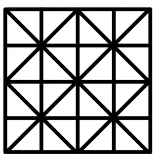
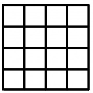
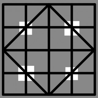
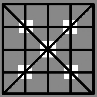
So the board is super interesting, but not all that different from a regular Chess or Draughts board. We know those to be 8×8 square grids where pieces are played on the squares themselves. Alquerque differs with pieces playing on the intersections between the squares, but we can also strip the lines of the board down to see how similar the Alquerque and chess boards are.
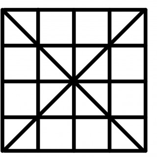
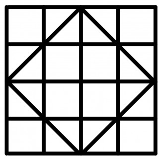
As we can see in the above image gallery, we can strip some of the lines from Alquerque to show how it makes up a grid-based board half the size of a regular Chess and Draughts board. it is when we strip down the board like this that we see its most interesting elements.
It’s quite a small board, especially if you are moving along the intersections. Some strategic thought in chess focuses on controlling the centre. When we strip back the Alquerque board to a grid-based format we can observe the centre as a 3×3 high ground of sorts.
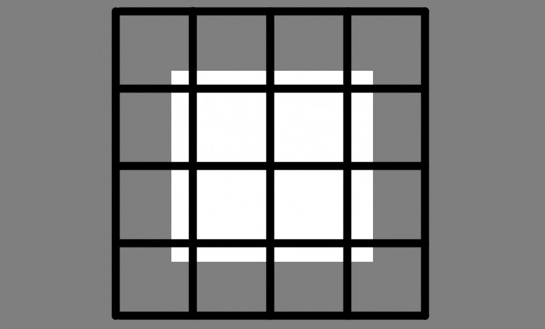 Control of the centre revolves around these nine points which makes the additional X and Diamond lines super important to the Alquerque board. So let's look at what the additional lines do to this 3x3 'high-ground'.
So what does all of this mean? Well let’s break it down into a bunch of bite-sized points:
- There are 56 lines that pieces can travel over and 25 intersections on the board
- From any intersection on the board, it takes no more than two movements to get a piece to the centre. Meaning this board provides a high amount of maneuverability for pieces
- There are five points on the board which provide eight movement options for pieces, making them potentially lucrative control points.
- Depending on the surrounding mechanics the 3×3 high-ground in the centre can be a powerful position to operate from.
So if I’m looking to make a game completely different to anything that has come before it on this board, how do I do it?
Designing for the Board
The most interesting part in Alquerque for me is when the board is cleared of pieces and there is more space to move around. So I wanted to design something that makes you appreciate how unique the board is. Initially, I thought about having players move pieces inside the triangles moving according to adjacent triangles. But interesting capture mechanics are non-existent and it’s a dull slog to move around the board when you have few pieces.
I experimented with other capture mechanics on the board. Using the flanking capture from the Hnefatafl family of games didn’t work because the board is too small.
So I returned to movement along the intersections, but so many ancient board games rely on capturing other pieces. I decided to experiment with capturing territory instead. When you tether the capturing of space to the basic movement along the lines a new dynamic is created for the board.
Tron-Alquerque
Though its final design pass will not make it similar to the light cycle battles in Tron, it is where a little bit of the design inspiration came from. There simply isn’t enough space on the Alquerque board to simulate these kinds of mechanics but I may try to do so in another project
I stuck with giving each player two pieces as that frees up a lot of space on the board for movement. The original goal was for the capture of over half of the 56 lines. Players could not traverse over an opponent’s captured line. there were lots of problems with this initial design though. The objective, though interesting at first, involved a lot of backtracking in the late game and so it became quite dull. The board was also an absolute mess of pieces that easily got thrown around. The method of capture also made things quite unfair as it removed an opponents piece from the board and they would have to spend a movement to bring it back. This became too much of a disadvantage for the player that got captured first.
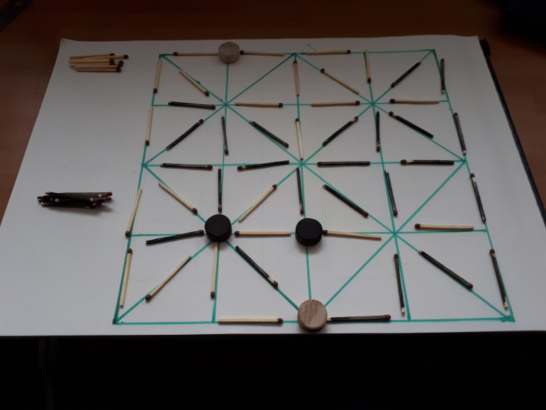 Matches everywhere. Pieces have to do so much backtracking in the late game. Captures are too powerful.
What I did with this initial design was to focus the objective in more. Instead of trying to capture half of the 56 lines on the board, players now just have to control three out of the five main intersections. These are the intersections with eight lines running out of them. This immediately gives a direction to how each piece moves and makes each movement a greater tactical consideration. Once one player controls five out of the eight lines of an intersection then it is locked down and the lines cannot be recaptured (more on that later).
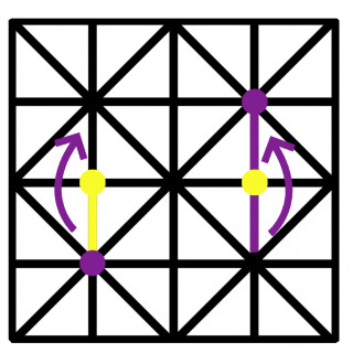
Also, pieces can move over their opponents captured territory, but they can only switch it over to their territory if they leap over another piece. In reference to this, I changed the capturing mechanic. Pieces are no longer captured, but when an opponent’s piece is leaped over the two lines they passed are captured by them, even if their opponent controlled them. This adds a lot more fluidity to movement. Players can lure their opponent’s pieces out of the 3×3 high ground with the promise of recapturing territory. This form of capture creates a very interesting dynamic between the 3×3 space in the centre and how players intend to draw their opponents across the board.
PHEW! That was quite the ramble! Next time I’ll be posting a blog about how I’ve made the components. Hopefully, they’ll not have turned out absolutely awful! 😀




























![Very Cool! Make Your Own Star Wars: Legion Imperial Agent & Officer | Review [7 Days Early Access]](https://images.beastsofwar.com/2025/12/Star-Wars-Imperial-Agent-_-Officer-coverimage-V3-225-127.jpg)


