Terrain Challenge: Summoning Portal
Part 5 - Adding Colour to the Portal - Learning Points
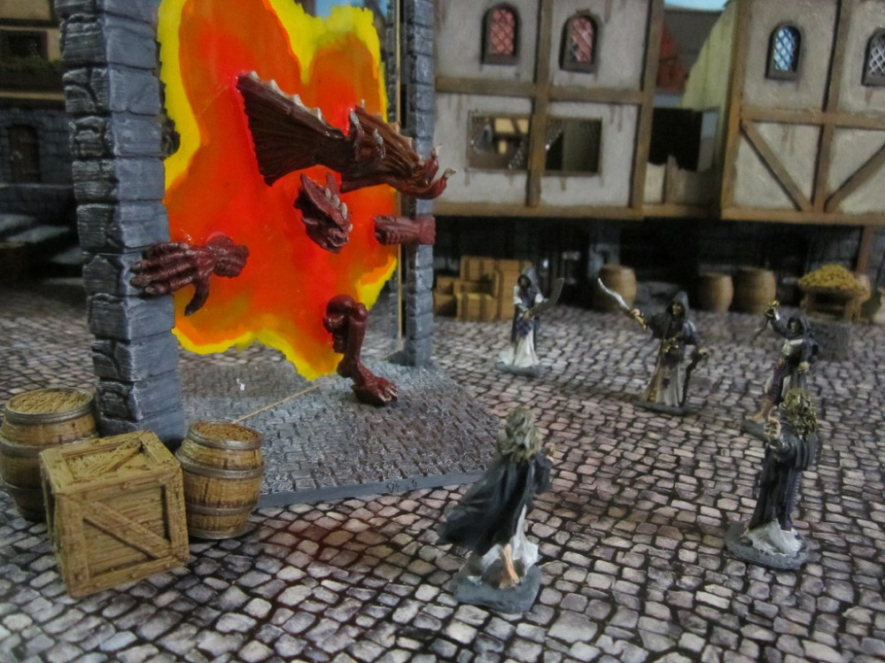
The above is a picture of the portal after a coat of gloss varnish to protect the back. The gloss varnish was going to be a necessity as the perspex was not really going to bond with the ink particularly well and I suspect it would otherwise have rubbed off quite easily. The varnish left slight frosting, meaning I needn’t have been so concerned with the discolouration form the flow improver initially.
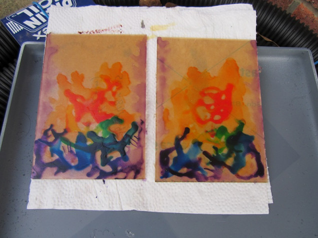
Will put up a shot once I remove the protective tape form the ‘working’ side – from the test pieces I do expect it to look quite different to the back (underlying/earlier layers should be more visible) so looking forward to the surprinse of the end result.
Learning points:
- The perspex was never going to stay completely clear – I needn’t have worried about putting down a base of flow improver.
- It may have been better to mix small quantities of flow improver with ink on a palette and dab them on with a brush rather than using pure ink. Result would have been more subtle.
- Colour gradient could have been enhanced form additional steps between colours – ie, red, then a red/yellow mix, then yellow etc.
- Going with a restricted palette may have enhanced the end effect – ie, reds, oranges and yellows for an infernal type portal, reds and purples for something interdimensional, greens and blues for drawing on the power of nature or the elements etc.
- Something I had not considered until I started to do this write up was just covering the whole sheet of perspex with a mix of one colour of ink with silver pigment mixed through to give a shimmering and reflective effect. Hrm… I may need to start ordering some more perspex and give some of these ideas a go…















































Leave a Reply