Learning to paint Non-metallic Metals (NMM)
Recommendations: 53
About the Project
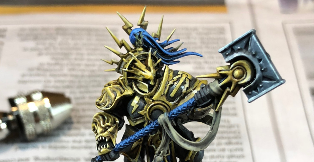
Oh, what a fool I was! A friendly challenge to push myself and try something a bit different. I've always been in awe and intimidated by NMM (Non Metallic Metal) as a style of painting. This project charts my first serious crack at learning this technique. I'm no expert, and I full expect to show off a less than perfect result, but that's half the fun :D
Related Genre: Fantasy
This Project is Active
Spot the difference!
Some days are better than others. This is the story of a not so good day. We often see people’s successes, but I think it’s important to show that this stuff is not easy, and often won’t work out perfectly first time.
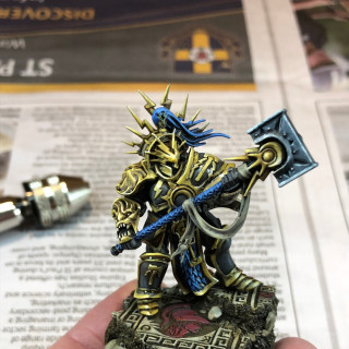
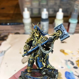
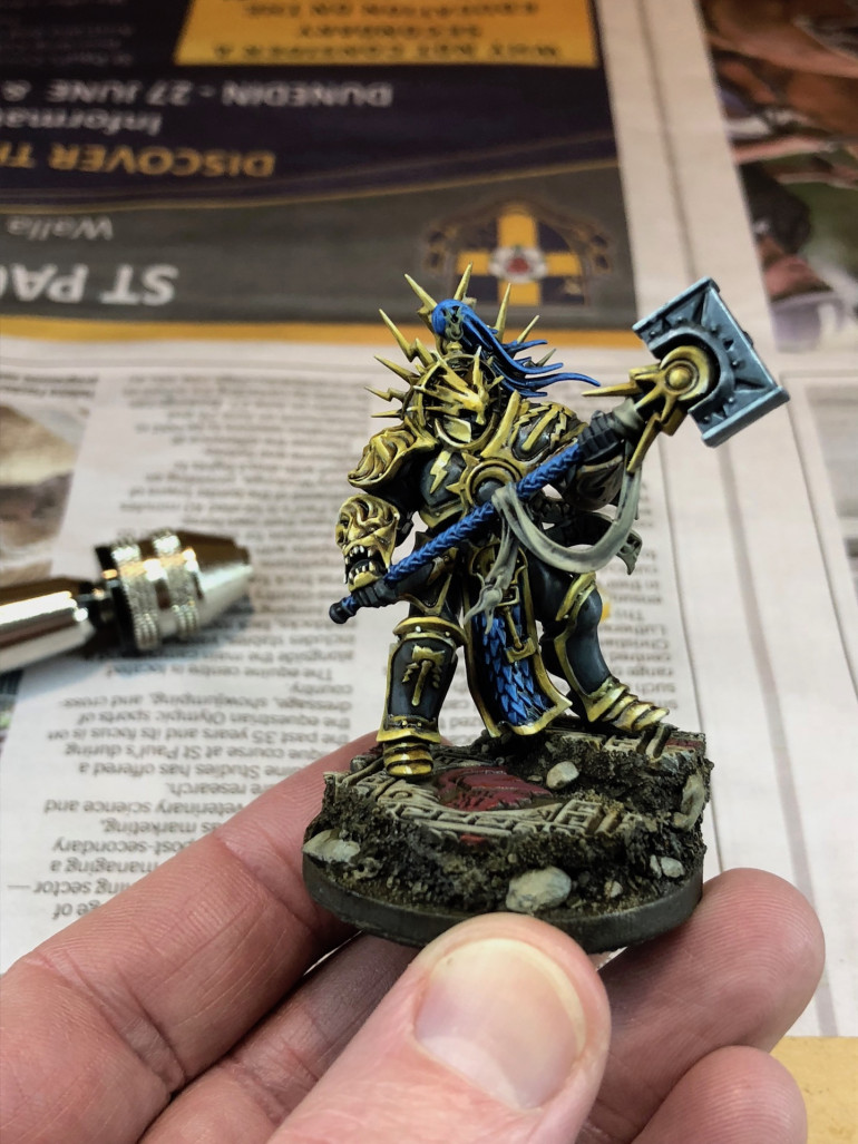
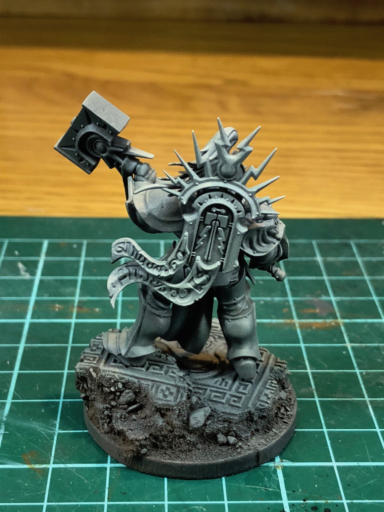
I managed to get an hour and a bit in last night, but to me it feels like not a lot of improvement. First up, a before and after pair of images to give some context:
Subtle, eh?
So I tried to get the surfaces of the hammer looking more metallic. I still just struggle sometimes to know where to put highlights and what shape they should take. Not too happy with it.
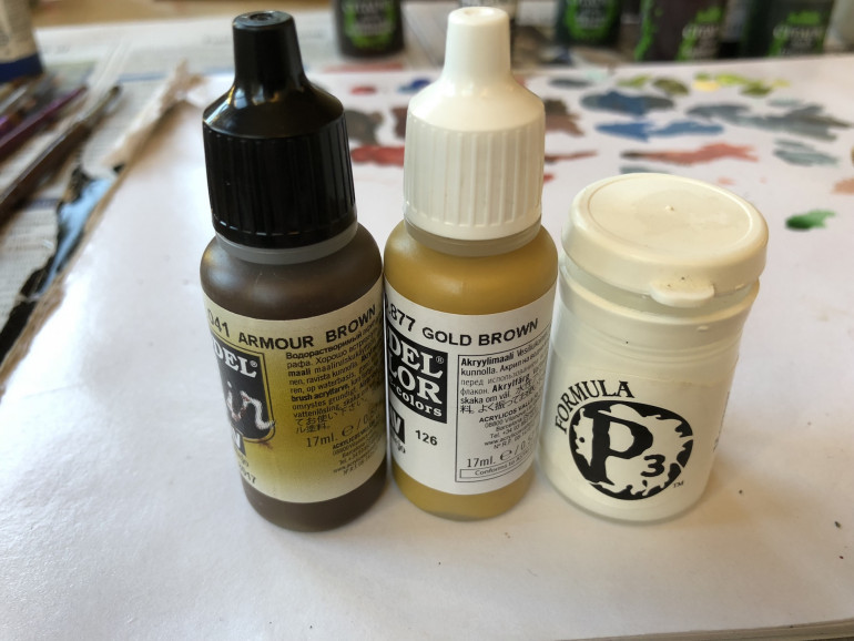
Next up, I was trying to use Vallejo’s Armour Brown to get some depth into the shadier parts of my golden metals. you can see this on the right foot of the model (left as you’re looking at it). I guess it sort of works? I dunno.
You can possibly also see on the greaves my attempt at putting a horizon line reflection. I’m 50/50 on this effect right now.
You can probably guess I’m a little down about it now. I’m used to being able to spend an hour on a model and see a noticeable improvement. NMM needs more patience, obviously!
On the positive side, I added some blue onto the base which helps tie the base to the model a bit better. So a small win 😀
Hopefully the next update will be a bit more cheery, I’ll aim to get the highlights completed on the model, at least.
Time for some highlights
Now comes the hard part, getting some highlights onto the model. I thought this might be a case where starting on a smaller area might be a good plan. So I began with the iron / silver look on the hammer. I tend to use Vallejo paints, both for the range and the dropper bottles, which are so convenient. I’m using Intermediate Blue and white as my two colours, mixing up blends of the two as needed on a palette. I use cheap pads of palette paper from a dollar / pound store and they’re great.
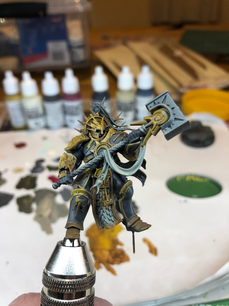
It’s not bad, but not great either. At this stage I was struggling a bit, so I resorted to my favourite part of the painting, adding washes. You can see this in the photo above. It’s such a simple stage, and adds so much detail. I was also hoping it would clarify where the highlights should go.
I used a variety of washes – Agrax and Sepia for the browns, and black / blue for the grey parts on the armour.
When this dried, I started on the gold for the gauntlet and one leg of the model. This is definitely a time for a smaller brush – I think I was using a size 1 at this stage. While the size of the brush is a factor, I tend to find the quality of the point on the brush is even more essential.
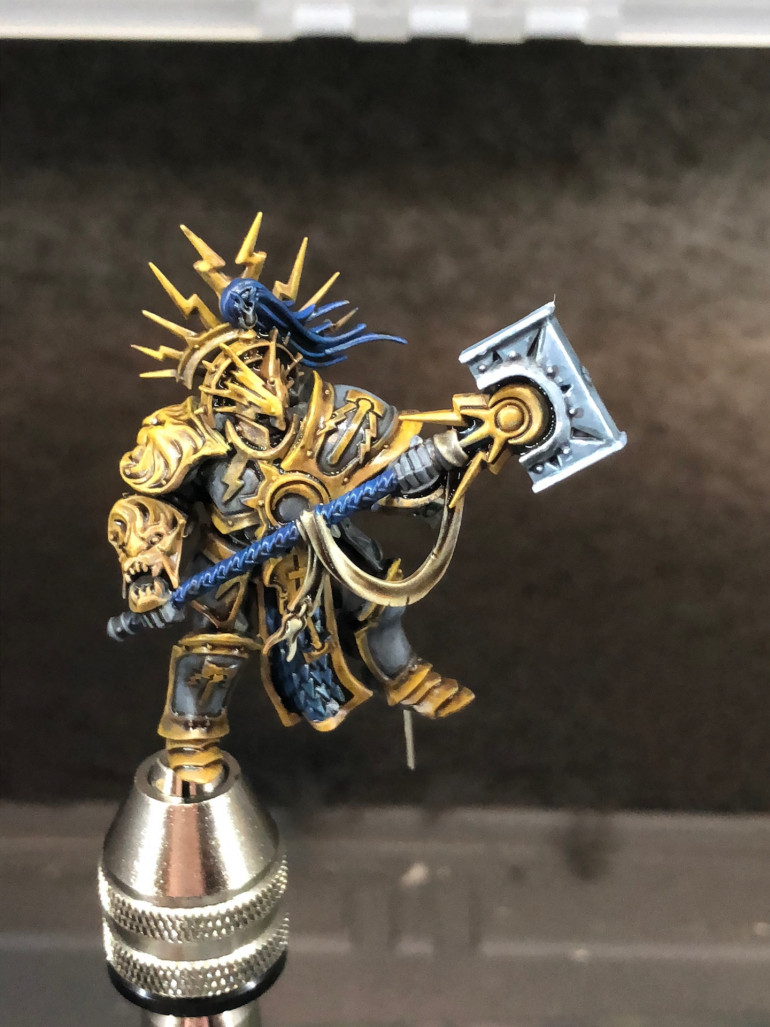
For these highlights, I started by placing a small almost white highlight where I thought it was needed, then blending down to the basic “gold” colour. There’s a lot of back and forth here as you go between too much and not enough. Being able to quickly mix up variations of your colours on a palette is a big help here. For reference, I’m only using 3 colours at this stage.
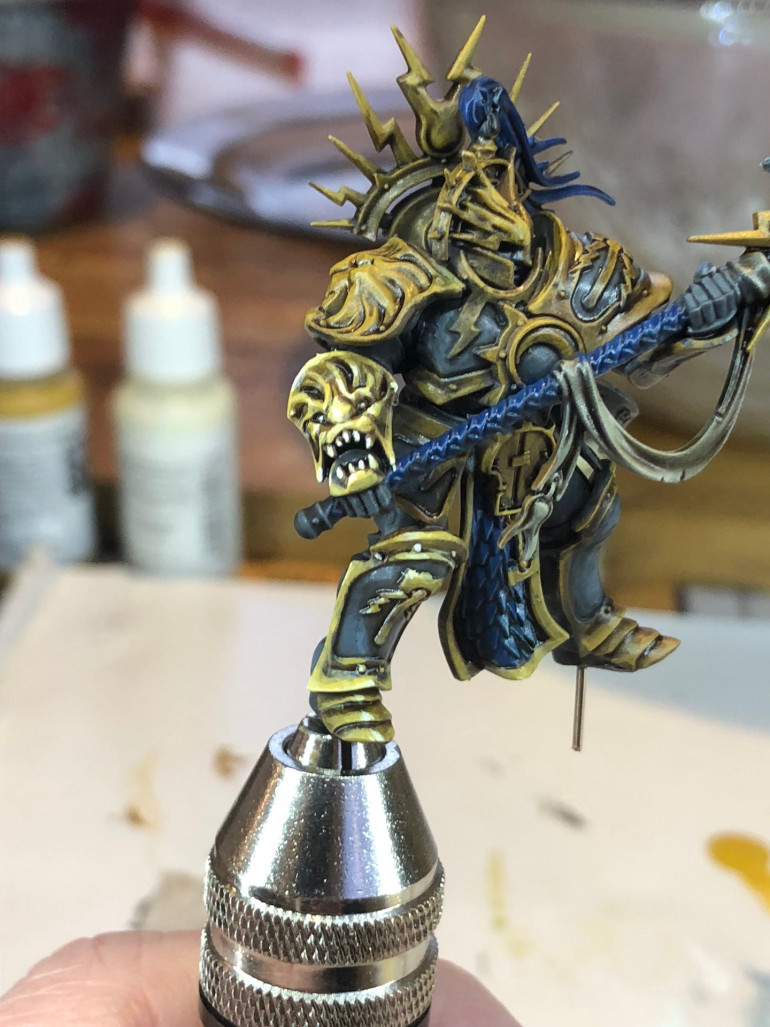
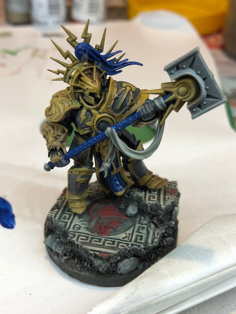
It’s a slow, careful process. I’m certainly no expert, but it’s starting to get there. In the last photo below, you can see where I’m up to. I try not to get bogged down, and move from area to area when I need a break. It’s a good way to ensure you keep the big picture in your head.
Also, when I got frustrated its nice to be able to switch over to something a bit simpler, like the blue tabard (loin cloth?). The photo below shows how some areas are getting closed to finished with highlights, while others haven’t even been started. It may seem a bit chaotic, but I find it a low stress way to work.
Once this stage is finished up, I think I’ll start to work on some of the shading, using the armour brown to accentuate the highlights, as it’s this contrast that is essential to NMM. Watch this space 🙂
Slapping paint on!
When I got back into painting a couple of years ago, I quickly found that I’m much happier and more productive working on a model that is covered in paint. I know many people like to work section by section or colour by colour – and that works for them – but I end up with a collection of partially painted figures in my case. Also, I like to quickly get a feel for a colour scheme so I can tweak it before I’ve put too much effort into it.
So, breaking out the size 6 brush (yes, I’m quite serious), it’s time to get some paint on this guy and see how my dark grey / gold scheme might look.
At this stage, I don’t need my edges or even coverage to be too perfect. It’s more about how the grey and gold contrast, so I can see what needs to be lightened / darkened or otherwise tweaked.
At this stage I also block in some other colours and the base.
The good thing about my way of painting is that I’ve only spent maybe half an hour (or maybe a bit more, there’s a chunk of detail on this guy) and I have a good feel for the overall colour of the model. Also, he meets a 3 colour minimum standard 😀
Initial build
So, armed with a fresh box of Stormcast, the first thing was to build up a model. I wanted this guy to be standing in the ruins of an ancient temple, ready to cleanse the crap out of anyone in his way!
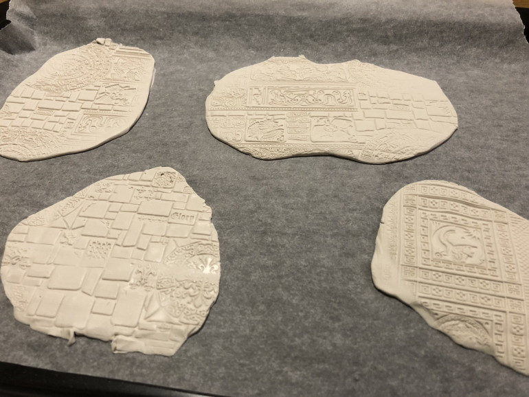
First steps involve rolling out the temple base, using a roller from Greenstuff World:
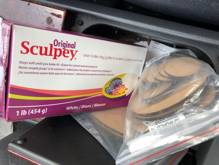 Sculpey works reasonably well, and is simpler/cheaper to use than green stuff. It can be a bit soft though.
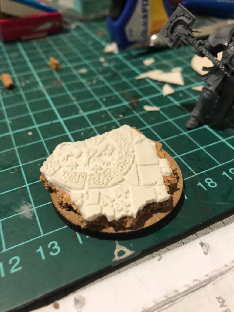
Once the clay is hardened – initially baked in the oven, then I find a night in the freezer helps further harden it – you can shape it for the base. My first step is to take a piece of cork and tear it to a shape that fits the base. You can be pretty rough here and an unexpected tear can often lead to a better shape than one that is carefully planned.
Once you have a shape for the cork, this can be used as a “template” to break off the clay surface. It doesn’t need to be a perfect match as we’ll blend the two together in the next step. Taking a craft knife to the clay can roughen the edges up nicely.
Next up, the cork and top surface are glued onto the base (which also has adhesive magnetic sheet added to the bottom for storage – this stuff is cheap, easy to cut and works well for plastic and resin figures).
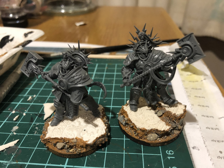
In the photo below, I’ve used Vallejo’s Earth Texture to fill out the base, blend the cork and clay together and hide any mistakes! It’s a great material, although you can typically find much cheaper (and almost as good) “modelling texture” gel from the art supply section of a dollar / pound store.
While the texture paste is still wet, I add some larger bits of gravel and then smaller sand / grit – no need to cover everything, we’re going for a variety of textures here.
Also in the photo below, I’ve pinned the model in place (not glued yet – I want to paint base and figure separately).
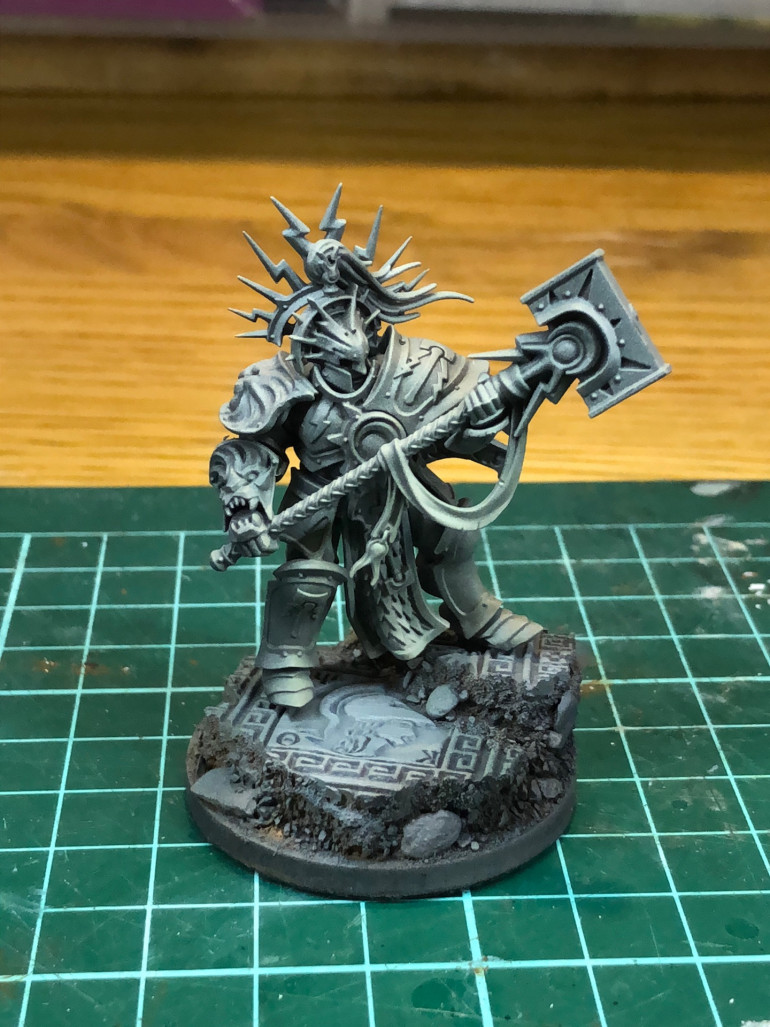
Assembly finished, and we’re ready to get painting. I love this stage, so much potential!
High hopes!
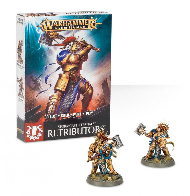
It all began as a friendly challenge. “Hey, we should try painting up a Stormcast Eternal using NMM”. Neither of us had any plans (at the time!) to build a Stormcast army, so it seemed a safe bet – just a single figure to paint up as a change from painting full units.
NMM is all about understanding how light bounces off surfaces – where highlights are, how they reflect off different types of surface and so on. A quick search will turn up any number of great tutorials.
Doing some research into how people paint NMM, I came across the Painting Buddha tutorials. These are fantastic and really break down the process into chunks that are manageable. There’s a lot of detail here, but it’s delivered at a pace that lets you “paint along” with the video. If I’d had any sense, I’d have got the same model to remove some of the cognitive load over where to place highlights and so on.
It turns out I don’t have any sense 😀




























![How To Paint Moonstone’s Nanny | Goblin King Games [7 Days Early Access]](https://images.beastsofwar.com/2024/12/3CU-Gobin-King-Games-Moonstone-Shades-Nanny-coverimage-225-127.jpg)
