Irregular Magazine Re-Design
The flow of a spread
A magazine spread consists of two pages and is called a unit. Therefore when designing your two page spread, this should be taken into consideration. It should be designed with this in mind, so design your spread with the pages side by side.
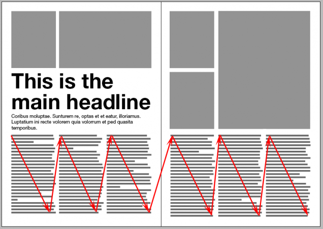
Some elements of a spread are more important than others, the reader eyes will flow top down. Most people generally start from the outside areas of the spread, so this is where the most provocative images and words should go. The bottom area of a spread is considered less important, which is why a lot of designers place the foot notes and some credits here.
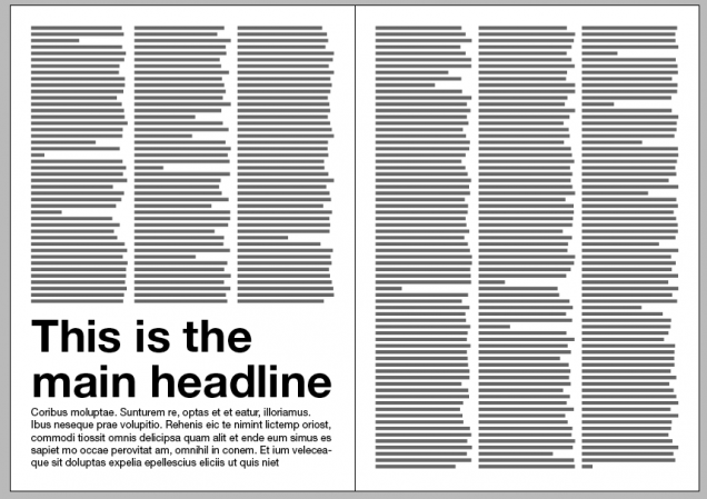
Examples of bad headline placing (the first image)
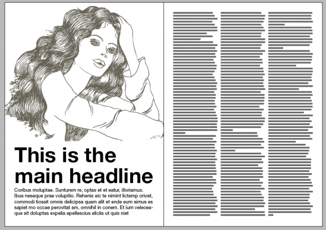
Readers will concentrate on the top area of a spread when skim reading. So placing your headline and intro text at the bottom right hand page is not a natural way to start reading a magazine, so it generally avoided. Your article and the layout should have flow that leads the reader through the article. Some times a headline can go at the bottom of a page if its preceded by artwork.
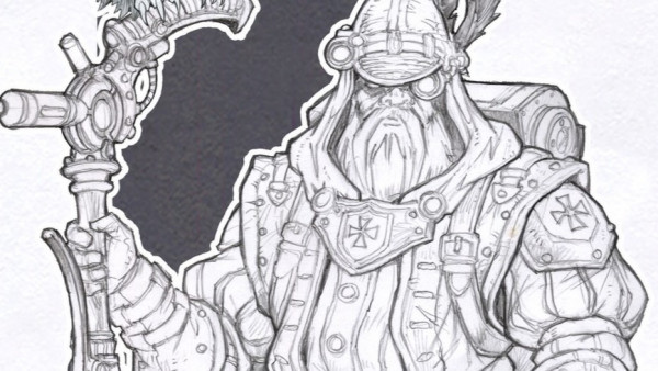
Example of good headline placement (2nd image)
Your article should go; headline, intro copy and main body.
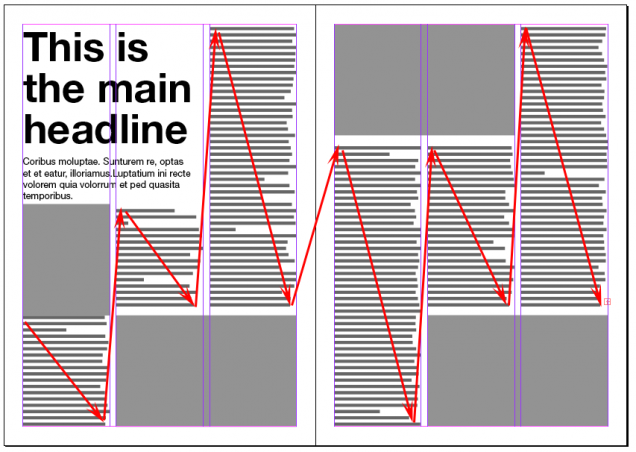
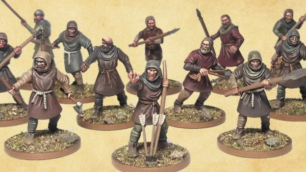
Example of bad placement/flow (3rd image)
When you place big blocks of text try not to break them up. It should flow, elements shouldn’t just be thrown down on a page. Otherwise the reader will have a hard time following the the flow of the article. Try to keep the body tidy and even so that the reader naturally flows with the article.
You should keep things simple
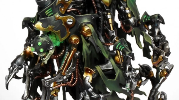
Example of good flow (last image)
Try to remember these simple rules when designing your own pages. Try to design more than one variation of your spread. This should be preferably done on paper before you jump onto a computer so that you have a good idea of how the page should be laid out.
















































Fascinating read on the principles involved in this particular craft.
Cheers, I’m hoping it might inspire some other members of the community to set up thier own niche zine. As a teen I use to enjoy the zines more than the professionally published magazines.