Star Wars Legion – Space Station Interior Table // Part 6
June 21, 2018 by johnlyons
Lots to look at on today's update. Let's dive right in and see how the table looks now!
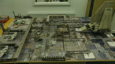
First off, the mats that come with the terrain sets have worked wonders in making the table look busy but still have that clear line between the "neat" looking area and the "gritty" one.
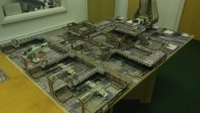
I really enjoyed working out how much access the models needed and where I could put it to keep the table relatively fair and accessible for both opponents.
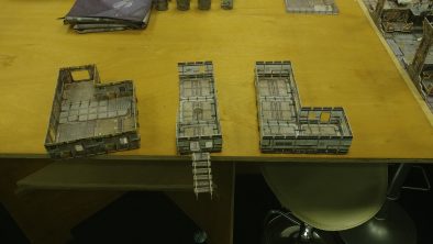
Adding the extra levels in a manner they can be removed easily and not hinder access to the lower levels has been in my mind a lot as I add more and more to the table.
Click Here To Watch The Entire Project
Let me know in the comments if you have taken on your own build with Battle Systems and how you found creating something of similar size.
Supported by (Turn Off)
Supported by (Turn Off)
Supported by (Turn Off)






























































Oh! You should use the angled observations windows from the landing bay set for the large hanger. They’re really cool and really lend that “control tower” type look to a landing area.
great table. I had to replay it, as I heard John say tie fighters. You need to lie down, and rest , as they look more like x-wings.
I am interested in the scenario you will be playing with this table? Will it be timed based on rounds or have you something else in mind? For example, have a counter that keeps track of refueling. Each round you have to roll 5 or 6 to move the counter. You have to hold off the Imperials until you are fueled and ready to go. Either that or replay the battle from the first Stackpole Rogue Squadron (Star Wars: X-Wing Series) book? Hopefully at the end you share your build list if someone wanted to recreate the table. I would… Read more »
I will be leaving the scenario in the capable hands of Gerry and Justin. So I am sure they will fill you in on lists and ideas on the game.
Following this with interest. I have two galactic core sets, to use with Infinity, Rogue Stars, Star Wars etc. unbuilt so far.
The playmat is a big distraction from the set up, it’s just to busy, would be better with something a little plainer.
Warren and I will be exploring an alternative 😉
Cue saxophone…
I would agree with @hithero The buildings blend too much into the mat being very similar colours. I think there needs to be some contrast.
Its come on great, the high section in the middle could do with being a bit higher, but as your showing what can be done with what you have to hand you dont want it to be to tall. The big landing area is impressive, plenty of room for more ships. The idea of having a big tower in the landing pad sounds right, to small and it wont look right to big and it would probably just get in the way. I would say go with the height of the flyer, or close to it. Cant wait to see… Read more »
Agree the mats are a bit busy. They could be fine in the built up area but something else for the landing bay might make it more distinct. Like the 4Ground shiny black bay – that was very imperial looking!
But overall – definite wow factor!