Infinity Terrain
Assembling the Power Hub
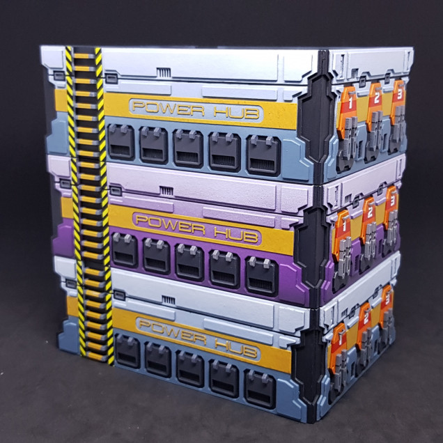
Quick update from me, I have assembled everything together. This has been a bitter sweet moment.
I seen that my painting plans worked and assembled all the pieces. I was overjoyed until I went to take these photo’s there is one major mistake that I made that is evident in this picture. I was so careful!
So I need to get over this. It’s not something I can fix at this stage. The instructions are crap! Because there isn’t any, apart from a 3D model. 🙂 which I drew. I only have myself to blame.
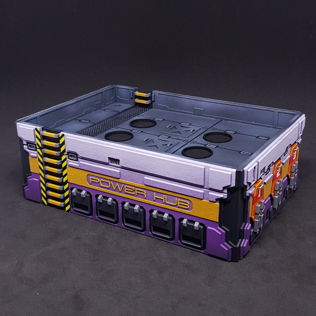
The funny thing is the closest to “perfect” is the purple one which I wasn’t going to do. I also prefer this colour Funny how things turn out.
I decided to use PVA glue to stick everything down to avoid any mistakes and to also make it easier to clean up should any glue come out the sides. The rungs are the exception and i pushed these in then glued with superglue from the inside.
That’s where I am at the moment. I have a few decisions to make.
- How to make the control panels. This did not look great before, I may need to draw something or make something?
- Should weather these the same way I done the containers and Prototype 1.0 Power Hub?
- Should I bother highlighting everything (sort of depends on 2)?
- Should I make another 2 and do them right?
I deliberately didn’t point out my major mistake/ If you find it then great. To be on such a high and come down to earth is quite brutal at this stage. There truly is too many parts to these buildings.
Feedback and suggestions are welcome at this stage. (and always)
































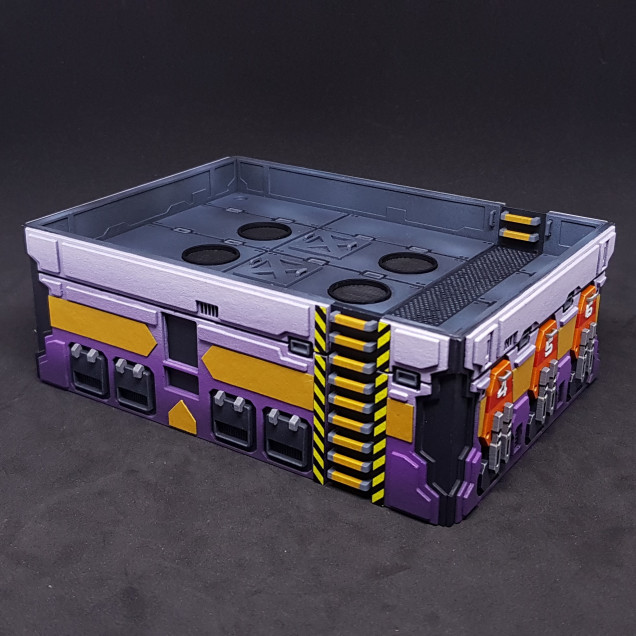
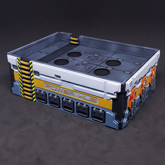
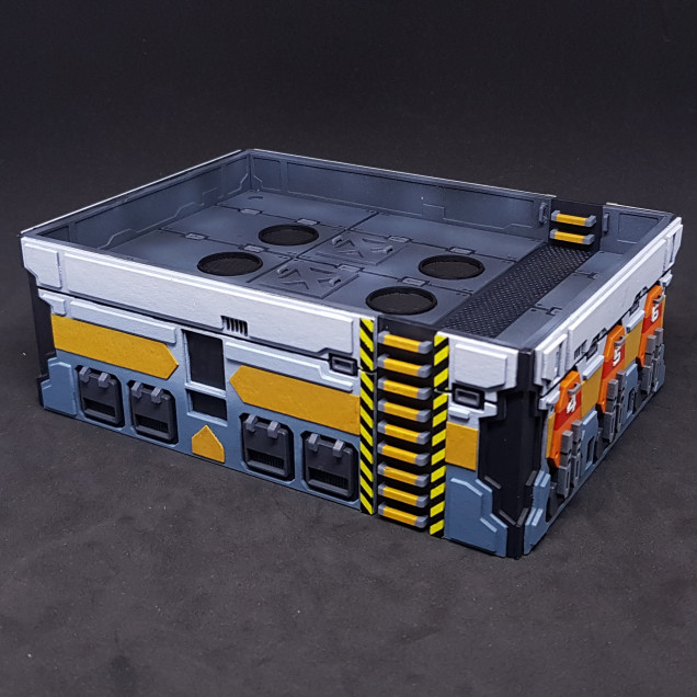







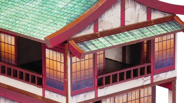



Dude, it looks f****n amazing, don’t beat yourself up! I can’t see any obvious mistakes. You’ve said there is one, so I start second guessing myself over a few details, but it’s a beautiful bit of modelling.
I’d do some weathering, but not sure how far to go – it depends on how you see the cityscape as a whole. At the moment it is very manga / comic feeling (which is not a bad fit for Infinity), but some weathering might help ground it (and avoid overpowering miniatures on the table) perhaps.
But overall? 5 stars, would comment again 😀
Thanks As no one has seemed to spot the only thing I cant stop looking at I may as well say (I couldn’t yesterday). It wont stop me from using them but the purple one is done correctly the two blue ones have the base layer MDF upside down meaning that the stairs should start high at the bottom and a small gap at the top. This is like stage two of building which means I cant change it without killing it. Thanks to @georgesealy and @malgol for not spotting this. It’s just my attention to detail that was obviously… Read more »
Even knowing what to look for, it doesn’t jump out as an error – I guess you know it’s wrong because it’s not how you designed it. For me, it still works either way.
Agree 100%. This is beyond great. It actually show how well design the terrain is in the first place when you see it in 3d.
“Misstakes”, i can see that the nobs on the white panels are missing and that the low panel on the top sshold be one long on that side. I dont mind though, if you`re planing on giving away or sell the plans it should be an easy fix.
Again, well done!
Cheers!
Planing on making decals for all the signs?
I will be doing decals for the POWH-22020 and control console signs. the small logo’s sill be getting missed off as it would require a proper transfer rather than a home print due to the white/colour and clear being required. I can order custom transfers for this but I think the cost to benefit ratio will be vastly off. It never occurred to be to use transfers for the control panel. I may test this out rather than use photo paper gloss coated which is what i done last time and used a very bad photo of the one already… Read more »
Thanks posted the mistake above. The small rivet things were missed off on purpose as I felt they would be unprotected and rip off during use.
These have turned out absolutely mindblowing. I wouldn’t even class the slight gap in the ladder as an error, it could just well be intended that way, it doesn’t “break” the reality of the scenery at all.
I would agree with what others have said and perhaps a touch of weathering to make them sit into a table and look a bit more real would be a good shout. Even as is, it could well be the centrepiece of any infinity table.