Celestial Painting Competition – Week #2 Judges Comments
May 18, 2018 by dracs
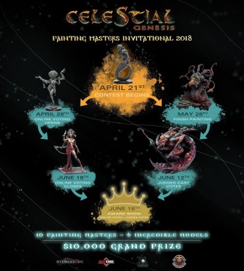
We stop in with the judges that were picked by Beasts Of War to give their thoughts on the work by the artists who are taking part in the CelestialPainting Competition which is running this month.
Week #1 Comments Here
Firstly, however, we should introduce some of the different judges. We have Ruben Martinez (Big Child Creatives), Dave Taylor (Dave Taylor Miniatures), Chris Handley (Darker Days Radio), Tommie Soule (Golem Painting Studio), Romain Darmon (BoW) and Tomas Mennes talking to us this week about their thoughts.
Aleksandra Cvetanovski - Zhurong
Ruben - She remains determined in her proposed style and scheme. Very impressive NMM on the parts that form the mechanical legs of Zhurong. I'm looking forward to seeing everything assembled to see how these parts interact with the main miniature.
Romain - Not much progress, but I really love what she’s done so far. She’s committed to a very graphic style that reminds me of old-style sci-fi illustrations, as opposed to something entirely realistic. I do wonder where this is all going! What I really love is that she’s one of those master painters who make their own videos, so it saves me the trouble of commenting and gives me a free tutorial!
Tommie - The real strong, busy shapes and colours really frame the delicately posed body on this piece very well. However will those extremities combined with the shapes added with the NMM be to busy on the finished piece?? I love it so far
Tomas - Not too much progress since last week. She does show off her incredible technique on those Non-Metallic Metal parts. I like her painting style. I like the techniques she uses. I’m still a bit afraid of how it will all come together, but looking forward to being proven wrong.
Sergey Chasniyk - Zhurong
Chris - Sergey has really made some great progress here. The painted texture on the top of the head has added some warmth that draws the eye. The highlights to the body have further enhanced the silkiness while toning down the competition that the knee area was presenting to the eye. The internal glow on the leg also match those on the top of the head and the model as a whole seems more cohesive.
Romain - Really interesting stuff from Sergey. Lots of effects and texture painting…I wonder how (and when) he’s going to clean it up… it’s going to make for a crowded paint-job on an already crowded miniature, but I’m willing to accompany him down this route! I see a certain cohesiveness, but that’s probably because I’ve missed last week’s entry.
Ruben - Again like Aleksandra, has started with the legs that support Zhurong flaunting an impressive technique. A very nice and well defined metallic/flaming effect. The main problem of Zhurong is that it is a miniature that forces you to paint the parts separately, so, either you have in mind at all times the position of each piece within the general composition, or you run the risk that when putting together all the pieces are a miniature worked all the same, in a cold and automatic way. This can be fixed with subsequent corrections once the figure has been assembled, which is not a problem, but I think it is something that must be taken care of.
Dave - Everything we have seen so far from Sergey has had a lot of vibrant effects and texture. It will be exciting to see how he brings all of the pieces together in a way that will allow for a focal point and a place for our eyes to rest as we admire the work.
Tommie - I’m very much drawn to the leg so far, will this be the case once the other leg is painted? I want to be drawn to the face but it is early days yet. The skin is nice and soft and looks great. I find the abundance of blackline work really makes the model look too busy for me.
Tomas - Oh man, how I love that helmet. The spider pattern as Sergey calls it himself is really impressive. I love the organic lines on the head. I’m still feeling a bit of a disconnect between the flowing lines of the helmet and the straight lines of the legs, but I really like the adjustments he made to the skin tone. This draws the miniature together a lot more.
Antonio Peña - Queen of the Void
Chris - The work on this model is progressing well, with Antonio introducing some nice warmth with the reds, the look of patinas on the legs. We are getting a sense of light and shadow through the warmth and coolness of the colours chosen, but we are still waiting for more work on the cloth and face that should really begin to set this piece off.
Ruben - Not many advances on the proposal of Antonio, so I can say little. More definition on the skin, and the appearance of some contrast tones by colour in some areas. The most interesting is the option to make the face darker than other parts of the body, to enhance the brightness of the eyes and also gives a darker appearance that pleases me in this miniature. I think I would have to start to consider the rest of the parts chromatically in order to give a more concise direction to the whole group.
Romain - I think we’re in for the long haul, here. At first, I thought the colours to be a bit simple, vivid, but now he’s adding layer after layer of complexity to deceptively straightforward surfaces (flat and draped). It will end up very rich indeed.
Dave - I think Romain has hit the nail on the head in his assessment - only Antonio has the whole vision, and it is being slowly revealed to us across the model.
Tommie - Yes very early days in this. Love the pose and I’m liking the blends on the yellow so far.
Tomas - I like where this is going. The skin of the model is getting a lot more depth. The different colours and patina are starting to look really cool. It feels a bit like the artwork is slowly revealing itself, giving us surprises all along the way.
Fabrizio Russo - Queen of the Void
Chris - Oh wow, so much to say here. The cracked ceramic work has now been applied to the face, and the model is really coming together. The base is a great component that is not competing for our attention. And the sweep of bubbles and bright material gives a sense of another material, as well as providing a stark background to the model upon which the softer porcelain body can be seen easily against.
Ruben - Again Rusto has returned to surprise with the scenic base. I can not say what alien substance has used to do it, but the truth is that it works, both in composition, creating a curve that envelops a figure as hieratic, as with colour and texture that provides a variety that contrasts and gives interest. Again a good rhythm of work in the process that makes it very attractive to follow.
Romain - I’ve been insanely jealous of this guy for ages… He doesn’t disappoint! After crying alone in my closet for a while over my lack of talent, I went back and examined just what had happened here (hint: a lot). Fabrizio’s Queen of the Void is less armour and more porcelain doll, almost a Karakuri of a kunoichi. The genie-like explosion of bubbles from a bottle is extraordinary and provides a much-needed touch of colour on a diorama that’s otherwise perhaps more subdued (although by no means less complex) than other works. I’m very interested to know how he does it, and where he’s going with that… or even if he has much left to do.
Dave - Fabrizio has taken this in quite a different direction this week. While he has completed some more of the wonderful shattered ceramic texture of the armour/skin, the surprise has been the wild additions to the base, incredibly dynamic splashes of vibrant colour. It’s going to be wonderful to watch him tie it all together.
Tommie - Sterling work on the “flesh”, just like aged cracked porcelain. I love how the WIP of the loincloth takes me all the way to silky smooth too! The colours, pose, base and the cracked effect really bring her sinister face to life too!
Tomas - Wow. I was not expecting this. I keep looking at the pictures and wondering what I think about it. This is the difficulty of seeing a model coming together this way. You make a picture of what the finished model will look like, and all of a sudden it turns out in a completely different way. The bubbly effect is gorgeously done. It changes the entire model.
Where last week the cracked skin was the part that immediately drew the eye, now it is more of a detail that you only notice on second glance, which adds a lot of depth to the body. The only thing I am wondering about right now is the cloth of her robe. With so many textures going on, I am wondering if it won’t be too plain in the overall composition, although adding more texture to it has the risk of the model getting too crowded with texture. Really looking forward to how this will turn out.
Enrique Velasco - Queen of the Void
Chris - The sense of different textures on this model is really coming through now. The difference between more polished metals scratched and weathered metallic legs, and the softer cloth is apparent. The work on the cloth, in particular, is of not, as he has used fine dotted highlights and hash marks to give the sense of fibres, rather than more smooth highlights which would just make it look like a sculpture of fabric. I’m very excited to see the upper torso.
Ruben - A great work on the fabric that gives it a very interesting subtle texture. The golden metals also accompany chromatically very well and more considering that he has used the three primary colours without colliding with each other. A very good base on which to continue working and finish with the figure completely assembled.
Romain - Gorgeous textures painstakingly painted in pointillism and glazes, and a very interesting non-traditional choice of red metal. I love how precise this all is, and I’ve always been a sucker for painted cloth fibres… I’m very eager to see more, and it’s somewhat frustrating to only see the lower torso so far!
Dave - Some spectacular work on the cloth textures this week from Enrique. His use of tiny hash marks and dots followed by subtle glazes to create the texture is masterful and provides a great textural contrast from the hard armour plates.
Tommie - Absolutely my favourite so far still. I feel the need to touch the cloth and I expect to feel it beaded and subtly sequined. Even if this is still at a sketch in stage I would be very happy to look at it. The red and the chrome joints really reminded me of old anime cartoons from my childhood. Sterling work indeed, especially the way the red almost smoulders, but this could be from the way photos are taken.
Tomas - A whole different take on this model again, which is a testament to how great these models really are. I like the contrast. I like the textures. I like how well defined everything is. It is a completely different take on painting, with strong colours contrasting each-other in the overall look. As with Aleksandra’s model, I am looking forward to seeing how it all comes together in the end.
Francesco Farabi - Nüwa
Chris - Still the base and the background, but still, we are getting a sense of how the colours will work together and the overall palette that will be used on the model itself. Can’t wait.
Ruben - With the base/frame almost finished, it only remains to see how the miniature is immersed in such a beautiful scene. An excellent work of technique and ambience, that will require on Nüwa a special work with the colour and even of illustration so that everything works as a set. Maybe it looks a little cold right now and everything worked the same, which will be corrected with the subsequent work once the figure claims the main focus of attention, but in short a great breakthrough in this, I'm sure beautiful creation.
Romain - Another idol of mine, I’ve been following his tutorials in magazines for a while. He’s forgotten more about painting than I’ve learned in my life. He’s choosing to frame and base his miniature in an otherworldly diorama with a hand-painted backdrop, proving he’s a complete artist. He’s also chosen a red/green complementary colour dichotomy that bodes well for what’s coming. I really wonder what the figure will look like!
Dave - I get the feeling that Francesco is really teasing us here. I bet he has completed the miniature, but we’ll get a few more updates of the base/frame before he surprises us all with a wonderful piece!
Tommie - I love this piece now! Old sci-fi comic books spring to mind the black and red create loads of drama, I can hear the dust storms! Yes, I feel teased now too. I can’t wait to see what goes on that stage
Tomas - That’s some real old school 90’s artwork on the back there! I like how he is slowly building up the scene. One point that I want to echo from last week, though. When you look at the finished frame, there is little direction in the whole scene. There is a contrast between the red and the green, but mostly in colour, not in lightness. This makes for a flat picture. I know the actual model still has to be put on the scene, but I am missing a bit of depth in what I am seeing right now.
Sergio Calvo - Nüwa
Romain - More of the same, this week… This is perhaps the most conventional miniature and paint-job of the lot, which is refreshing for such a range. The miniature has been “sketched” and is now getting progressively more defined all over. It’s lovely, but he’s got some serious competition!
Tommie - Man I really love the lighting on this piece. It creates really atmospheric shadows which really suit the painterly style. Though I am finding the scales keep pulling my eye down. I can't wait to see how this progresses.
Diego Esteban Perez - X’hydral
Chris - The contrast between the internal glowing orange and the blue of the staff is exciting. There is a sense of bulk, with the scales looking weathered, but also life thanks to the pinks and oranges on the more sinuous flesh. The armour has been started but I think there is still more to be seen as this has to stand out against the scales.
Ruben - Not many advances on which to comment this week, only the tonal proposal on the staff, which fits perfectly, since they are colours already present in the miniature. I am curious to see what effect or material the blue part of the staff resolves.
Romain - I applaud at blue and orange metals, and of course the flesh tones! It’s really quite daring… but what else is one to do on such a miniature? I believe he is doing justice to this biomechanical monster: it’s the perfect canvas to show off one’s virtuosity for metals, chitin, weathering, source lighting and colourful monster flesh. He’s the only one to have selected this miniature (possibly for this very reason), and it looks like he’s having fun!
Dave - Diego is bringing in his blue tones wonderfully, and their use on the top of the staff as a magical effect will work brilliantly. I'm still a huge fan of the subtleties of texture created through the use of the blues, oranges, and flesh tones on the skin/scales of X’hydral.
Tommie - I love the variety of colours here but I would like to see this mini photographed on a darker background because I am drawn to its belly more than the face. This I feel is because the face is just as light as the backdrop. I bet the change in backdrop will change the focal point giving me a different view.
Tomas - I think Diego has given himself a bit of a problem here. The orange, glowing belly is so striking and eye-catching, that it is becoming the focal point of the model. At the moment, the scales and back of the model are in a darker, cooler, less highlighted colour, which means it - in my opinion - is not strong enough to make it a balanced composition. I am wondering how this will turn out.
Ben Komets - Twilight
Romain - Ben has nothing to prove and goes for a cartoony miniature that looks much more emotional than others. What will he do with it? It’s still too early to tell. The skintone is marvellous as it is, but we don’t even know if it’s finished yet.
Tommie - Good so far, simple and understated, which is my taste. Though I expect much more to come.
Massimiliano Richiero - G’gong
Tommie - The sadness got me straight away with this one too. I also found it quite serene and I found myself “feeling” the skin pattern. I have never described a paint job only in emotions and senses before. Thank you!
Tomas - The only new addition this week is the base, which looks cool and befitting the miniature. Imagining how it will all fit together, I think it will nicely echo the movement of the ‘sled’ that the model is standing on. Massimiliano is obviously teasing us, only showing bits and bobs. I am looking forward to seeing how it will all come together.
Share Your Thoughts
So, that gives you some thoughts on the progress of the various painters right now. Make sure to get stuck into their group on Facebook HERE and tell the artists what you think of their work too as well as see the developments each week.
Which is your favourite project so far?
Supported by (Turn Off)
Supported by (Turn Off)
Supported by (Turn Off)




































I’m thrilled to bits with both the competition and its coverage. It’s a little humbling but incredibly inspiring .
Good to see Romain involved as he understands art as a whole and writes beautifully.
Aww, now I’m blushing…
I’m really liking the coverage of this range. I went ahead and ordered a Twilight. My skills don’t hold a candle to any of these painters but it should still be a cool project.