Forge World Show Off The New Astraeus Super-Heavy Tank
October 13, 2017 by brennon
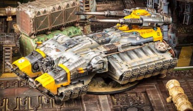
The Space Marines have always had some rather large tanks in Warhammer 40,000. Seems they couldn't just stop at the Land Raider though with the first Super-Heavy Tank for the Primaris, the Astraeus.
That is certainly one large looking tank. Once again it seems we're turning our attention to the gravity stomping power of this thing as it doesn't have traditional tracks. It's a shame really as it would have looked great with them I think, much like a Mammoth Tank from Command & Conquer.
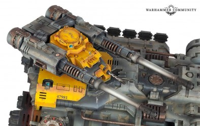
You can check out the teaser video above for more about this, but the tank will be coming out of Forge World in the near future. The enormous hull of this thing is bristling with weapons and we should draw special attention to the larger cannon on the top, the macro-accelerator cannons.
They fire twelve shots with -2 AP and 3 Damage apiece which sounds nasty as hell. Could you find this becoming part of your armoury for a growing Primaris Space Marine force?
Let us know below...
Supported by (Turn Off)
Supported by (Turn Off)
Supported by (Turn Off)







































much nicer than the Repulsive! Repulsor, sorry. 😉
Man, that’s one fugly tank… 🙁
Hmmm Ive got mixed feelings about this one. I love the look but its doesnt feel very grimdark. I think its an awesome futuristic hover tank and I could do so much with one of those things in my collection. Compared to the classic land raiders and rhinos it just looks too different I think. It just doesnt fit with what I think tanks should look like in the game. It does show that GW are moving forward though and not just re releasing versions of the same thing and that can only be good. I’d definitely love to see… Read more »
Well it’s good looking big tank but it’s shame that it doesn’t have transport capacity and over all gives me feel of G.I. Joe toy vehicle.
you’re not alone mate, someone has mocked up a GI Joe box art for it 🙂
Sort of have the feeling that if I have to ask the price I can’t afford it.
I’m beginning to think that GW have given their new marines a neutral style (not grimdark) to create a range of models that could be used in any game system no just 40K.
Looks… not like a space marine tank. Weird and not in a good way.
I wish space marines stuck to landraiders, rhinos and predators.. leave the big tanks for imperial guard..
Me too. This doesn’t feel like a Marine vehicle to me at all.
Don’t have a problem with the Sicarans, Mastodons, Fellblades – hell, I don’t mind them figuring out AG tanks (after all, Thunderhawks fly somehow) – but this has no redeeming features.
I think I would have preferred it as an Admech super-heavy. They can get away with gigantic random looking weapons of war.
Is it a spaceship?
I think it’s good on it’s own merits but I understand why people are saying it doesn’t feel very 40K ish. I’m more reminded of Hammer’s Slammers description of hover tanks than something from the Imperium when I look at it.
I’d buy three…in Epic scale. XD I do like the look of the vehicle though.
this moistens the parts other tanks simply cant moisten…..
Lol 😀
Surely not. Ugly, ugly floater.
Like a flattened Thunderhawk.
Like a bad kitbash.
Like the Repulsor.
(It also has a weird centre of gravity thing where it looks like it shouldn’t be flying level with that bulging payload on the rear “axles” – I understand it’s to compensate for the weight of the turret, but it’s just… inelegant.)
Someone call G.I.Joe and tell them we found their stolen toy tank.
That’s how unimpressed I am.
as much as it pains me to say it I think the design team need to consider that, sometimes, just because they can do something doesn’t necessarily mean that they SHOULD….
Because 40k was a game that needed another hideously overpriced “mini” that takes up a quarter of a gaming table on its own
Why? Don’t like the design but, it seems well done but again: Why?
Because there has been quite a lot of Space Marine players complaining about how every other faction seems to be able to bring in a super heavy while Marines have always struggled with that. Now they have this so… yay? *shrugs*
It seems like the front was designed by one person, the back designed by another and they mashed them together. If they made the front and back there own thing it would work.
Definitely designed by a committee.
@cpauls1 In all honesty, I think a lot of stuff coming out of Games Workshop these days looks like that. You can see where they cut’n’pasted parts of other 3D models and stuck them together to create a new model. I suppose it makes sense for the Empire to re-use parts that are already proven to work – like an engine or wing configuration – but it does lead to stale and rather boring designs. This tank, if you ask me, suffers very much from the same problems. When you have the 3D files for the suspensor pads underneath one… Read more »
I like the design, but I agree it is a very stark contrast to the normal 40K look, and in a setting where the imperiums technology is all ancient and noone knows how it was created (unless they changed the fluff), coming up with all new high tech weapons/tanks/marines feels out of place in what is essentially the dark ages in space. Also, I am sure it will be so over powered that its game over as soon as it hits the table top. I am keen to see the price, just for the shock value (gotta know I am… Read more »
I think this is consistent with the change in the Imperium with the reappearance of Cawl and Guilliman – the technological paralysis is over and now they get hover tanks.
Pig-ugly hover tanks.
Apologies to pigs.
I really like the new vehicle aesthetics and the step change in direction to grav tanks, also it gives the Primaris a more progressive feel than the rinse repeat chassis variants.
For those wedded to the past STC variants (*also guilty*) just drag out your Fellblade if you want a super heavy rolling.
My only negative comment is would look a bit goofy in mix & match scenario of old & new but I have held that opinion since the first Release of Primaris marines that they look better on the table as a stand alone force.
What the heck is this ugly garbage? At least the continuing releases moving farther and farther from 40k’s aesthetic are making it really really easy to feel confident about quitting the game.
To me there seem to be two major problems with this tank.. firstly it looks like someone has kitbashed the front of a rhino with a falcon grav tank and secondly they put an anti-aircraft gun on top of it…
Yak, the more I look at it the cheaper it looks to me.
🙁
IMO it looks really like a hobby kitbash.
I really liked the repulsor design, this however is just big blocky and uninspired.