Grindhouse Games Show Off The Final Incursion Cover Art
July 15, 2013 by brennon
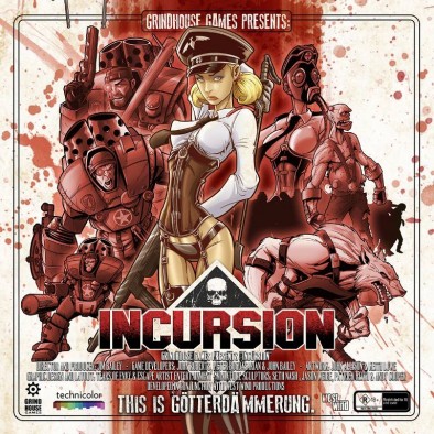
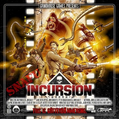
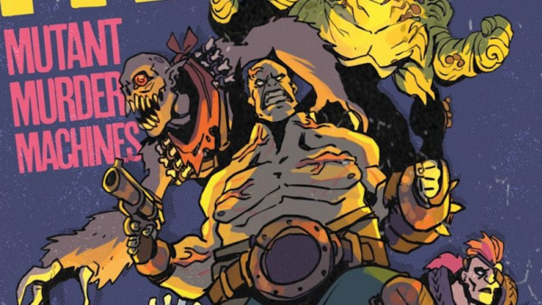
Grindhouse Games have been working hard behind the scenes and they have previewed some of the finalised artwork for the front of their Incursion board game. Check out the main game and the expansion below...
It's certainly an evocative and over the top art style that draws from many a graphic novel. The old game was a lot of fun and I managed to play it a few times. It will be interesting to see how it all looks once they're done with this new version and if the artwork is anything to go by, it's going to be great.
I do like how it's been presented as a movie poster!
Update:
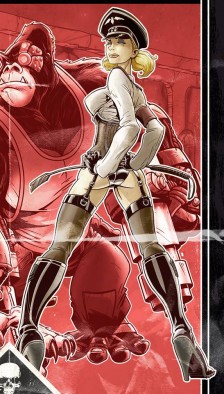
The folks over at Incursion have had a lot of feedback about the cover art for the main game and some of you might notice that it's different from the original art we saw...
Some people considered the younger Gretel a little over the top and sexualised (both are in reality) and wanted this older and more threatening Gretel back. Which one would you have picked for the cover?
Will you be getting the new Incursion?
Supported by (Turn Off)
Supported by (Turn Off)
Supported by (Turn Off)

































I preffer the top one to be honest.
The Bottom one reminds me too much of Madonna. (And no. That’s not a good thing. )
Totally agree.
As much as all the art is a nod back to pulp comics and grindhouse B movies the top version of Gretel is more unique while the bottom one is just straight Ilsa She-Wolf/Madonna lift.
I much prefer the art style on the original version of the game.
IMHO that box cover is best of those while expansion cover is decent. Last one looks too much like Ilsa.
Reminds me of the Zombicide artwork, loving the top version.
The middle one.